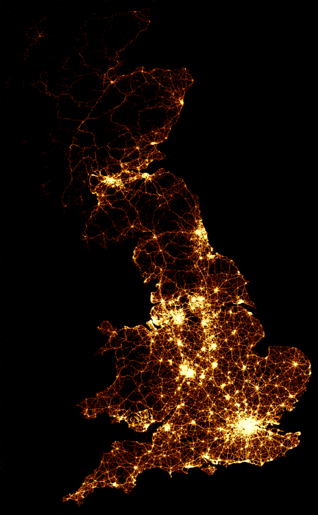
As part of their series on road accidents, BBC News mapped every recorded death on the road in Great Britain, from 1999 to 2010. That’s 2,396,750 road crashes. As you’d expect, the map looks a lot like population density, but check out the videos, which show twelve years of data compressed as if it were one week, played out over a few minutes. Each light represents an accident.
Contrast with road fatalities in the United States.
Update: The BBC headline and copy seem to conflict, but this seems to be just accidents, and I’m not sure when casualties enter the equation. At 2.4 million crashes over 12 years, that’s about 455 per day.
[BBC News via @aaronkoblin]
 Visualize This: The FlowingData Guide to Design, Visualization, and Statistics (2nd Edition)
It’s an impressive image. I wonder if the title is misleading – is it every death? The caption states “The image below shows the location of 2,396,750 road crashes in Great Britain from 1999 to 2010. Each light point is an individual collision which resulted in a casualty.” I’m pretty sure there haven’t been over 2 million deaths on the road in 11 years.
The map would be even more useful if it included information about traffic density – this would highlight particularly safe as well as dangerous stretches of the road map.
It is quite pretty but does not really tell much. The data could probably be linked to other sources such as age, gender, population density, economic factors, alcohol consumption, drug use etc. At the moment it just looks like brighter areas for larger cities in England, Scotland and wales. Even some basic standardisation to generate an expected count and SMR would not be that difficult with this data.
I stumbled across this recently and was compelled to send it to you during my lunch at work, glad you’ve put this up though, as disregarding infographics the statistics are still very interesting!
I’m unsure though whether you saw the actual article (In “Did you know?”) as it does explain the “accidents” more clearly in this:
http://www.bbc.co.uk/news/uk-15975564
(3,266,854 casualties, 36,371 deaths, 373,985 serious injuries, 2,856,498 light injuries)
Not a very interesting infographics, interesting statistics too. (Also live in one of the lowest areas, in search by area there have only been two fatalities in the town I live in, which makes me feel a -little- safer!)
As a British person, and also a geographer, I can confirm that this map is basically a population map plus the main road network, as could easily be guessed. That doesn’t stop it being interesting, but it’s useless at quantifying risk to anyone.