Along the same lines as Jessica Hagy’s indexed charts, Coolness Graphed charts only…
Nathan Yau
-
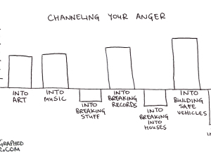
Coolness graphed
-
Link
csvjson →
Converts a CSV file into JSON or GeoJSON [via]
-
Link
The Subway Map That Rattled New Yorkers →
It’s not geographically accurate, but it wasn’t meant to be
-
Link
Hand-crafted data →
Data Stories has Stefanie Posavec on as guest; she makes intricate pieces without code
-
Disney Research makes plants interactive
Botanicus Interacticus from Disney Research turns plants into multi-touch surfaces, simply by placing…
-
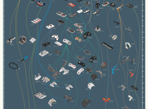
Evolution of video game controllers →
From the department of old-but-new-to-me, Pop Chart Lab charted the evolution of video…
-
Link
Statisticians need better marketing →
So much hype and funding for big data, but statistics as a field of study seems to be lost
-
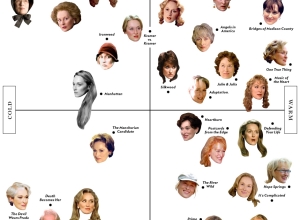
Meryl Streep scatterplot →
Vulture plotted Meryl Streep’s character faces on a cold-warm, frivolous-serious scatterplot. Sure, why…
-
Link
Visualizing Hadoop →
Twitter releases HDFS-DU to explore what’s going on in your clusters
-
Link
Data Jujitsu →
Don’t like the title, but the (free) report could be worthwhile
-
Network analysis on high school hierarchy of friends
Brian Ball and M. E. J. Newman analyzed friendship data from a high…
-
Link
Too many bars →
Improving on gradient-filled bar charts with clarity [via]
-
Link
Politics of eating out →
Mostly a correlation with geography
-
Link
Piecon →
Easy way to add a pie chart as your favicon, to update loading progress
-
Link
Olympic stars of Twitter →
Streamgraph seems to be growing into de facto chart type for Twitter trends
-
Link
Another bad Fox chart →
They just need to learn how to use bar charts
-
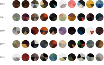
Paintings as pie charts →
Expanding on his Vincent van Gogh pie charts, Arthur Buxton minimalized famous paintings…
-
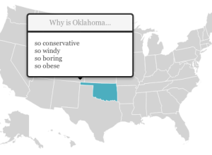
State stereotypes suggested by Google
Renee DiResta got to wondering about state stereotypes, so she looked them up…
-
Link
If you want to help inform the public, you need to actually inform. →
A critique of the arms trade interactive from Google
-
Review of Tufte course
Thousands of people have attended Edward Tufte’s one-day course on data graphics. Robert…
Recently for Members
Second Edition
 Visualize This: The FlowingData Guide to Design, Visualization, and Statistics (2nd Edition)
 Visualize This: The FlowingData Guide to Design, Visualization, and Statistics (2nd Edition)
New tools, refined process.
Browse by Chart Type See All →


