By designer Stephen Wildish, a taxonomy of arse. No comment necessary.…
Nathan Yau
-
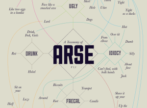
A taxonomy of arse →
-
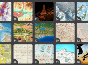
Insisting on beautiful maps
In the Atlas of Design, published by the North American Cartographic Information Society,…
-
Link
Basics of JavaScript and D3 for R Users →
From a statistician’s perspective
-
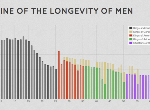
Lord of the Rings visualized
Driven by his love for Lord of the Rings, Emil Johansson explores the…
-
Link
Reporter or Artist →
Free book from 1992 on how newspapers use information graphics
-
Link
Music history of campaign finance →
Speech snippets with a beat
-
Link
Guardian Interactive →
Quick interview with editor Gabriel Dance
-

Stephen Colbert on the USA Today infographic logo
USA Today launched a redesigned logo last month. It’s a circle that reflects…
-
Data on decades of Boy Scout expulsions released
The Los Angeles Times released nearly 5,000 records of allegations from the Boy…
-
Link
Mathgen paper accepted →
Automatically generated math paper accepted into a journal [via]
-
xkcd-style charts in R, JavaScript, and Python
The ports and packages to make your charts look like they came from…
-
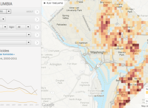
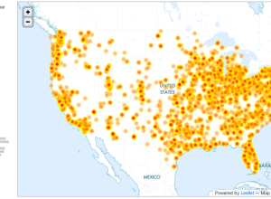
Tracking homicides in Washington, D.C. →
In a multipart special report, The Washington Post investigated homicides in the nation’s…
-
Link
Data Heroes: Sisi Wei →
On her work with DataKind and The Washington Post, “wrangling complicated data can be abnormally satisfying.”
-
Masterful design of the everyday baggage tag
Pilot Mark Vanhoenacker describes the history and careful design of the everyday baggage…
-
Link
Dual Degree: Journalism and Computer Science →
Registration for new master’s program now open; my adviser is the director and it’s going to be amazing
-
Link
Evolution of the Flowers →
Stamen on the process behind creating the spreading animation for Facebook Stories
-
Link
Visually Marketplace →
Connects clients to infographic designers; seems good on the surface but still makes me uneasy
-
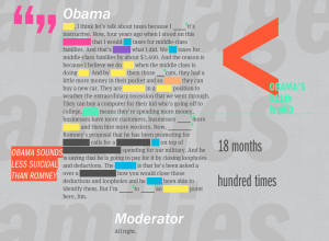
ReConstitution recreates debates through transcripts and language processing
ReConstitution 2012, a fun experiment by Sosolimited, processes transcripts from the presidential debates,…
-
Link
Why becoming a data scientist isn’t easy →
In response to this
-
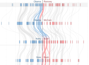
Shifting states over the decades, between Democrat and Republican →
Mike Bostock and Shan Carter visualized how states have shifted parties over the…
Recently for Members
Second Edition
 Visualize This: The FlowingData Guide to Design, Visualization, and Statistics (2nd Edition)
 Visualize This: The FlowingData Guide to Design, Visualization, and Statistics (2nd Edition)
New tools, refined process.
Browse by Chart Type See All →


