From the machine learning course on Udacity, an a cappella group sings a…
Nathan Yau
-
Machine learning a cappella on overfitting
-
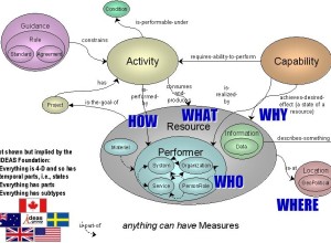
Military infographic fascination
Paul Ford describes his fascination with military infographics. Here’s what he has to…
-
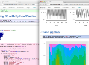
Beaker allows data exploration in various languages
Currently in beta, Beaker lets you work and experiment with data with different…
-
The United States of Metrics isn’t such a bad thing
Bruce Feiler for The New York Times describes his concern and distaste for…
-
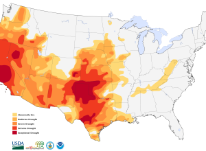
Drought map shows extreme shortages
From the U.S. National Drought Monitor.
The entire state of California is in… -
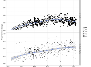
A majority of your email in Gmail, even if you don’t use it
For reasons of autonomy, control, and privacy, Benjamin Mako Hill runs his own…
-

Newborn false positives
Shutterfly sent promotional emails that congratulate new parents and encourage them to send…
-
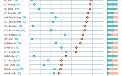
Alcohol consumption per drinker
We’ve seen rankings for alcohol consumption per capita around the world. These tend…
-
Share your traces with a stranger
The MIT Media Lab Playful Systems group is working on an experiment in…
-
Job Board, May 2014
Looking for a job in data science, visualization, or statistics? There are openings…
-
Responsive data tables
Alyson Hurt for NPR Visuals describes how they make responsive data tables for…
-
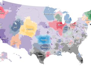
NBA basketball fans by ZIP code
After the popularity of The Upshot’s baseball fandom map, it’s no surprise the…
-
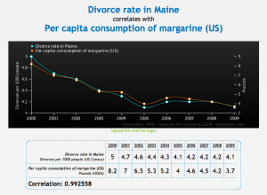
Random things that correlate
This is fun. Tyler Vigen wrote a program that attempts to automatically find…
-
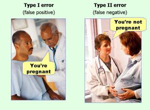
Type I and II errors simplified
“Type I” and “Type II” errors, names first given by Jerzy Neyman and…
-
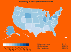
Name popularity by state, animated by year
Using baby name data from the Social Security Administration, Brian Rowe made this…
-
Optimizing your R code
Hadley Wickham offers a detailed, practical guide to finding and removing the major…
-

Naked Statistics
Naked Statistics by Charles Wheelan promises a fun, non-boring introduction to statistics that…
-

Downloading Your Email Metadata
Email provides a window into who we interact with and what we do. This tutorial describes how to get that data in the format you want.
-

Crystal clusters of world data
Artist Scott Kildall generates what he calls World Data Crystals by mapping data…
-
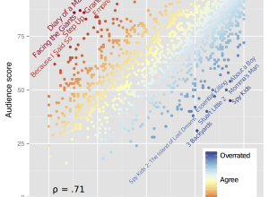
Most underrated films
Ben Moore was curious about overrated and underrated films.
“Overrated” and “underrated” are…
Recently for Members
Second Edition
 Visualize This: The FlowingData Guide to Design, Visualization, and Statistics (2nd Edition)
 Visualize This: The FlowingData Guide to Design, Visualization, and Statistics (2nd Edition)
New tools, refined process.
Browse by Chart Type See All →


