From Vox and research from Zuidhof et al., chickens are quite big these…
Nathan Yau
-
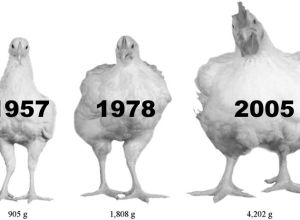
Big chicken
-
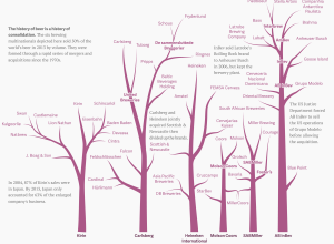
Beer family tree
With Anheuser-Busch InBev rumored to have an interest in acquiring SABMiller and SABMiller…
-
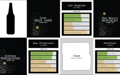
Multivariate Beer
Can you experience data? Sometimes visualization gets you part of the way there, putting data into context, serving as a trigger for your memory, and all that. But only so much can happen through the computer screen.
-
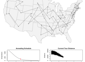
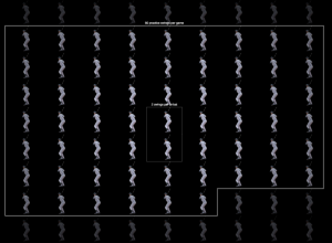
A simulation of the traveling salesman problem
In a nutshell, the traveling salesman problem is as follows: “Given a list…
-
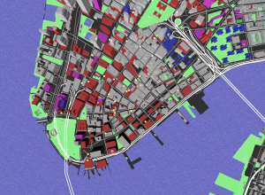
Open source mapping lab
Mapzen focuses on building open source mapping components for developers.…
-
Fitbit obsessed
After you’ve collected data about yourself for a while, you tend to go…
-
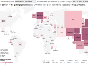
Flooding risk cartogram
As you may or may not know, climate change could bring with it…
-

Drones programmed for light painting in the sky
What do you get when you put LEDs on a system of drones…
-
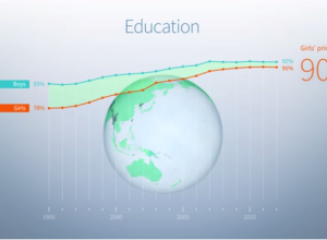
No Ceilings highlights progress towards gender equality
No Ceilings: The Full Participation Project, an initiative from the Clinton Foundation, aims…
-

Quartet point cloud
This is beautiful to watch. Graham Roberts, Daniel J. Wakin, and others from…
-
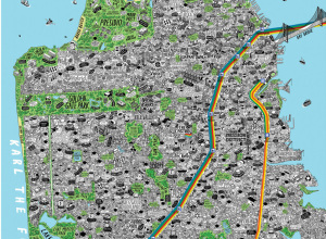
Hand-drawn, detailed city maps
Maps can be about a lot of things, from strictly geography and location…
-
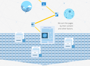
How search works
Google explained the process of a web search with a scrolling infographic. Might…
-
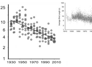
Evolution of movies
We know that movies have changed over the decades. We’ve seen it in…
-
Members Only
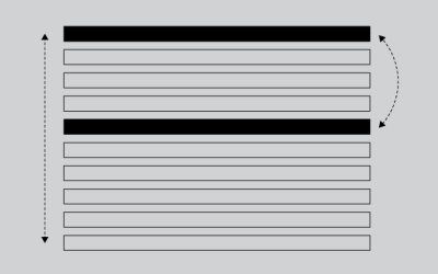
How to Make an Animated, Self-Sorting List
You have a list of things that can be ordered by different values. Let them sort themselves out.
-
Director of Basketball Analytics. Must know Excel
When you hear about sports analytics in the news or when announcers talk…
-
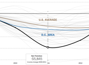
Household incomes rise
Since the recession, it’s taken a while for household incomes to come back…
-
Last day to pre-order a song chart poster
Today is the last day to pre-order a song chart poster. Now is…
-
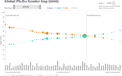
PhD gender gaps around the world
Periscopic, for Scientific American, visualized the number of PhDs awarded in various countries.…
-

Search for word usage in movies and television over time
Movies and television shows often reflect cultural trends of the time they are…
-
Powers of Ten, Derek Jeter style
You’ve likely seen the classic Powers of Ten video from 1977. It starts…
Recently for Members
Second Edition
 Visualize This: The FlowingData Guide to Design, Visualization, and Statistics (2nd Edition)
 Visualize This: The FlowingData Guide to Design, Visualization, and Statistics (2nd Edition)
New tools, refined process.
Browse by Chart Type See All →


