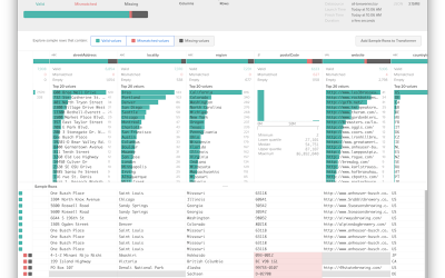
Vizable is a free iPad app from Tableau Software that helps you explore…
Nathan Yau
-

Vizable, for data exploration on an iPad
-

Particles swirling in the atmosphere
Gavin Schmidt shows different types of particles that swirl around in our atmosphere:…
-
Trifacta Wrangler to format and clean data
Data wrangling — formatting and cleaning — is a sore spot and stumbling…
-
Stock trading game
Bloomberg Business has an interesting stock trading game with a simple premise. A…
-
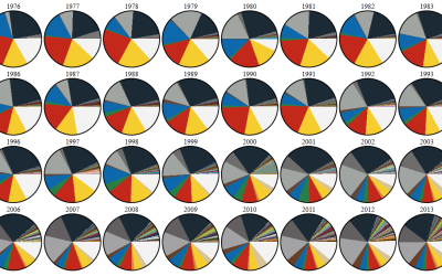
Evolving LEGO color palette
DaveE from the Brickset Forum was curious about the changing LEGO color palette,…
-
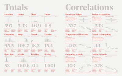
Last Feltron Annual Report
Nicholas Felton released his 10th and final annual personal report. It’s the end…
-
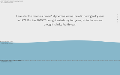
Water scroller
Here’s a nice scroller from Katie Park for the Washington Post. It shows…
-
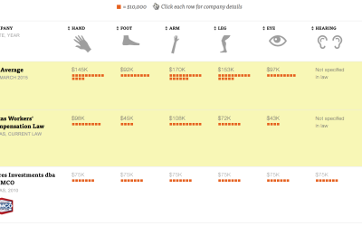
Value of body parts for injured workers
A detailed look at the state where companies can write their own workers’ compensation plans.
-
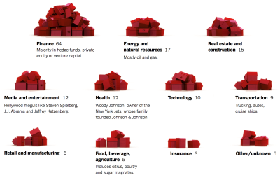
Monopoly pieces to show presidential funding
According to the New York Times, 158 families funded about half of the…
-

Work Counts
Looking at educational attainment, income, work hours, and commute, this is who has the same work life as you do.
-
Link
tigris →
A package to help you download and map TIGER shapefiles in R.
-

A month in the life of personal location and messaging metadata
Data researcher and artist Mimi Onuoha looked at the personal location and messaging…
-
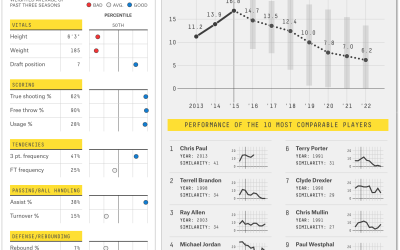
NBA player career projections
Predictions for how NBA players will contribute to their teams, based on their own performance and history.
-
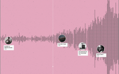
A timeline of history
“I wish there was a timeline browser for all the historical events documented…
-
Using stereotypes as an advantage
In 2004, Annie Duke won the World Series of Poker Tournament of Champions,…
-
Link
What to do with small data →
When the algorithms and methods for big data don’t work.
-

Network Effect overwhelms with data
Network Effect by Jonathan Harris and Greg Hochmuth is a gathering of the…
-
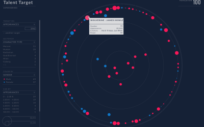
Superhero HR dashboard
Talent Lab is an application for human resource professionals to evaluate a work…
-
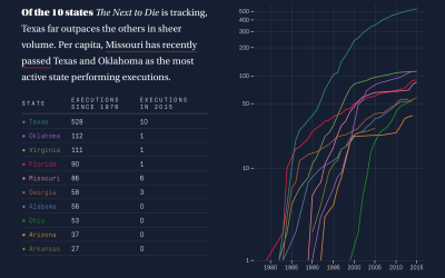
Human side of executions
On one side, a person is scheduled to die. On the other, the person did horrible things. It’s complex.
-
Link
NFL play-by-play data →
Download play-by-play and standings data scraped from the NFL site, dating as far back as 1920.
Recently for Members
Second Edition
 Visualize This: The FlowingData Guide to Design, Visualization, and Statistics (2nd Edition)
 Visualize This: The FlowingData Guide to Design, Visualization, and Statistics (2nd Edition)
New tools, refined process.
Browse by Chart Type See All →


