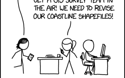
From xkcd, a blockbuster idea right here.…
Nathan Yau
-
xkcd: Disaster Movie
-
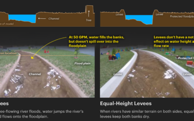
Scale model shows how levees increase flooding
Levees are intended to prevent flooding in the areas they are built, but…
-
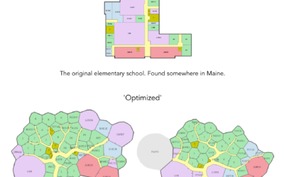
“Optimized” floor plan with genetic algorithms
Genetic algorithms are inspired by natural selection, where the system is given a…
-
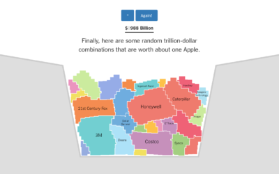
Bucket o’ companies compared to Apple $1 trillion value
Apple’s value passed $1 trillion on Thursday, and as tradition requires, we must…
-
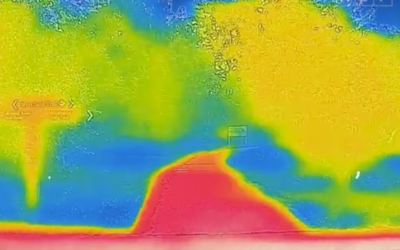
Why the city is hotter than the suburb
NPR used video from a thermographic camera to explain why cities tend to…
-
Members Only
Wrong Tool, Right Tool, More Tools for Visualization
Welcome to the new members-only newsletter: The Process. In this first update, a certain data graphics expert seems to really dislike R, which prompts a look into the visualization tools we use and what one might get out of a bigger toolbox.
-
Trust The Process
I’m happy to introduce an in-depth, process-focused newsletter for FlowingData members. It’s called…
-
Three flavors of data scientist
As the field grows and needs develop throughout companies, specialization in data science…
-
Download 3 million Russian troll tweets
Oliver Roeder for FiveThirtyEight:
FiveThirtyEight has obtained nearly 3 million tweets from accounts… -
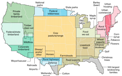
How America uses its land
Dave Merrill and Lauren Leatherby for Bloomberg visualized land use for the conterminous…
-
Finding the Beatle who wrote each song using statistical models
There’s been some disagreement about who wrote “In My Life” by The Beatles,…
-
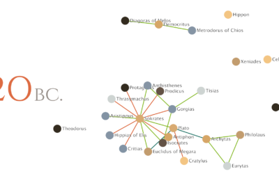
Relationships between philosophers over time
Maximilian Noichl visualized the relationships between philosophers from 600 B.C. to 160 B.C.:…
-
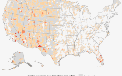
Searching for education deserts
The Chronicle of Higher Education looked for education deserts — places where people…
-
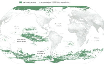
Mapping the ocean undisturbed by humans
Researchers recently published estimates for the amount of area undisturbed by humans —…
-
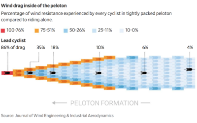
Calculating wind drag in the cycling peloton
When cyclists ride in that big pack during a race — the peloton…
-
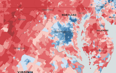
Extremely detailed election map
The Upshot returns to 2016 election results mapped at the precinct level. Because…
-
Members Only
How to Visualize Ranges of Data in R
When you want to focus on the magnitude of differences between low and high values, use visual cues that highlight distance.
-
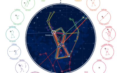
Same stars, different constellations
Cultures have formed different stories and pieced together different constellations from the stars,…
-
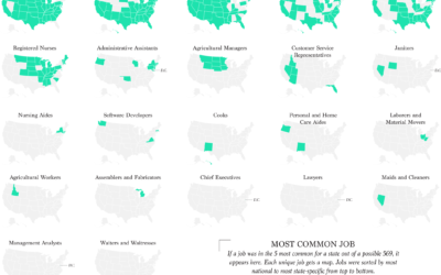
Most Common Jobs, By State
Instead of looking at only the most common job in each state, I found the top five for a slightly wider view.
-
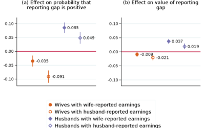
When wife earns more than husband, they report a lesser gap
Marta Murray-Close and Misty L. Heggeness for the Census Bureau compared income responses…




 Visualize This: The FlowingData Guide to Design, Visualization, and Statistics (2nd Edition)


