A Yahoo News/YouGov poll recently showed this:
Only 40% of American adults are…
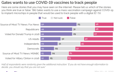
A Yahoo News/YouGov poll recently showed this:
Only 40% of American adults are…
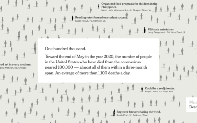
The New York Times used their full front page to list 1,000 names…

This is The New York Times front page for Sunday, May 24, 2020.…
Using anonymized cellphone data from SafeGraph, Reade Levinson and Chris Canipe for Reuters…
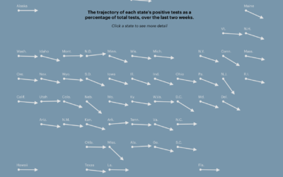
With coronavirus testing, many governments have used the percentage of tests that came…
The Georgia Department of Public Health published a questionable chart showing confirmed Covid-19 cases over time. Intentionally misleading or poorly made chart?
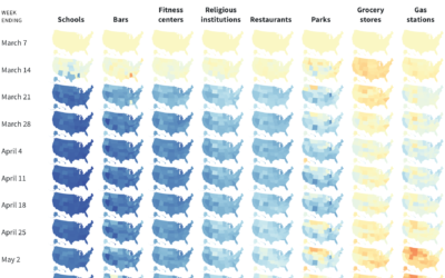
States are reopening. Some seem ready, and some less so. Lena V. Groeger…
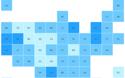
This straightforward grid map by Danielle Alberti for Axios shows the percentage of…

What does the coronavirus look like? Rebekah Frumkin for The Paris Review highlights…
“Rivers know this: there is no hurry. We shall get there some day.”…
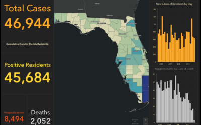
Rebekah Jones, GIS manager for the Florida Department of Health, was fired a…

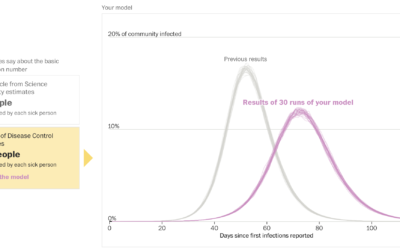
Thomas Dimson trained a model to generate words that don’t exist in real…
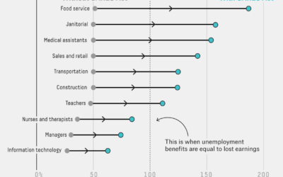
Economists at the University of Chicago analyzed unemployment benefits from the CARES act…
Let’s just animate all statistical concepts with LEGO from now on:
My daughter…
Harry Stevens and John Muyskens for The Washington Post put you in the…
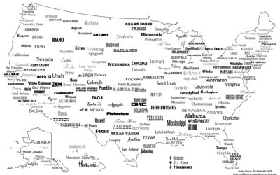
For The Statesider, Andy Murdock wondered how many typefaces are named after American…

This issue of The Process is public.
Hi,
Nathan here. This is The…
From Andy Kirk, there’s a new visualization podcast in town:
Explore Explain is…
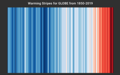
Ed Hawkins, who you might recognize from charts such as spiraling global temperature…

Based on a chart by Ed Hawkins, the shower wall of Gretchen Goldman…
 Visualize This: The FlowingData Guide to Design, Visualization, and Statistics (2nd Edition)
New tools, refined process.


