For Reuters, Feilding Cage provides a series of interactive tidbits to demonstrate why…
Nathan Yau
-

Why time feels weird right now
-
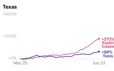
Increased case counts not just from increased testing
Some attribute increased Covid-19 case counts to increased testing. While that is certainly…
-
Members Only

Try New Visual Encodings, Because Something Might Work (The Process 096)
Sometimes a chart type seems terrible. But you’ll never know until you try.
-
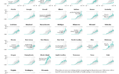
Restaurant Reopenings, a Comparison to Last Year
Restaurants are reopening for dining across the United States. Some states are doing it faster than others.
-

Map shows where to go to get away from fireworks
Using a voronoi map, David Yanofsky for Quartz mapped the places in the…
-

Decade-long time-lapse of the sun
NASA’s Solar Dynamics Observatory has been taking a picture of the sun every…
-

When the world shut down, seen through global flights
Lauren Tierney and William Neff for The Washington Post used a rotating globe…
-

Cataloging all the house number styles
Dan Kois walked all of the blocks in his ZIP Code and collected…
-
Members Only

How to Make a Spiral Chart in R
Using a spiral might not be the best way to encode data. But here’s how to do it anyway. Just in case.
-
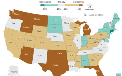
Map of Covid-19 surge
Axios provides a straightforward state map showing the percentage change in the 7-day…
-

LEGO relief map
Cameron Bennett made a relief map of Idaho, completely out of LEGO bricks:…
-
Members Only

Visualization Tools, Datasets, and Resources – June 2020 Roundup
Here’s the good stuff for June.
-
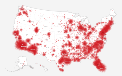
How the coronavirus won in the United States
Using a wide array of sources, The New York Times shows how the…
-
Algorithm leads to arrest of the wrong person
Even though there was supposedly a person in the decision-making process and a…
-

Face depixelizer with machine learning, and some assumptions
In crime shows, they often have this amazing tool that turns a low-resolution,…
-

Bad bar chart
Welcome to whose bar chart is it anyway: where the geometries are made…
-

Who is responsible for climate change?
Kurzgesagt, in collaboration with Our World in Data, tackle the question of who…
-
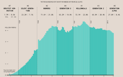
Age Generation Populations
Based on estimates from the United States Census Bureau released for July 2019, Millennials are the largest living generation in the country now.
-
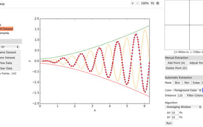
Extract data from a plot in a flat image file
Maybe you’ve seen a chart and wished you could look at the data…
-
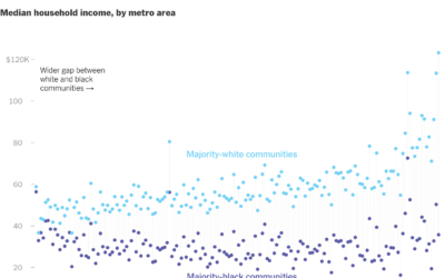
Gaps between black and white America
New York Times Opinion compared several demographics, such as unemployment and income, between…
Recently for Members
Second Edition
 Visualize This: The FlowingData Guide to Design, Visualization, and Statistics (2nd Edition)
 Visualize This: The FlowingData Guide to Design, Visualization, and Statistics (2nd Edition)
New tools, refined process.
Browse by Chart Type See All →


