Eugene Wei looks closer at the algorithms that drive TikTok and how its…
Nathan Yau
-
Through the eyes of the algorithm
-
Members Only

The Process 117 – Accumulating Data
It might be tricky. It might be tedious. But it’ll make your process more straightforward when it’s time to visualize.
-
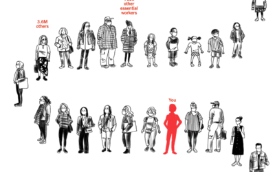
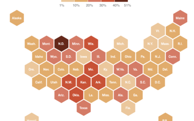
Your place in the vaccine line
Using estimates from the Surgo Foundation and Ariadne Labs, Stuart A. Thompson for…
-
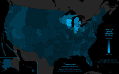
Searching for Blue Moon ice cream
Daniel Huffman grew up with an ice cream flavor called Blue Moon. Where…
-

A game where you get to be a faceworker and mess with an AI system
Kyle McDonald, in collaboration with Greg Borenstein, Evelyn Masso, and Fei Lui, made…
-
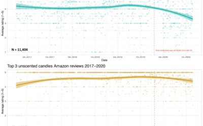
Scented candle reviews on Amazon and Covid-19
Prompted by a tweet about scented candles without smell and Covid-19, Kate Petrova…
-
Jobs of a data scientist
Roger Peng outlines four main roles of a data scientist:
If you’re reading… -
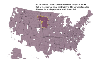
Mapping 250,000 people
As we’ve talked about before, it can be hard to really understand the…
-

Leftover Turkey Flowchart
I roasted a turkey. There were a lot of leftovers. But my mom taught me to never waste.
-
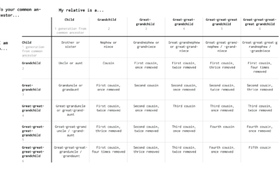
What to Call Your Distant Relative
When you have a big family, it’s a challenge to figure out how everyone is related. So here are some charts to help you figure it out.
-

Fake faces created by AI and where this might be headed
It’s grown easier and easier to generate fake faces with AI. For The…
-
Where there are hospital staff shortages
Reporting for NPR, Sean McMinn and Selena Simmons-Duffins on staffing shortages:
On data…
-
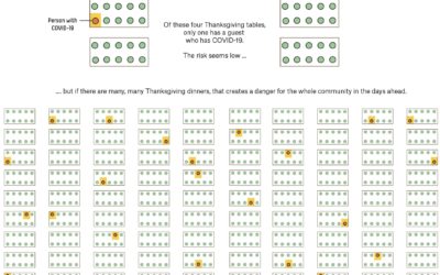
Why small gatherings can be dangerous too
A small gathering of 10 people or fewer can seem like a low-risk…
-
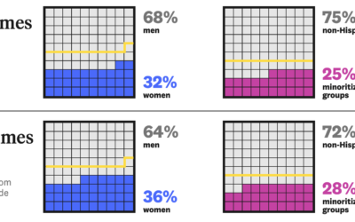
Analysis of representation in crossword puzzles
For The Pudding, Michelle McGhee analyzed representation in crossword puzzles. Some crossword publications…
-
Members Only
Visualization Tools and Resources – November 2020 Roundup
Here’s the good stuff for November.
-
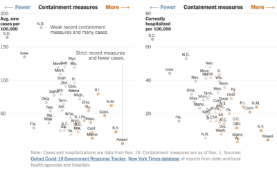
State restrictions and hospitalizations
The University of Oxford’s Blavatnik School of Government defined an index to track…
-
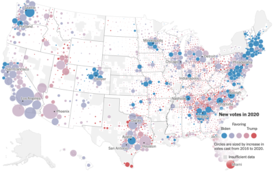
Voting gains for 2020, compared to 2016 election
For The New York Times, Ford Fessenden, Lazaro Gamio and Rich Harris go…
-
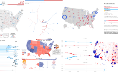
Recap of all the election maps and charts
Alan McConchie from Stamen recaps the wide array of maps and charts that…
-
U.S. military buys location data from apps
Joseph Cox, reporting for Motherboard:
Some app developers Motherboard spoke to were not… -
An atlas for the world’s development indicators
The World Bank tracks global development through a number of indicators. (You can…
Recently for Members
Second Edition
 Visualize This: The FlowingData Guide to Design, Visualization, and Statistics (2nd Edition)
 Visualize This: The FlowingData Guide to Design, Visualization, and Statistics (2nd Edition)
New tools, refined process.
Browse by Chart Type See All →


