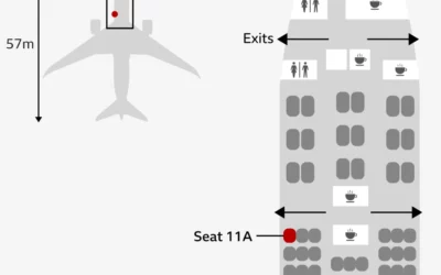
There was one survivor from Air India flight AI171. He sat in seat…
Nathan Yau
-
Seating chart for lone survivor in India plane crash
-
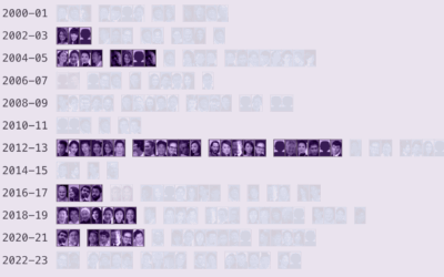
Asian misrepresentation in American films
For the Pudding, Dorothy Lu and Anna Li examine the match rate between…
-
Disney and Universal sue Midjourney, the generative AI service
For Reuters, Dawn Chmielewski reports on the alleged copyright infringement.
In the suit… -
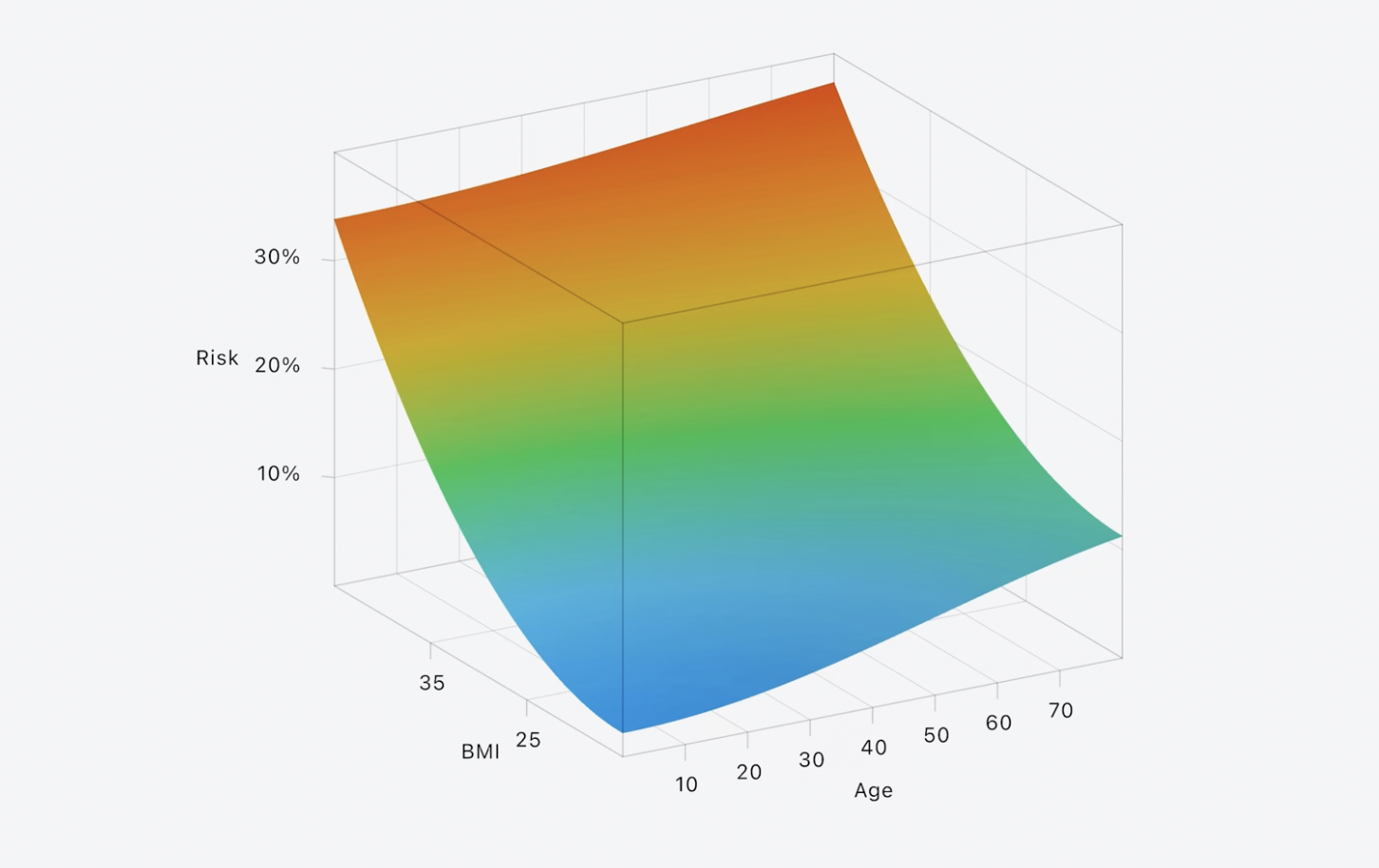
Apple introduces third dimension to Swift Charts framework
Apple, with an announcement that the world has been waiting for, released 3-D…
-
Members Only
Comparing multiples
This week we make it easier to compare multiple charts when differences are small but significant.
-
Airlines sell passenger flight data to Customs and Border Protection
While there are laws in the U.S. to protect some of your privacy…
-
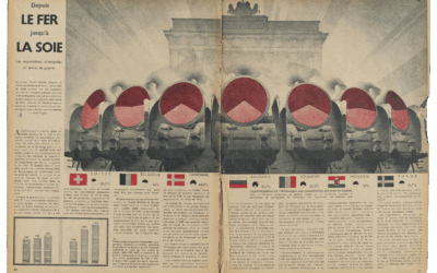
Nazi propaganda charts
RJ Andrews and Attila Bátorfy highlight information graphics from Signal, the Nazi propaganda…
-
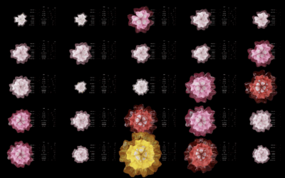
Flower blooms to visualize climate change
Annelie Berner used blooming flowers as a visual metaphor to show climate change.…
-
John Snow probably didn’t use that Broad Street map to reach his conclusions about cholera
Many visualization folks recognize the cholera map as a vital tool that John…
-
Reduced sampling for Consumer Price Index estimates
The Bureau of Labor Statistics announced a reduction in data collection to put…
-
Magnus Carlsen chess match against the wisdom of crowds ends in a draw
Chess grandmaster Magnus Carlsen played against 143,000 people in a single game. The…
-
Professor who studied honesty loses tenure over faked data
A couple years ago, Harvard professor Francesca Gino was accused of faking data,…
-
Members Only
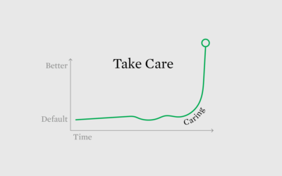
Caring Data
Hi folks. It’s Nathan. Welcome to the Process, the newsletter for FlowingData members…
-
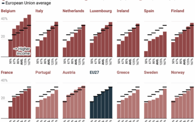
Progressive tax rates in Western Europe
There is always ample discussion about progressive tax rates in the United States.…
-
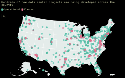
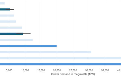
Unknowable energy footprint
For MIT Technology Review, James O’Donnell and Casey Crownhart ran numbers and interviewed…
-
AI energy usage, rough estimates for the hardware
Hardware for AI uses a whole lot of energy while training on data…
-
Survey microdata for free
Downloading survey microdata from public resources can be tricky. Sometimes the documentation is…
-
Last episode of Not So Standard Deviations podcast
Roger Peng and Hilary Parker started the statistics and data science podcast Not…
-
Data-driven story on the first vaccine
As we enter a time when people question the usefulness of vaccines, even…
-
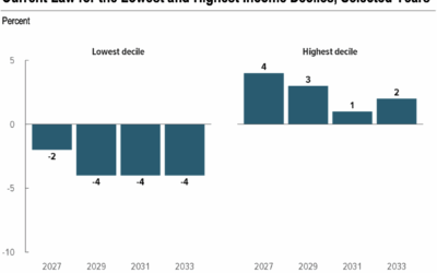
Pay more taxes and receive less
The Congressional Budget Office published a report estimating effects on household income if…




 Visualize This: The FlowingData Guide to Design, Visualization, and Statistics (2nd Edition)


