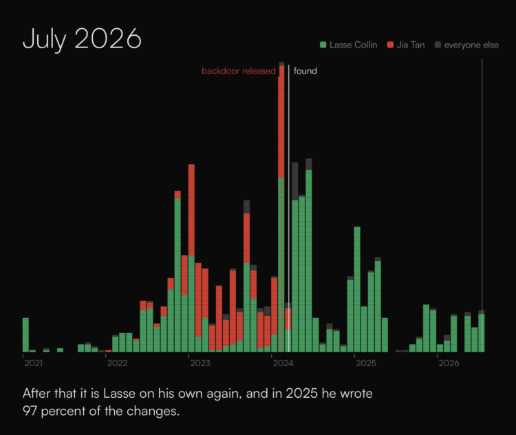
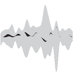
In reference to the xkcd comic that illustrates the internet as a stack of blocks propped up by a small project, sheets.works shows development history of real open source projects that our devices depend on. It is not uncommon for a single developer to maintain widely used open source software on a volunteer basis.
-
The Centre for the Study of the Legacies of British Slavery published a searchable database of four million records logged between 1813 and 1840. For the Guardian, Aamna Mohdin reports:
The registers were created by the British government after the abolition of the transatlantic slave trade in 1807, and were designed to prevent illegal trading of enslaved people and to monitor the enslaved population.
Researchers say people were recorded in the registers with chilling precision. Entries include names, ages, physical descriptions and family ties, as well as births, deaths and transfers of ownership. Some distinguish whether a person was born in Africa or in the Caribbean.
Nicka Sewell-Smith, a professional genealogist and senior story producer at Ancestry, said it was not lost on her that records originally created to count enslaved people as property were now being used by their descendants to reconstruct their family histories.
-
Daniel Willingham, a professor at the University of Virginia, argues that students should only use AI for things they know how to do well.
This lead/associate orientation makes sense for life after graduation. Once a student is in the workforce, they will use AI to produce products: new ideas, reports, and so on. A guiding principle of “Use AI, but let me see your work” makes sense.
This is not, however, an optimal guiding principle for students. Students produce products, but the product is seldom the point. No one wants to read the papers they write, and the math problems they solve have no practical value. Teachers have them do these tasks because they provide practice in cognitive abilities that we think matter.
I remember pulling all-nighters in the computer lab in college, with only Pop-Tarts and a fear of a failing grade to keep me going. What it must be like for students and educators these days knowing that the answer is only a prompt away.
I just keep telling my young kids (while they still listen to me) that we need to know how to do things and how things work. Things will break or need to get better, and that requires people who can think for themselves.
-
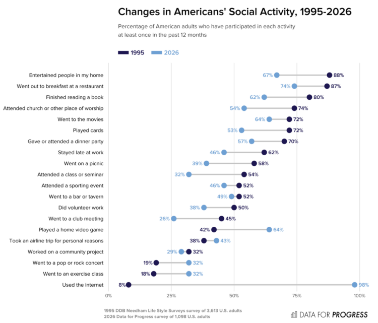
Data for Progress compared social activities among American adults in 1995 against 2026. Hanging out with others is down a lot for many activities.
We find that Americans’ participation in various social activities has declined by double-digit margins, including attending a class or seminar (-22), entertaining people in your home (-21), attending church or a place of worship (-20), going on a picnic (-19), going to a club meeting (-19), playing cards (-19), going out to breakfast at a restaurant (-13), and doing volunteer work (-12).
A few activities have seen increased engagement: using the internet (+90), playing a home video game (+22), attending an exercise class (+14), going to a pop or rock concert (+13), and taking an airline trip for personal reasons (+5).
At least staying late at work is also down quite a bit.
They used a dumbbell chart to show the difference, but arrows that start with the 1995 value and point to the 2026 value would make for an easier comparison. If they wanted to stick with the dumbbell, I would’ve switched the shades so that present day stands out more. The current color scheme reads backwards in time.
-
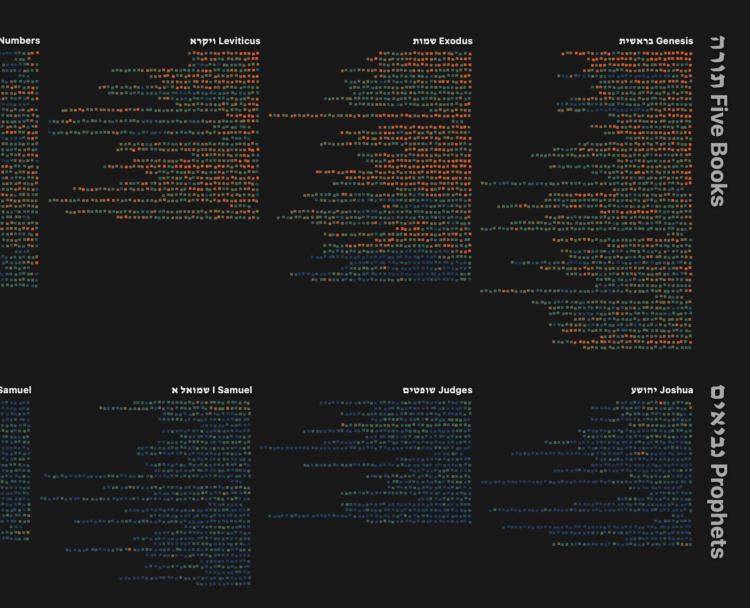
Torahmap by Danyel Fisher is an interactive visualization of the Hebrew Bible. Each column represents a book, each line represents a chapter, and each square represents a verse. Zoom and pan to see details.
I know little about the context, but I like the concept and interaction with text. People should do more with words as data.
-
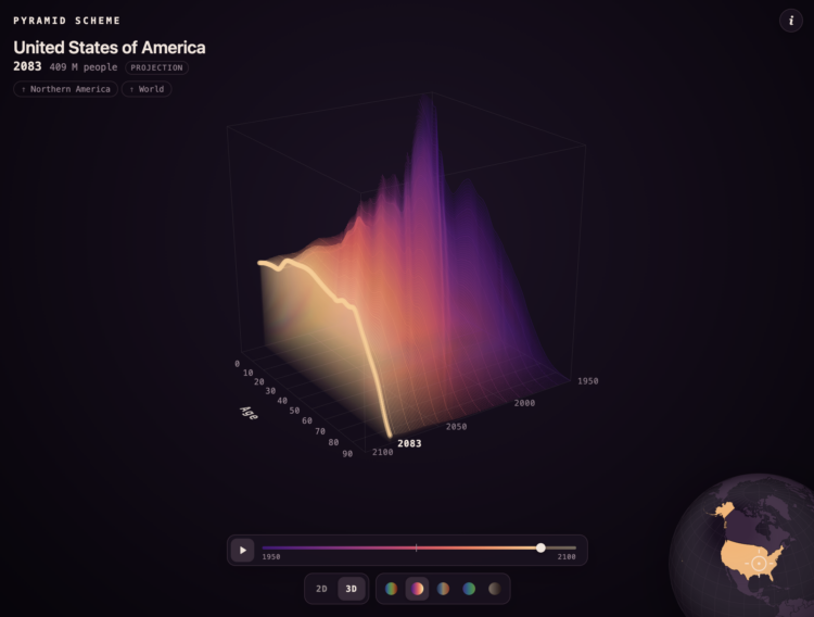
A population pyramid shows the age distribution of a population, usually with counts on the x-axis, age on the y-axis, and two sides for male and female. You’ve probably seen them before. Karim Douïeb added a third dimension in a visualization that shows total population around the world and over time.
Select a country on the globe, and you get age distributions from 1950 through a projected 2100. One year appears at a time to create a surface.
Each layer is one year, from 1950 to 2100: the share of the population at each single year of age. Young, fast-growing places bulge on the left; ageing ones flatten out and lean right. Switch to 2D to see the years overlaid.
It’s a fun riff on an old chart. Fair warning: my old computer nearly buckled under the pressure in the 3-D view.
-
Members Only
-
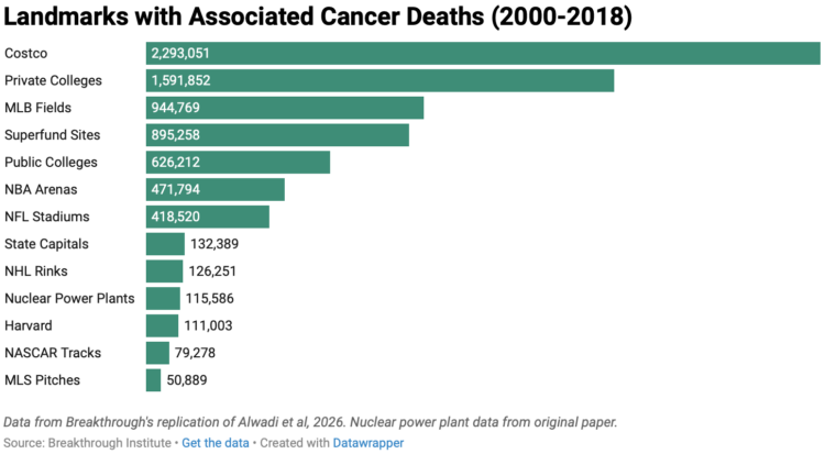
Harvard researchers published an analysis arguing that risk of cancer increases when people live closer to nuclear power plants. Deric Tilson and Adam Stein, of the Breakthrough Institute, disagree with the study, so they replicated it. They show that using the Harvard methodology, results suggest any physical landmark will lead to increased cancer risk.
Costco, with its “reasonably priced clothes”, topped the list, which seems like an incorrect conclusion to draw from the data. How dare they.
-
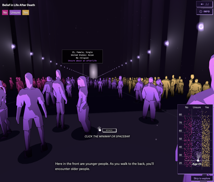
Is there something that comes after we die? For the Pudding, Alvin Chang imagined what it would be like if you walked into a room and could see everyone’s answer. A dot plot provides a map of where people stand, by age and their responses. You walk and scroll through the crowd along the axes and towards the light while music and narration provide depth to the data.
I like how Chang keeps the abstract connected to reality. It is a recurring theme, like in previous work on loneliness, teenage adversity, and relationships. Zoom out to see the patterns and zoom in to see individual survey responses.
-
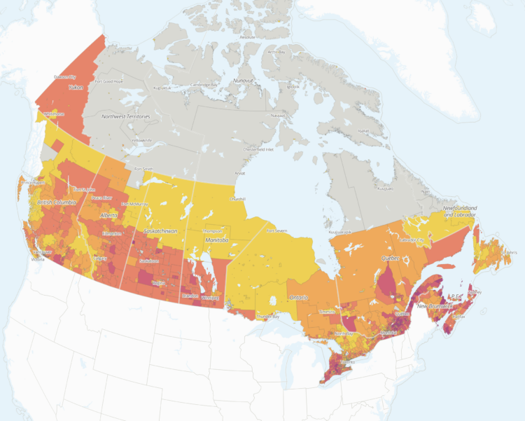
Researchers at the School of Cities, a center at the University of Toronto, are studying the impact of U.S. tariffs in Canada.
Since May 2025, Tara Vinodrai and Karen Chapple have led a team of researchers at the School of Cities to develop interactive mapping and visualization tools that measure and explore the potential impacts of tariffs on jobs and businesses across Canadian cities and communities at the neighbourhood and city level. Our tools illustrate the highly localized and uneven potential impacts of U.S. tariffs reflecting Canada’s underlying urban, regional and sectoral specializations.
An interactive map shows potential exposure. The above shows estimates as of the end of September 2026, which have high uncertainty, because they are dependent on the variable choices of the U.S. president.
-
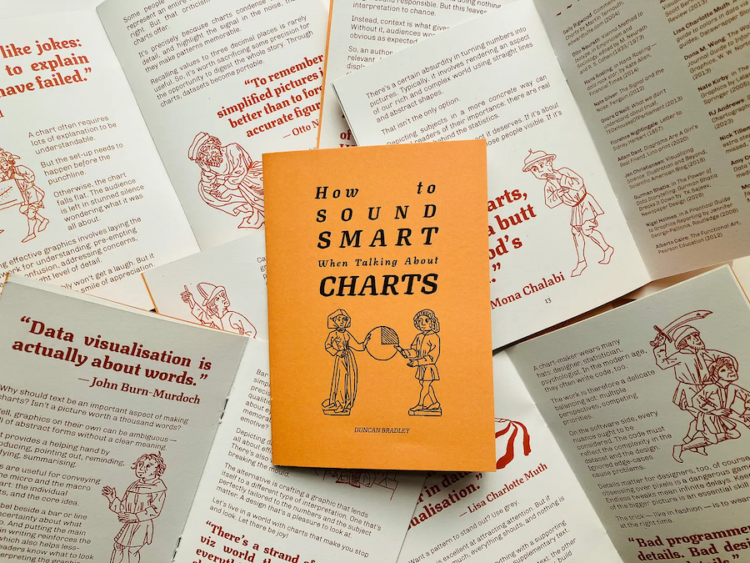
Duncan Bradley made a zine of one-liners from data visualization folks. It is called “How to Sound Smart When Talking About Charts.”
-
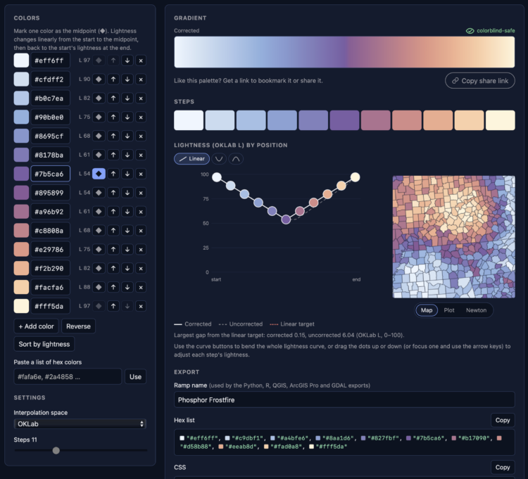
It has been a whole ten minutes since posting a color selection tool, so here is another. Phosphor by Joshua Stevens lets you enter hex colors and get a gradient with the gaps filled in between. Made with chroma.js, there are some familiar options, such as color space and color deficiency previews.
-
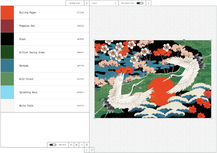
OKpalette is a tool to grab a color palette from an image. Load the image in the browser, set the number of colors, and define a region in the image and you get a collection of shades. Images stay on your computer and the color picking is in-browser. Nifty.
There will never be enough color-picking tools.
-
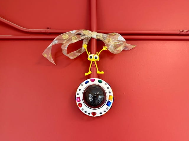
Over summer break, MIT installed over 500 AI-enabled surveillance cameras around campus. In an act of
defiancecelebration, professors started a group to bedazzle the cameras.That said, if any students, staff, or faculty still have pesky concerns about this unprecedented ratcheting-up of campus surveillance, now you know that there’s a committee to contact with complaints. Or, you could join us, the cheerful bedazzlers, by celebrating the beauty of our beholdenness to Big Brother Tech. Do you feel proud to be involved in the capitalist project of improving Ambient.ai’s services and enriching surveillance for all people, everywhere? Do you patriotically embrace the fact that Ambient.ai shares the data they collect with government and law enforcement when they receive subpoenas, without needing to ask or tell the institutions from whom they collected it? If so, there are hundreds of white plastic eyelids out there awaiting artistic adornment to enhance their visibility even as they enhance ours!
In sum, we thank our glorious administration for their brilliant technical solution to a social problem. This is how it should be, because all social and political problems definitely have a technical solution, and usually we just need to pay for something involving AI rather than have an open discussion as a community (what a waste of time that would be!).
-
Members Only
-
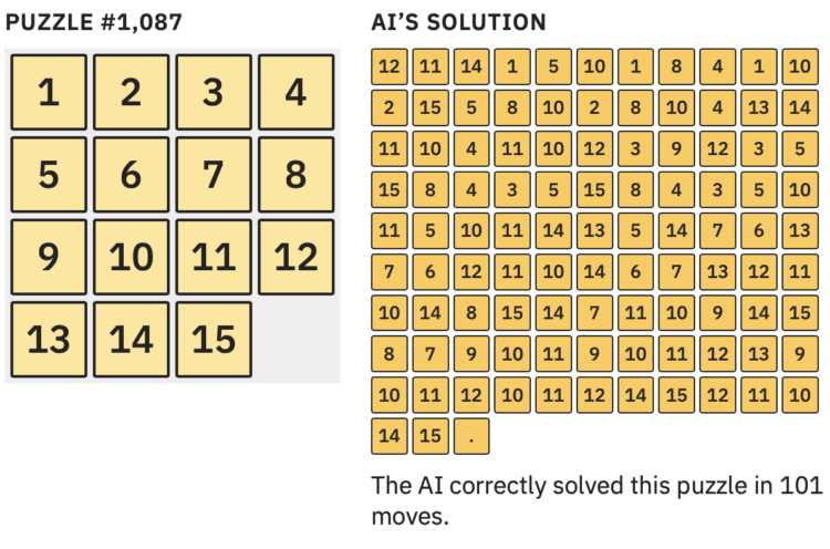
Large language models are heavily dependent on training data to determine what comes next in a series of choices. So when there is limited data for a given situation, the choices grow more uncertain. However, as Aatish Bhatia explains, this can lead to output that is “confidently wrong” instead of a highlighting random guesses.
Bhatia uses a puzzle (that you can play) to demonstrate training, processing, and the guesswork that brings you to the jagged boundary of a model’s accuracy. The boundary is surprisingly at the beginner level.
-
For NYT Opinion, Giorgia Lupi argues that the best ideas come from getting lost:
The same is true for a great recipe, a great story or even a thoughtful PowerPoint presentation. A.I. may be (mostly) accurate, but it’s not considerate. The greatest contributions to humanity — art, inventions, even products — show evidence of people who got lost in a problem and came out the other side with an idea they would not have found otherwise. That does not happen by taking a shortcut to the center. It happens in the detours.
AI promotes skipping to the answer, which is useful when the problem is well-defined and the solution is concrete. But even then, you’re missing out on the in between.
Christoph Niemann shared a similar sentiment last year with art: “Automating the creation of art is like automating life, so you can make it to the finish line faster.” Terence Tao said similar with mathematics.
Lupi, Niemann, and Tao all use generative AI tools in their process. Just not for the ideas and pathfinding.
-
Jane Wickline impersonated Anthropic CEO Dario Amodei for Saturday Night Live’s Weekend Update.
Read More -
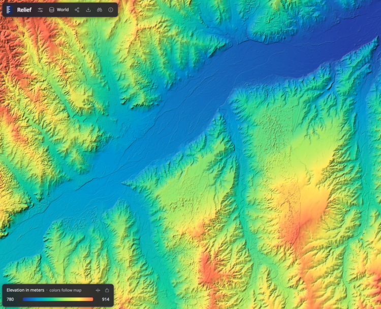
Bert Spaan, with help from Jules Schoonman, made an elevation map for the world, based on data from Actueel Hoogtebestand Nederland (AHN). The nice feature of this interactive map is that the color scale adapts dynamically by the area you are looking at.
I’m not sure about the rainbow color scheme, as there are alternatives that are contextual and easier to see, but to each his own. It’s fun to check out the details as you pan and zoom.
-
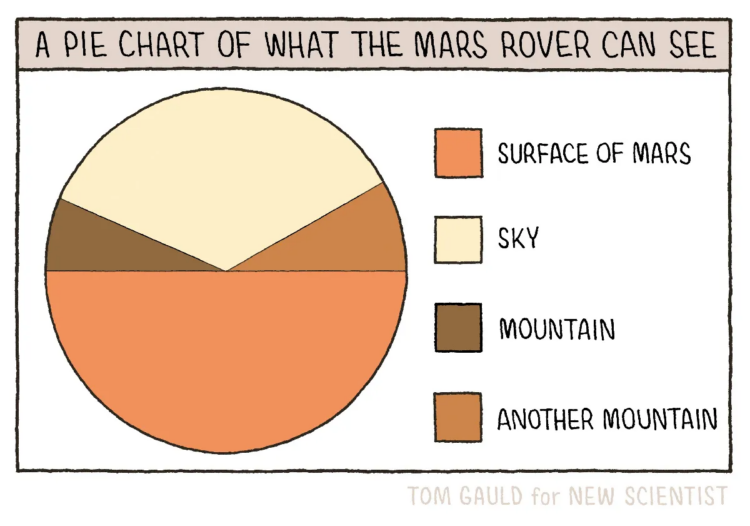
New to me, Tom Gauld, for New Scientist, made a fine pie chart to show what the Mars rover can see while on the surface of the Red Planet.
This is up there with the pie chart pyramid and eaten pie.
Visualize This: The FlowingData Guide to Design, Visualization, and Statistics (2nd Edition)