
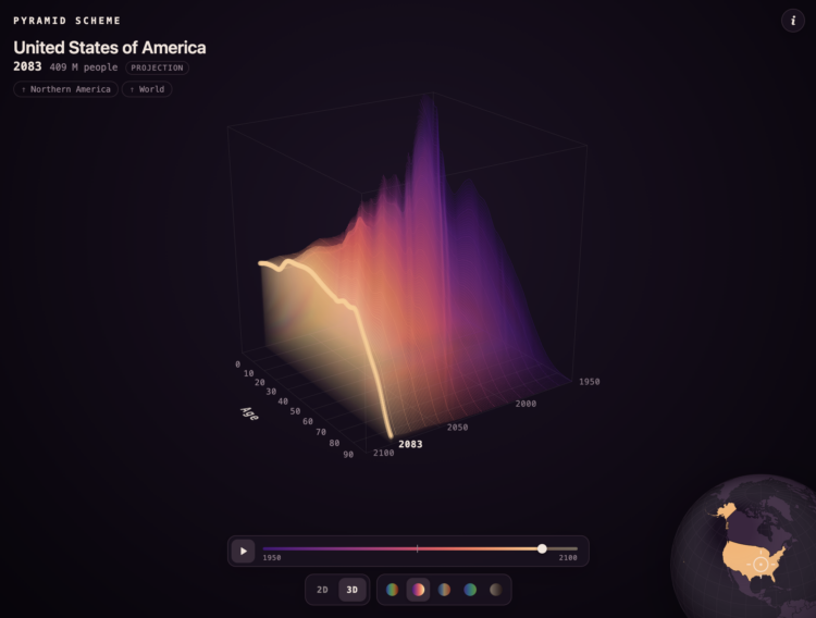
A population pyramid shows the age distribution of a population, usually with counts on the x-axis, age on the y-axis, and two sides for male and female. You’ve probably seen them before. Karim Douïeb added a third dimension in a visualization that shows total population around the world and over time.
Select a country on the globe, and you get age distributions from 1950 through a projected 2100. One year appears at a time to create a surface.
Each layer is one year, from 1950 to 2100: the share of the population at each single year of age. Young, fast-growing places bulge on the left; ageing ones flatten out and lean right. Switch to 2D to see the years overlaid.
It’s a fun riff on an old chart. Fair warning: my old computer nearly buckled under the pressure in the 3-D view.
 Visualize This: The FlowingData Guide to Design, Visualization, and Statistics (2nd Edition)
