
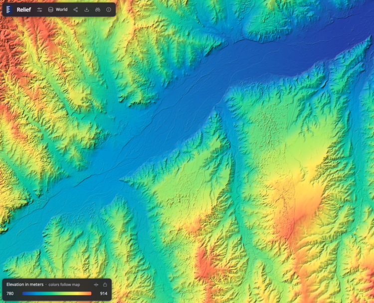
Bert Spaan, with help from Jules Schoonman, made an elevation map for the world, based on data from Actueel Hoogtebestand Nederland (AHN). The nice feature of this interactive map is that the color scale adapts dynamically by the area you are looking at.
I’m not sure about the rainbow color scheme, as there are alternatives that are contextual and easier to see, but to each his own. It’s fun to check out the details as you pan and zoom.
 Visualize This: The FlowingData Guide to Design, Visualization, and Statistics (2nd Edition)
