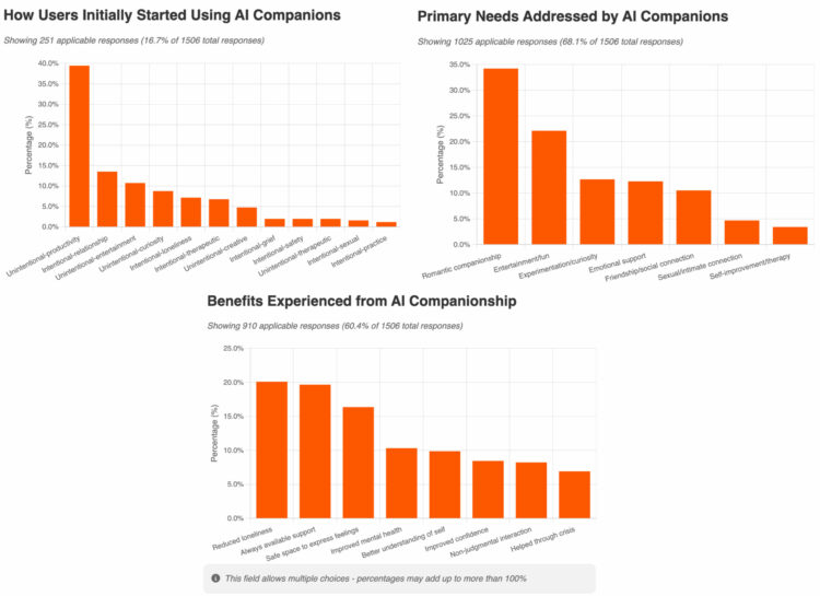
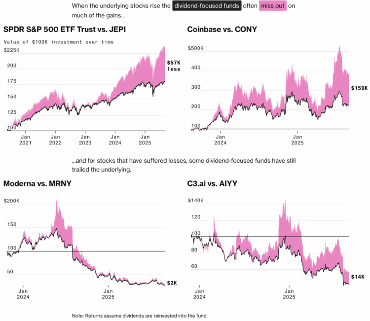
• Researchers from the MIT Media Lab studied posts to r/MyBoyfriendIsAI on Reddit. While using AI chatbots for relationship stand-ins is still niche, interest seems to be growing. On the reported benefits:

    Reported benefits centered on addressing social isolation and emotional needs. Users frequently cited reduced loneliness (12.2%) and always-available support (11.9%) as primary advantages, emphasizing the temporal accessibility that distinguishes AI from human relationships. The provision of a safe space for emotional expression (9.9%) and non-judgmental interaction (5.0%) highlighted the psychological safety users experienced. Mental health improvements were explicitly reported by 6.2% of users, with 4.2% crediting AI companions with helping them through crises. Additionally, 6.0% reported better self-understanding through AI interactions, suggesting these relationships facilitate introspection and personal growth. These findings indicate that companion AI systems serve complex psychological and social functions, often addressing unmet needs in users’ human relationships while providing unique affordances unavailable in traditional social contexts.

    I’m not sure what to make of this. If the alternative is loneliness, then maybe it’s okay as a temporary band-aid, but marrying a large language model can’t be good long-term, right?

  • From Gyana Swain for Computerworld on how “hallucinations” a.k.a. computer errors are inevitable with LLMs:

    “Unlike human intelligence, it lacks the humility to acknowledge uncertainty,” said Neil Shah, VP for research and partner at Counterpoint Technologies. “When unsure, it doesn’t defer to deeper research or human oversight; instead, it often presents estimates as facts.”

    The OpenAI research identified three mathematical factors that made hallucinations inevitable: epistemic uncertainty when information appeared rarely in training data, model limitations where tasks exceeded current architectures’ representational capacity, and computational intractability where even superintelligent systems could not solve cryptographically hard problems.

    LLMs function under data with uncertainty attached. For general purpose, in the human world, that will always be the case. This is problematic when you have chatbots spouting sure things all the time.

  • For Futurism, Maggie Harrison Dupré highlights the role of ChatGPT between divorced couples.

    “Empathy and validation are important components of any kind of mental health treatment or mental health intervention, but it can’t stop with empathy and validation,” she said. “You can’t just continually tell somebody you know who’s looking for emotional support that their way is the right way, and their worldview is the only correct worldview.”

    The “role of a good therapist,” said Lembke, “is to make people recognize their blind spots — the ways in which they’re contributing to the problem, encouraging them to see the other person’s perspective, giving them linguistic tools to de-escalate conflicts with partners and to try to find their way through conflict by using language to communicate more effectively.”

    Most of the couples interviewed had existing issues, but when one or both spouses start turning to a hype man with encyclopedic knowledge, you’re going to run into trouble.

  • Women’s clothing sizes aren’t the same across brands. The Straits Times collected measurements, printed 3-D models, and compared size charts against reality to show variation scale and maybe help you find the right size.

    Size information also varies. Some brands provide general body measurement sizing guides for all products, others list garment measurements for each item, and some offer both. Since general body measurements are easier to compare with our own, we collected body measurement charts from eight popular brands in Singapore – Uniqlo, H&M, Cotton On, Sandro, COS, Lululemon, Love & Bravery and Love, Bonito – which publish them online.

    Most sizing guides often provide bust, waist and hip measurements, but bodies are more complex than a set of numbers, and that’s part of why finding a good fit can be tricky.

    The article opens with a graphic similar to the Cox classic on dress sizes and then they go all-in on showing fit and clothes size. There is even this interactive bit that lets you adjust measurements to see where one might relate.

    As a man with a single waist measurement and an aversion to trying on clothes, I am thankful.

  • Speaking of the BLS, economist David Wessel joins Jonathan Schwabish on the PolicyViz podcast to discuss the current state of the economy and the reliability of data coming from statistical agencies. There’s a brief lesson in there about where the data comes from, its importance, and how it affects us at the community level. For example:

    And I don’t think people generally understand how much of the social programs we have are influenced by the research that people have done before. I mean, just take for an example, the Earned Income Tax Credit.

    It’s one of our biggest anti-poverty programs. It’s a bonus that we pay low-wage workers. And it has survived in part because there’s good data on what effect it this has on people’s willingness to work or the well-being of their children and stuff like that.

    So without good data to fund to that honest researchers can do, and sometimes we’ll discover some programs don’t work and we can get rid of them, we’ll be driving blind.

    Some people probably prefer that we drive blind so they can point us in the direction that they want to go. But that doesn’t seem like the right direction.

  • Erika McEntarfer, the former chief for the Bureau of Labor Statistics made her first public appearance since the abrupt firing. For Bloomberg, Molly Smith reports:

    On Aug. 1, several hours after her agency reported weak jobs growth in July and substantial downward revisions to the prior two months, McEntarfer said she was contacted by a reporter requesting comment on a social media post from President Donald Trump calling for her immediate firing.

    “To be honest, I didn’t actually believe I had been fired,” McEntarfer said in prepared remarks at an event Tuesday at her alma mater, Bard College.

    Then McEntarfer received a brief email from the White House:

    Dr. McEntarfer,

    On behalf of President Donald J. Trump, I am writing to inform you that your position as Commissioner of Labor Statistics is terminated effective immediately.

    Thank you for your service.

    No flowers or anything. Rude.

  • The Washington Post algorithmically identified circling flight paths for helicopters over Washington, D.C., between August 7 and September 7, 2025. The repeating patterns make it obvious where the helicopters have been hanging out.

  • The Bird Migration Explorer shows bird migrations that you can explore. Each color represents a type of migratory bird, such as landbirds in green and shorebirds in yellow.

    I’m into the color pencil aesthetic. Although my computer buckled in interaction mode. I believe if you are on a newer computer, you can hover over the paths to get more information about each bird type’s journey.

  • Speaking of data games, Dataguessr by David Bauer is a sorting game that follows in the steps of NYT’s Flashback quizzes. Each day is a new dataset, such as total population by country. Then you sort a selection of seven countries, one at a time. The goal is to place as many countries as you can in the right spot on the list.

    This one is pretty tricky when the estimates, from Our World in Data, are close to each other.

  • Members Only

    This week, we highlight more literal representations of data, because in the end, it’s the only thing that separates us from the artificial.

  • Chartle, by Erwan Rivault and Adnaan Jiwa, is a game to test and/or improve your knowledge about world demographics. In the spirit of Wordle, the game presents a line chart each day that shows a time series for different countries. The goal is to guess the country highlighted by a red line. You get five guesses.

  • For the Washington Post, Taylor Telford, Jaclyn Peiser, and Federica Cocco report on job numbers, listings, and unemployment, which have not looked favorable for many over the past year.

    Hardly any corner of the economy is untouched by jobs cuts and slowdown: Employment in all goods-producing industries slumped in August, with the deepest losses coming from manufacturing and mining. The service sector was racked by steep layoffs in business and professional services and IT.

    My general feeling is that data folks have seen better days, which seems to be part of a broader trend. Hoping things start ticking in the other direction.

  • For Reuters, Mariano Zafra and Sudev Kiyada highlight the true size of Africa and use the opportunity to describe map projections with handy illustrations.

    You would think by now, after many maps, illustrations, and interactive graphics, we would have a better intuition for the pros and cons of different map projections. But then the African Union wouldn’t still need to campaign for anything other than the Mercator projection.
    Read More

  • OpenAI released a study of how people are using their chatbot.

    Patterns of use can also be thought of in terms of Asking, Doing, and Expressing. About half of messages (49%) are “Asking,” a growing and highly rated category that shows people value ChatGPT most as an advisor rather than only for task completion. Doing (40% of usage, including about one third of use for work) encompasses task-oriented interactions such as drafting text, planning, or programming, where the model is enlisted to generate outputs or complete practical work. Expressing (11% of usage) captures uses that are neither asking nor doing, usually involving personal reflection, exploration, and play.

    A relatively small percentage is for programming and even less for data analysis. Writing and how-to queries take the majority, which I can only assume is mostly for LinkedIn posts.

  • This summer was supposed to be a return to pre-pandemic levels of movie-going, but that was not the case, as shown by Christine Zhang and Brooks Barnes for the New York Times.

    I’m into the movie poster as stacked bar geometry. Now do it with streamgraphs.

  • There is a growing trend among investors to put money in places with high dividends. They prefer money now over decades from now. However, the higher dividends come at a cost in the longer term. For Bloomberg, Denitsa Tsekova and Vildana Hajric, with graphics by Armand Emamdjomeh, discuss the trade-offs that make the money-now approach seem less favorable.

    The current wave of interest is new enough — and many of the followers young enough — that it has been easy to ignore how the most popular funds have often lagged basic stock indexes and threaten to eat away at long-term returns. Samuel Hartzmark, a professor of finance at Boston College, has researched the issue for more than a decade and has found that investors tend to fall for the “free dividends fallacy,” treating them and capital gains as separate. A 2015 paper of his finds that investors prone to that bias have a preference for funds that report boosted dividends even if they don’t improve overall returns.

    There is a scrolling chart at the beginning that compares returns with different strategies over time. At first, I wasn’t fond of a non-zero baseline on an area chart, but technically it’s a difference chart with a baseline that indicates the starting investment. I guess I’ll let it slide.

  • Bloomberg gained access to an email cache from Jeffrey Epstein’s Yahoo Mail inbox, spanning two decades between 2002 and 2022. They highlight the relationship between Epstein and Ghislaine Maxwell and how the timing and nature of the emails reflect a closer timeline than Maxwell has suggested.

    The cache also included a spreadsheet from Epstein’s accountant that lists gifts and payments, such as watches and massage lessons. Bloomberg charted three years of transactions with a bubble chart over time.

    It’s only a fraction of Epstein emails, as he used multiple addresses over decades, but it’s quite the digital trace. Find more on how Bloomberg verified and analyzed the cache here.

  • This sight is growing too common in the United States. The New York Times shows an aerial view of where Kirk was and where the shooter is believed to have been. A Utah locator map appears in the top left to provide geography, and a north arrow on the bottom right sets orientation.

  • In case you’re trying to navigate from one star to another in the Star Wars galaxy, there is an official detailed map of the fictional space. It is not comprehensive, as apparently the galaxy “contains billions of stars and is home to trillions of beings” but it seems like it should at least be good enough to figure out which direction to go. (via kottke)

  • Members Only

    I refreshed an old project with new data and interactions. This week we walk through the steps.