You probably remember how Target used purchase histories to predict pregnancies among their…
2014
-
Hiding a pregnancy from advertisers
-
Interactive visualization used as music video
George & Jonathan used an interactive audio visualization for their recent album George…
-
Combatting the Obsession with New Tools
Michal Migurski thinks about finding the right job for the tool rather than…
-
Learn regular expressions with RegExr
Learning regular expressions tends to involve a lot of trial and error and…
-
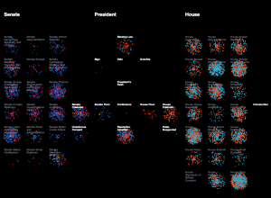
Lawmaking through the House and Senate visualized
Researchers at the University of Washington’s Center for American Politics and Public Policy…
-
Members Only
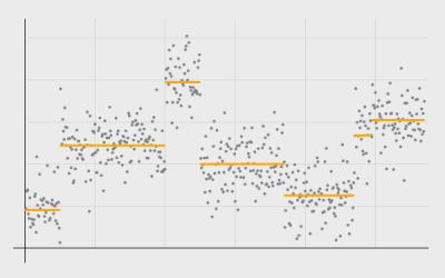
Detecting and Plotting Sequence Changes
Change detection for a time series can be tricky, but guess what, there’s an R package for that. Then show the results in a custom plot.
-
Audio visualizer made with matrix of fire
The Pyro Board is a matrix of 2,500 flames that have controllable intensity,…
-
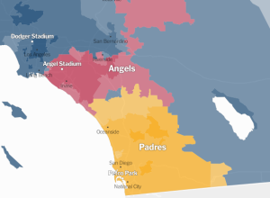
Detailed map of baseball fandom →
For the past couple of sports seasons, Facebook mapped the most liked team…
-
PourOver allows filtering of large datasets in your browser
The New York Times released PourOver, a library that lets you do database-like…
-
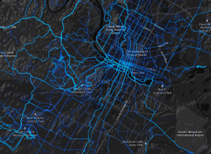
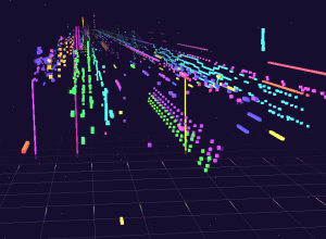
Where people bike and run, worldwide
Remember those running maps I made with limited data from RunKeeper? Strava, which…
-

The Change My Son Brought, Seen Through Personal Data
I combed through personal data that I’ve actively and passively collected since early graduate school to see how life is different now with a 6-month old.
-

The Upshot, a data-centric site from The New York Times launched
We heard a little bit about The Upshot last month. Now we get…
-
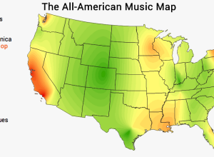
Music preference by region
Movoto mapped music preference for various genres, across the United States.
We calculated… -
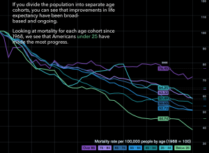
How people die in America
Matthew Klein for Bloomberg View explored mortality in America through a slidedeck of…
-
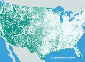
Where nobody lives
We’ve seen the map of where everyone lives. Now here’s the reverse of…
-
A principal component analysis step-by-step
Sebastian Raschka offers a step-by-step tutorial for a principal component analysis in Python.…
-
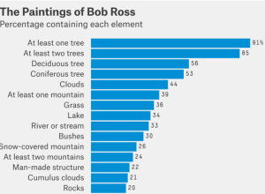
Analysis of Bob Ross paintings
As a lesson on conditional probability for himself, Walt Hickey watched 403 episodes…
-
Weird stacked area map thing
This chart-map-looking thing from Nightly News is making the rounds, and it’s not…
-
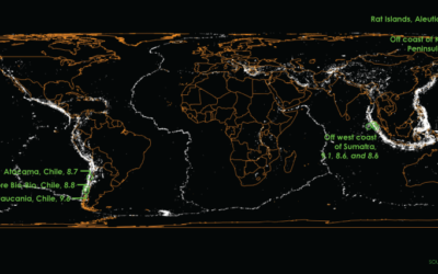
Mapping a century of earthquakes →
Earthquakes are in the news a lot lately. A quick search shows a…
-
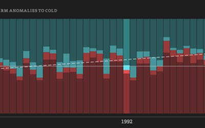
Five decades of warm and cold weather anomalies
This year’s polar vortex churned up some global warming skeptics, but as we…
Recently for Members
Second Edition
 Visualize This: The FlowingData Guide to Design, Visualization, and Statistics (2nd Edition)
 Visualize This: The FlowingData Guide to Design, Visualization, and Statistics (2nd Edition)
New tools, refined process.
Browse by Chart Type See All →


