To show the mix of votes across the country, the Washington Post used…
Maps
Intuitive to look at spatial patterns and great for distributing geographic data.
-

Mapping every voter as a grain of sand
-
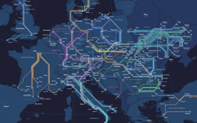
European night train map
The Night Train Map is for Europeans who want to travel at night:…
-

Jello map as states are called
The Bloomberg Graphics desk is building out a jello map as states are…
-
Electoral vote cartogram
The major news outlets all have electoral vote cartograms, but I appreciate Bloomberg’s…
-

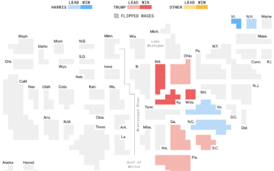
Live map of county shifts
The Washington Post has a live county map that shows the shift towards…
-

Election touchscreen really deep dive by The Onion
The Onion gained access to the most granular election data yet. Technology sure…
-
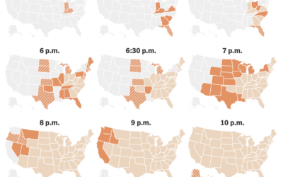
When the polls close
For The New York Times, June Kim, Leanne Abraham, and Maggie Astor provide…
-
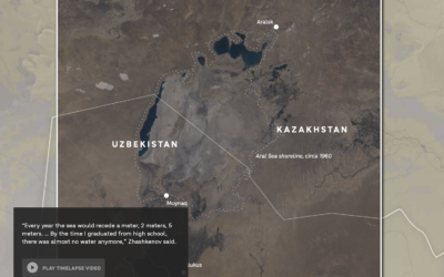
Drying of the Aral Sea and its source rivers
NPR reports on the drying Central Asia water sources. The Aral Sea has…
-

Election ad views for Democrats and Republicans
For NYT Opinion, Gus Wezerek compared ad views per household:
To figure out… -
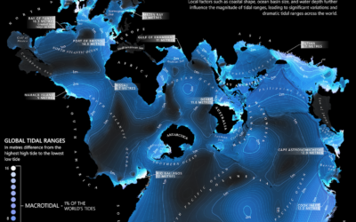
World map of tides
From Dave Taylor, this world map shows tidal ranges, from microtidal to macrotidal:…
-
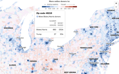
Which campaign people donate more to, by ZIP code
Using a combination of Federal Election Commission filings and voter registration, the Washington…
-

Micro-communities that might decide the election
For NYT Opinion, Patrick Ruffini, with graphics by Quoctrung Bui and Aileen Clarke,…
-

Legality of abortion pills in each state
For the Washington Post, N. Kirkpatrick and Szu Yu Chen describe the legality…
-
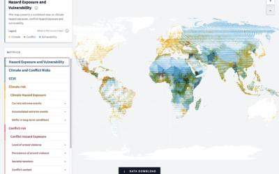
Scoring climate, conflict, and vulnerability around the world
In an effort to measure and highlight risks globally, the German Federal Foreign…
-
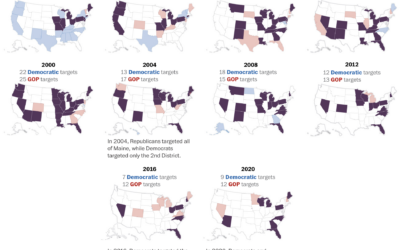
Presidential campaign target states, since 1952
We mostly hear about a handful of swing states these days, as presidential…
-
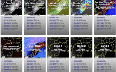
Seen from space: Hurricane Milton approaches
NOAA has a viewer for their GOES (Geostationary Operational Environmental Satellite) system, which…
-
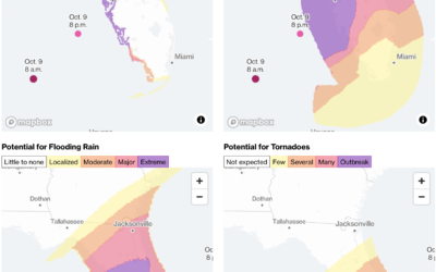
Hurricane Milton potential threats
Hurricane Milton continues towards Florida, estimated to make landfall on October 9, 2024…
-
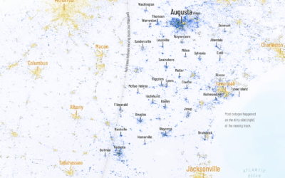
Helene power outages mapped
Chenxiao Guo, a PhD candidate in geography who goes by the name Atlas,…
Recently for Members
Second Edition
 Visualize This: The FlowingData Guide to Design, Visualization, and Statistics (2nd Edition)
 Visualize This: The FlowingData Guide to Design, Visualization, and Statistics (2nd Edition)
New tools, refined process.
Browse by Chart Type See All →


