In Kindergarten Cop, one of Arnold Schwarzenegger’s greatest works, a mother welcomes the…
Maps
Intuitive to look at spatial patterns and great for distributing geographic data.
-
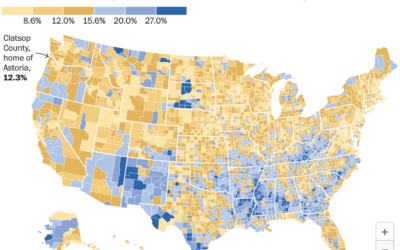
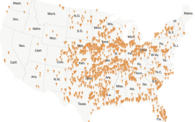
Astoria, not the single-parent capital of America
-
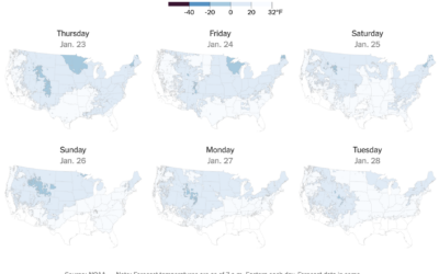
Tracker for freezing temperatures
The forecast for the contiguous United States this week is cold, and below…
-
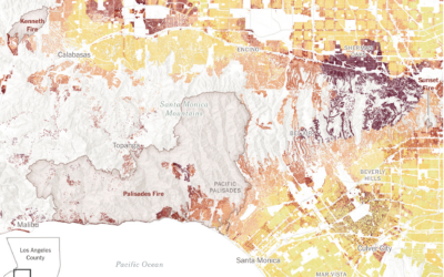
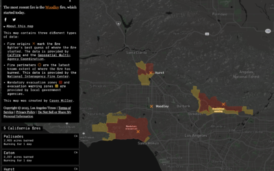
Wildfire risk for buildings in Los Angeles
As we have learned in recent weeks, even when homes seem far away…
-

Visual guide to the wildfire damage
The Guardian provides a visual guide to the damage in Los Angeles with…
-
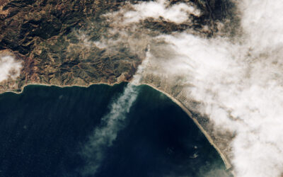
Palisades fire, seen from above
Sentinel-2 satellite of the European Space Agency captured an image of the Palisades…
-
Wind flow patterns over Los Angeles
Based on data from NOAA, the New York Times shows the direction and…
-
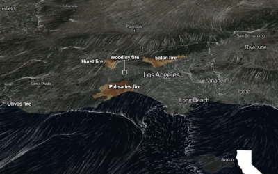
Map of active wildfires in California
This California wildfires map from Los Angeles Times shows an up-to-date status in…
-
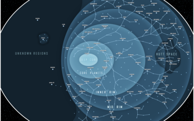
Star Wars galaxy map
I can’t vouch for the accuracy of this Star Wars map, but I…
-
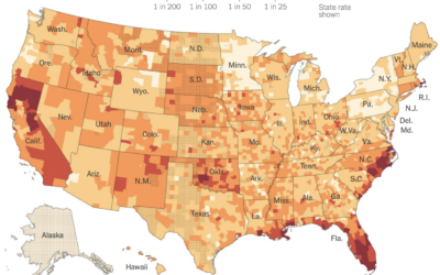
Home insurance companies dropping customers
Because of a warming planet with more wildfires and hurricanes, it’s growing more…
-
Year of tornadoes
For the New York Times, Marco Hernandez visualized all the tornadoes in 2024,…
-
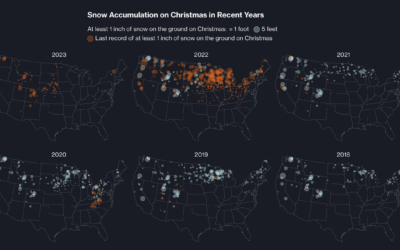
When cities last saw snow on Christmas
Christmas is coming. For some, that means snow on the ground, but as…
-
Counting the Christmas days with snow
This is a fun one by Dylan Moriarty for the Washington Post. Punch…
-
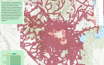
Map of walkable neighborhoods
Researchers at Sony Computer Science Laboratories in Rome estimated the time it takes…
-
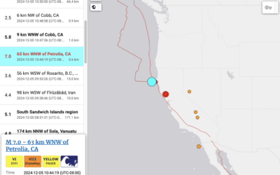
Tsunami alert, because earthquake off coast of Northern California
The folks up here received one of those loud emergency alerts a few…
-
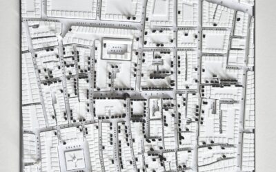
3-D print of John Snow cholera map
You know the John Snow map that highlights a cholera outbreak in London,…
-
Dot density map for election results
With what is now a common mapping method, The Economist used a dot…
-

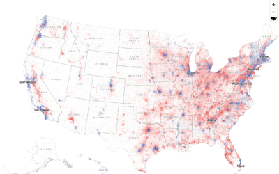
Mapping every voter as a grain of sand
To show the mix of votes across the country, the Washington Post used…
-
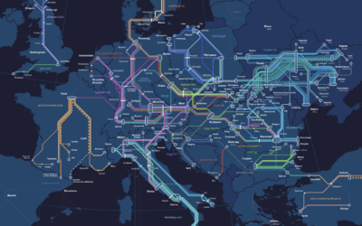
European night train map
The Night Train Map is for Europeans who want to travel at night:…
Recently for Members
Second Edition
 Visualize This: The FlowingData Guide to Design, Visualization, and Statistics (2nd Edition)
 Visualize This: The FlowingData Guide to Design, Visualization, and Statistics (2nd Edition)
New tools, refined process.
Browse by Chart Type See All →


