Based on estimates from CarbonCounter by the MIT Trancik Lab, electric vehicles typically…
Infographics
Telling stories with data and graphics.
-
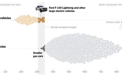
Emissions from big electric trucks vs. gas vehicles
-

Greatest unexpected NBA performance
This is a fun one from Russell Samora and Reshad Malekzai for The…
-
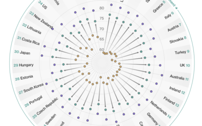
Countries with the longest healthy retirements
Bloomberg compared retirement years in the context of life expectancy and healthy life…
-
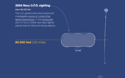
Spy balloons and UFOs
For The New York Times, Eleanor Lutz illustrated things in the sky, because…
-
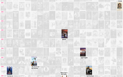
Tour of romantic comedies through the decades
In celebration of the most romantic day of the year that is sometimes…
-
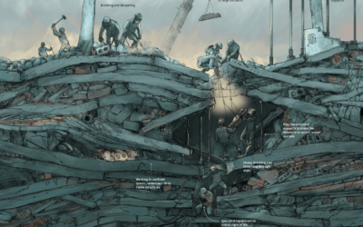
Search and rescue after an earthquake, illustrated
After a big earthquake, such as the 7.8 that hit Turkey and Syria,…
-
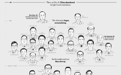
Inferring the scale of China’s Covid spike through obituaries
China reported 80,000 Covid deaths since lifting restrictions in early December 2022. But…
-

Pele greatness illustrated
For South China Morning Post, Victor Sanjinez and Dennis Wong used a visual…
-
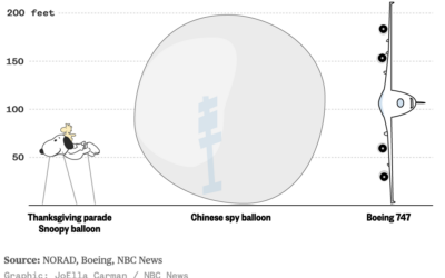
Scale of the Chinese balloon
I wasn’t paying much attention to the Chinese balloon that the U.S. shot…
-

Objects in space headed towards Earth
NASA’s Center for Near Earth Object Studies tracks large objects, such as asteroids,…
-
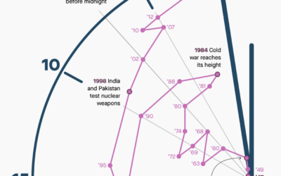
Shifts in time on the Doomsday Clock
The Doomsday Clock is a metaphorical clock that symbolizes a catastrophic end to…
-
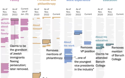
Evolution of George Santos’ biography
George Santos, currently a U.S. representative, seems to lie about his background and…
-
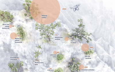
Battling plant extinction
In a story about how scientists are using drones to fight plant extinction,…
-

Differing approaches between SpaceX and NASA to sending rockets to the moon
For The Washington Post, William Neff, Aaron Steckelberg, and Christian Davenport show the…
-
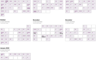
Mass shootings calendar
A shooting in Monterey Park, California on Lunar New Year’s eve left 11…
-
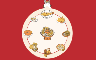
Meaning of the Chinese New Year meal
In celebration of Chinese New Year, Julia Janicki, Daisy Chung, and Joyce Chou…
-

Inevitably super rich
Sometimes it feels like a foregone conclusion that most of the money ends…
-
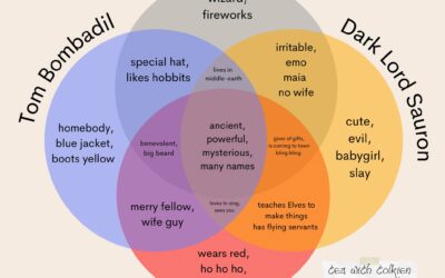
Lord of the Rings and Santa Venn diagram
Kaitlyn Facista, of Tea with Tolkien, made a four-part Venn diagram that shows…
Recently for Members
Second Edition
 Visualize This: The FlowingData Guide to Design, Visualization, and Statistics (2nd Edition)
 Visualize This: The FlowingData Guide to Design, Visualization, and Statistics (2nd Edition)
New tools, refined process.
Browse by Chart Type See All →


