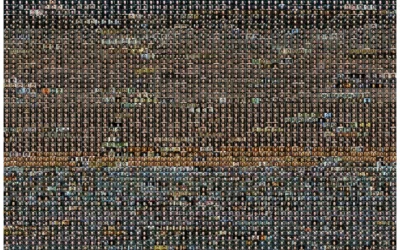
Over four years, Barbara Iweins cataloged every object she owns — all 12,795…
Self-surveillance
Insight to change our own behaviors.
-
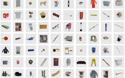
Photographer catalogs every owned object
-
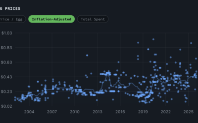
Egg receipts for 25 years
John Rush has been scanning his receipts for 25 years. He did something…
-

A word with a videoclip every day
Riffing on the photo-everyday genre, Henry Brown recorded a clip of himself saying…
-
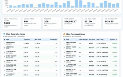
Personal dashboard for Costco spending
Reddit user ViKoToMo scraped Costco receipts from his account and made a dashboard…
-

xkcd: Fifteen Years
Randall Munroe, of xkcd, illustrated fifteen years with his wife. It is very…
-
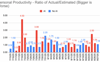
Lack of promised coding productivity with AI tools
A big promise behind AI coding tools is that they will make you…
-
Second brain deleted
Joan Westenberg had been writing notes and storing bits for seven years in…
-
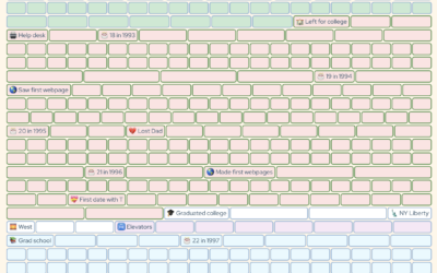
A life documented in weeks
Coming up on 50 years old, Gina Trapani mapped out her life so…
-
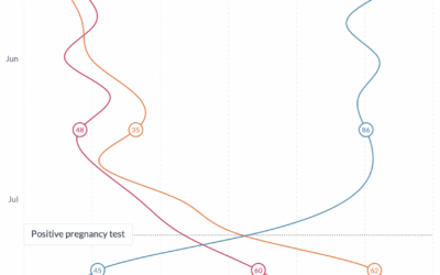
Stress of growing a human, charted
Maggie Appleton is growing a human, and as you might expect, pregnancy can…
-
Quarter century of self-portraits
Noah Kalina has been taking a picture of himself every day for 25…
-
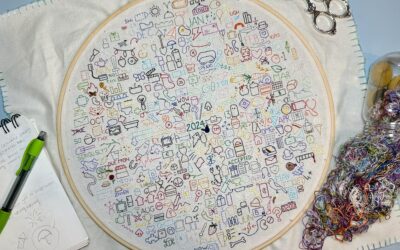
Embroidered daily journaling
Those who keep a daily journal typically record with words, photos, and video.…
-

Daily post-it notes as stop motion diary
Daren Jannace animated 30 frames per day for one year and then put…
-

Tracking time wasted scrolling
Ben Grosser made a personal mini-site that indicates whether or not he’s on…
-
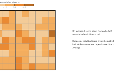
Analysis of Sudoku play patterns
Vivek Rao likes to play Sudoku, enough that he collected data on his…
-
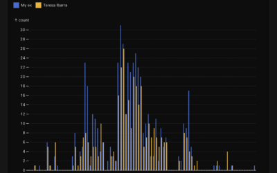
Analysis of text messages with an ex-boyfriend
Teresa Ibarra used Facebook Messenger to text with her now ex-boyfriend almost a…
-

Data-driven running journal
K.K. Rebecca Lai ran her first marathon. She recounts her training and the…
-
Data portrait of a life with long Covid
Giorgia Lupi, known for using data visualization to connect real life and numbers,…
-
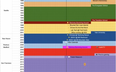
Life timeline in a spreadsheet
Coming up on 40 years old, Emmett Shear, perhaps best known as a…
-
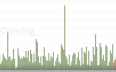
Stripper earnings tracked over four years
Reddit user nerdydancing tracked her earnings on each shift for four years. If…
-
Tracking hundreds of pizza slices
For eight years, Liam Quigley tracked every slice of pizza he ate in…
Recently for Members
Second Edition
 Visualize This: The FlowingData Guide to Design, Visualization, and Statistics (2nd Edition)
 Visualize This: The FlowingData Guide to Design, Visualization, and Statistics (2nd Edition)
New tools, refined process.
Browse by Chart Type See All →


