Soloham is a yo-yo style where there are two yo-yos off the string.…
Infographics
Telling stories with data and graphics.
-

Breaking competitive yo-yo
-

Optimized onion cutting for the most uniform dice
For the Pudding, Andrew Aquino, with Russell Samora and Jan Diehm, supplies interactive…
-

Alcohol is amazing and also terrible
We know that alcohol is not the healthiest beverage to consume. When abused,…
-
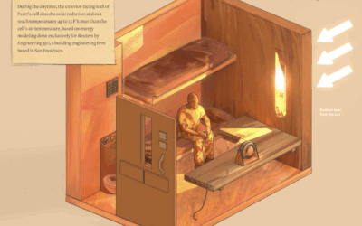
Heat in prison cells
Reuters highlights unsafe temperatures in prison cells, using building models, public records, and…
-
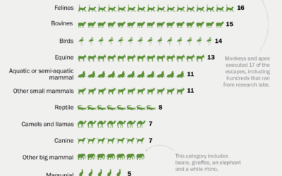
History of zoo animal escapes
It’s exciting when an animal escapes from the zoo. A monkey breaks free…
-

Taxicab Geometry
For the New York Times, Steven Strogatz explains taxicab geometry through the lens…
-
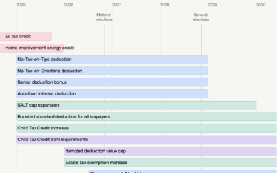
Policy timelines for the Big Beautiful Bill
The OBBB introduced policies for taxes, government assistance, student loans, and immigration, with…
-
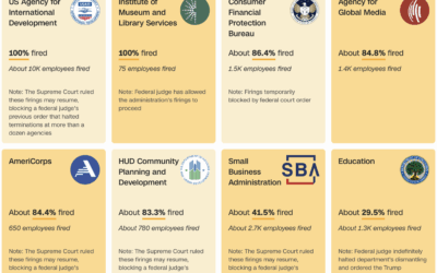
Tracking federal layoffs
For the ongoing federal layoffs and reversals, a tracker from CNN:
CNN is… -
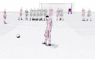
Free kick strategy by Lionel Messi and Cristiano Ronaldo
In soccer, a free kick can be awarded after an opponent commits a…
-
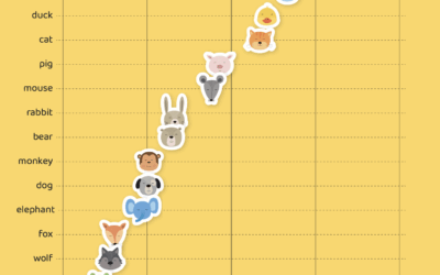
Gender of animal characters in children’s books
Read enough children’s books with anthropomorphic animals and you might notice that some…
-
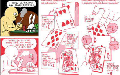
Illustrated guide to card counting and investing
The internet continues to feed my compulsion to click on anything that mentions…
-
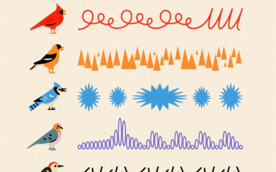
Backyard bird sounds
Alex Tomlinson illustrated backyard sounds of a cardinal, goldfinch, blue jay, mourning dove,…
-
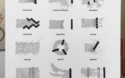
Types of deadlines illustrated from beginning to end
Some deadlines come unexpected, some come staggered, and some come on a fixed…
-
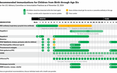
Table for science-backed vaccine recommendations
Jen Christiansen and Meghan Bartels provide a quick reference for Scientific American:
Kennedy’s… -
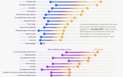
When a woman’s cycle stops
Many women lose their period while still of reproductive age. For Reuters, Daisy…
-
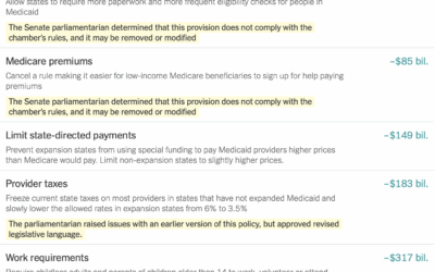
Cost and savings for each item in the GOP bill
NYT’s the Upshot has a running list of the items in the bill…
-
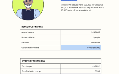
Effects of the Republican bill on your taxes
The tax bill, that seems to be on its way to passing, will…
-
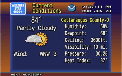
Weather displayed as vintage 1990s forecast on the Weather Channel
There was a time when you tuned in to the Weather Channel on…
Recently for Members
Second Edition
 Visualize This: The FlowingData Guide to Design, Visualization, and Statistics (2nd Edition)
 Visualize This: The FlowingData Guide to Design, Visualization, and Statistics (2nd Edition)
New tools, refined process.
Browse by Chart Type See All →


