Last week marked 18 years of FlowingData.
That seems like a long time,…
Site News
Listen up, ladies and gentlemen.
-
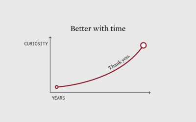
FlowingData enters adulthood at 18
-
Information is Beautiful Awards shortlist and community vote
The Information is Beautiful Awards, brought back with the help of the Data…
-

2024.
I haven’t reviewed a year on FlowingData since 2020, which seems like a…
-

Gifting FlowingData
Is there a better gift than the gift of knowledge? No, there is…
-

See you on Bluesky
Bluesky, maybe best pitched as a place for those who liked Twitter and…
-
FlowingData Membership Update
Short version: Members make FlowingData possible, and it’s a lot easier to support…
-
Q&A with Amstat News
Fourteen years ago, I did a short Q&A with Amstat News, where apparently…
-
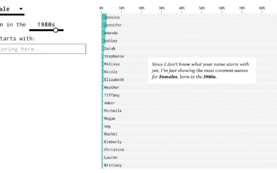
Name guessing probabilities on talk radio
A few years ago, I made an interactive chart that guesses your name…
-

FlowingData at 17
Last week marked 17 years running this small corner of the internet on…
-
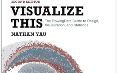
A New FlowingData Book, Second Edition
I wrote a book! It’s the second edition of Visualize This. It focuses…
-
Where else to find FlowingData
You can always count on the site for updates on visualization, data, and…
-
On the Data Journalism Podcast
I had a short chat with Alberto Cairo and Simon Rogers on The…
-
New Visualization in R Course, and Other Updates
I have two course-related updates on FlowingData. First, there’s a new course on…
-
15 years
This past weekend marked 15 years since I first posted on FlowingData. What…
-
FlowingData Shop is Open
I’m opening the print shop for a few days. Get your order in,…
-
Still Flowing at 14
FlowingData turned 14 years old last week. Is that old? It feels old.…
-
Introducing a New Course on Mapping Geographic Data in R, with ggplot2
I’m happy to announce a new course on mapping geographic data in R,…
-
2020.
Last year, in 2019, my main goals for FlowingData and work were to…
-
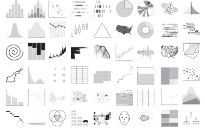
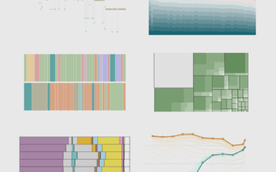
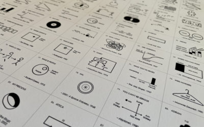
Cataloging All the Charts
If you’re interested in a specific chart type, you can now browse FlowingData…
-

2019.
My main goal for FD this year was to make charts.
I hoped…
Recently for Members
Second Edition
 Visualize This: The FlowingData Guide to Design, Visualization, and Statistics (2nd Edition)
 Visualize This: The FlowingData Guide to Design, Visualization, and Statistics (2nd Edition)
New tools, refined process.
Browse by Chart Type See All →


