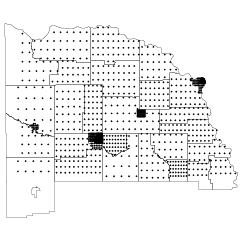
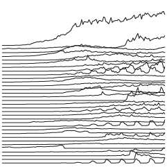
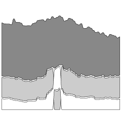
Using their peaks and valleys metaphor, The Washington Post shows the shift in…
Washington Post
-

Maps of racial population change
-

Where America is expanding in developed areas
Zach Levitt and Jess Eng for The Washington Post mapped newly developed areas…
-
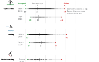
Age range of Olympians
Bonnie Berkowitz and Artur Galocha go with the strip plot to show the…
-

New Olympic sports explained
The 2020 Summer Olympics are here, so ’tis the season for experimental visual…
-

Case rates adjusted for the unvaccinated
Covid-19 cases in the United States were down, but they’re moving up again,…
-
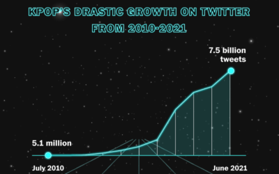
Rise of K-pop
K-pop seems to be inescapable these days, which really confuses me. Marian Liu,…
-
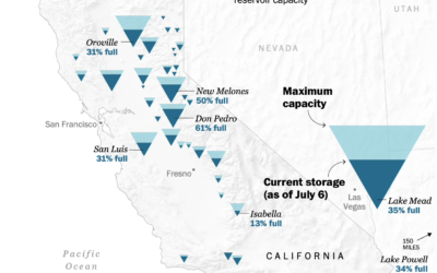
Map of drying reservoirs in the west
To show water levels in California’s drying reservoirs, The Washington Post used upside…
-

How big tech grew by acquiring small tech
Big tech — Amazon, Apple, Google, and Facebook — got big and then…
-
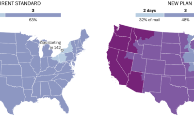
Mail slowdown
Postmaster General Louis DeJoy proposed new standards for first-class mail, which would slow…
-
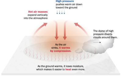
Welcome to heat dome
It’s hot here in the western United States, and it’s only mid-June. From…
-

Scale of a mouse plague
There’s a mouse plague in Australia right now. The words alone don’t express…
-
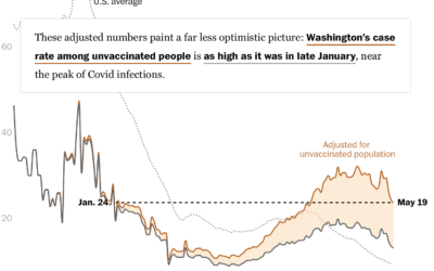
Hospitalization rates for the unvaccinated
Overall, Covid-19 cases and hospitalizations are down in the United States, but much…
-
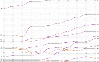
Historical shifts in where people live
The places in the United States with the highest populations weren’t always like…
-

Stephen Curry’s record-setting month for shooting threes
Steph Curry has been on a tear as of late. In April he…
-
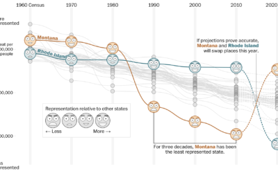
How your state might lose or gain representation with Census count
Harry Stevens, Tara Bahrampour and Ted Mellnik for The Washington Post look at…
-

Visualizing risk of Johnson & Johnson vaccine side effect
As the Johnson & Johnson vaccine pauses in the United States, Philip Bump…
-

Domestic terrorism incidents plotted over time
The Washington Post (paywall) shows the recent rise in domestic terrorism incidents in…
-

How the Ever Given got unstuck
The Washington Post illustrated how the Ever Given got stuck and was freed…
-

Pandemic timeline as animated dot density map
As a lead-in and backdrop to a timeline of the past year by…
-
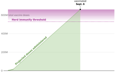
How quickly the U.S. is vaccinating vs. how long it’ll take to get back to “normal”
Vaccines provide light at the end of the tunnel, but when we finally…
Recently for Members
Second Edition
 Visualize This: The FlowingData Guide to Design, Visualization, and Statistics (2nd Edition)
 Visualize This: The FlowingData Guide to Design, Visualization, and Statistics (2nd Edition)
New tools, refined process.
Browse by Chart Type See All →