One of the best and most direct ways to visualize data with clarity is to ask questions and answer with data.
questions
-
Members Only
Questions to visual answers
-
Members Only
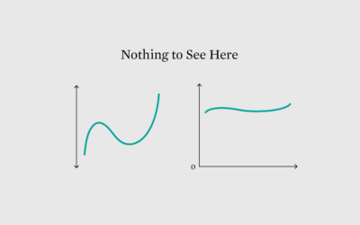
Does the data make sense?
When you analyze data, there are times when a trend, pattern, or outlier jumps out and smacks you in the face. Or, you might calculate results that seem surprising. Maybe they’re real, but maybe not.
-
Members Only
Baseline Point of View
The point of visualization is to understand what data is about, which is rarely just about the numbers and almost always about what the data represents.
-
Members Only
Endless Visual Options
In a sea of endless possibilities, narrow down your visualization options by looking for what works instead of looking for what is the best.
-
Members Only
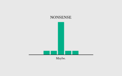
Nonsense
If you just always assume the data is right, you’ll probably finish with garbage.
-
Members Only
Three Questions to Visualize Data Effectively
Answer the questions. Produce more focused and useful charts.
-
Members Only
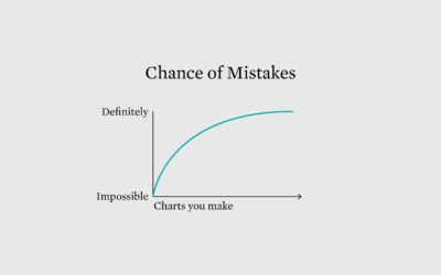
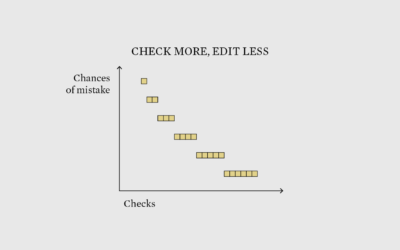
Double Check Twice, Edit Once – The Process 182
Be skeptical of your data in the beginning to save time in the end.
-
Seeing just the questions
As a way to explore how people use questions in their writing, a…
-
Statistician answers stat questions
For Wired, stat professor Jeffrey Rosenthal answered statistics questions from Twitter, such as…
-
Members Only
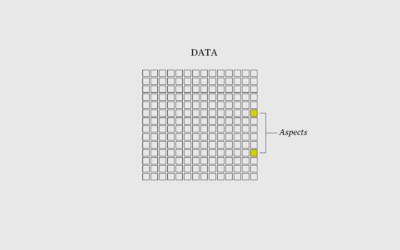
I Want to Visualize Aspects of the Data – The Process 162
When you visualize aspects of the data instead of just the data itself, what you show grows more obvious.
-
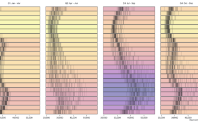
Visualizing time-based data
Zan Armstrong, Ian Johnson, and Mike Freeman for Observable wrote a guide on…
-
Members Only
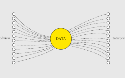
Different Points of View from the Same Data – The Process 153
It still amazes me that you can give multiple people the same dataset and the results can vary depending on questions, goals, and audience.
-
Members Only
Analyzing Data, General to More Specific – The Process 148
Use basic statistical methods to move you towards fancier things.
-
Members Only
The Process 103 – End Result
Last month I did a short Q&A about FD and my workflow. I thought I’d elaborate on one of my answers.
-
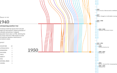
Evolution of Census questions
On the surface, the decennial census seems straightforward. Count everyone in the country…
-
Members Only
Technical Know-How is Part One (The Process #70)
There’s a technical component of visualization that leans towards code, data formatting, and clicking the right buttons in the right order. Then there’s everything else that makes okay charts into something much better.
-
Members Only
Less Time With Methods, More Time With Questions and Context (The Process #61)
Data represents the real world, and visualization represents data. But sometimes data and the real world disagree with each other.
-
Ask the Question, Visualize the Answer
Let’s work through a practical example to see how asking and answering questions helps guide you towards more focused data graphics.
-
Link
What Questions to Ask When Creating Charts →
Make charts with a purpose.
-
Visualization choice depends on the data and the questions
When you don’t know where to start with a dataset, try to come…







 Visualize This: The FlowingData Guide to Design, Visualization, and Statistics (2nd Edition)


