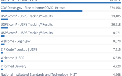
With the announcement of free Covid-19 tests through the United States Postal Service,…
government
-
Analytics for U.S. government websites
-
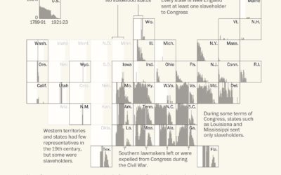
Congressmen who enslaved people
Using old Census records and documents, Julie Zauzmer Weil, Adrian Blanco and Leo…
-
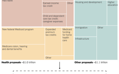
All the provisions in the Build Back Better bill
For NYT’s The Upshot, Alicia Parlapiano and Quoctrung Bui outlined all of the…
-
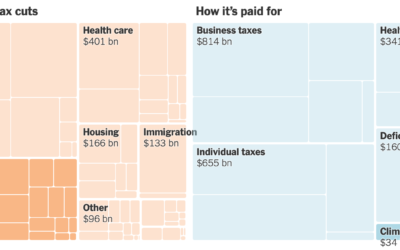
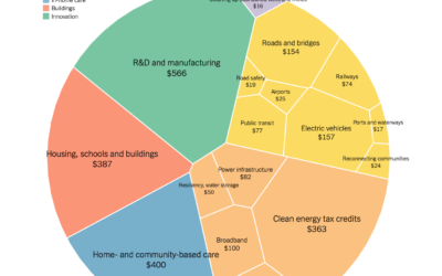
Spending bill in a treemap box
Margot Sanger-Katz and Alicia Parlapiano for NYT’s The Upshot broke down a Democrat…
-
Comparison of Biden infrastructure plan and updated bipartisan plan
Aatish Bhatia and Quoctrung Bui for NYT’s The Upshot made the comparison using…
-
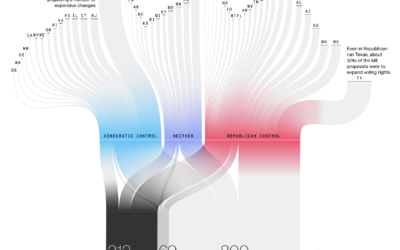
Passing restrictive voting bills
Bloomberg used a Sankey diagram to show the path of over a thousand…
-
Money-in-politics nonprofits merge their datasets
Center for Responsive Politics and National Institute on Money in Politics are merging…
-
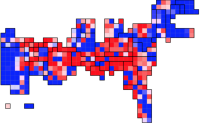
Population Growth and Seats Gained
The Census Bureau released state population counts for 2020. Here’s how each state gained and lost population and seats.
-
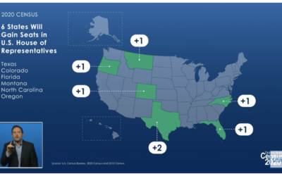
States that gained and lost seats with 2020 count
The Census Bureau announced their state population totals, so we can see who…
-
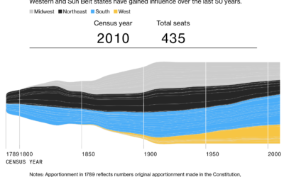
Seat apportionment over time
The 2020 Census count at the state level is set for release this…
-
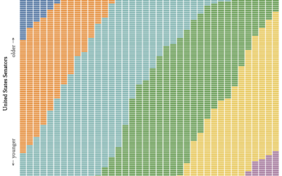
Age generations in the U.S. Senate, over time
With this straightforward unit chart, wcd.fyi shows which generation each Senate member belonged…
-
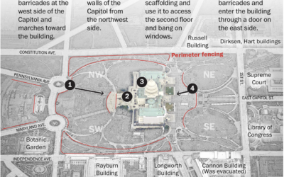
How the mob broke into the U.S. Capitol
The Washington Post pieced together video footage from multiple sources for a timeline…
-
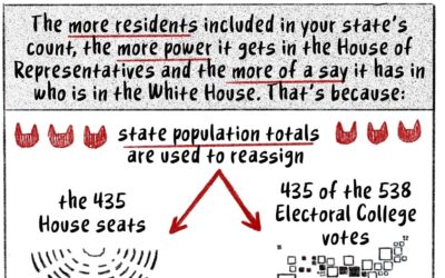
How the Census translates to power, a cat comic
State population dictates the number of seats in the House of Representatives, so…
-
U.S. military buys location data from apps
Joseph Cox, reporting for Motherboard:
Some app developers Motherboard spoke to were not… -
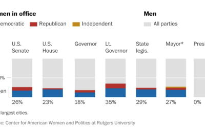
How long before there is gender equality in the U.S. House and Senate
For The Washington Post, Sergio Peçanha asks, “What will it take to achieve…
-
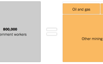
Government shutdown, other industries provided for scale
As the shutdown continues, 800,000 government workers wait for something to happen. The…
-
High school statistics class builds election prediction model
High school seniors, in the Political Statistics class at Montgomery Blair High School…
-
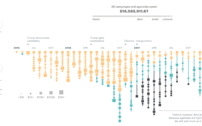
$16.1m in political and taxpayer spending at Trump properties
ProPublica compiled spending data from a wide range of sources to calculate the…
-
Amazon Rekognition for government surveillance
Amazon’s Rekognition is a video analysis system that promises to identify individuals in…
-
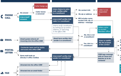
Where constituent input ends up
When you have input to send Congress, you have a number of communication…



 Visualize This: The FlowingData Guide to Design, Visualization, and Statistics (2nd Edition)


