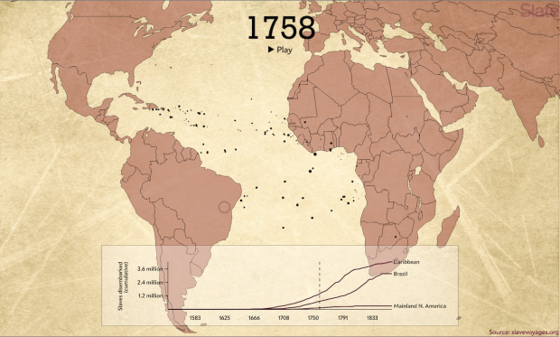
The Trans-Atlantic Slave Trade Database provides records for thousands of voyages between the 16th and 19th centuries. Andrew Kahn for Slate mapped about 20,000 of them. Portugal and Spain are most prevalent at first, and then other countries come into the picture.
From Jamelle Bouie:
In the 1700s, however, Spanish transport diminishes and is replaced (and exceeded) by British, French, Dutch, and—by the end of the century—American activity. This hundred years—from approximately 1725 to 1825—is also the high-water mark of the slave trade, as Europeans send more than 7.2 million people to forced labor, disease, and death in the New World. For a time during this period, British transport even exceeds Portugal’s.
Be sure to pause the animation and click the dots, which represent a ships and the number of people enslaved on board. You get more details on where the ship is from, where it’s headed, and how many trips it took.
 Visualize This: The FlowingData Guide to Design, Visualization, and Statistics (2nd Edition)