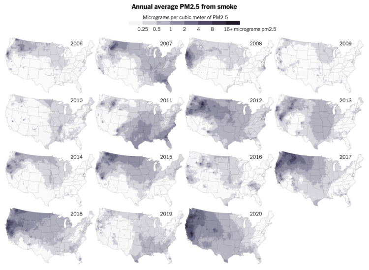
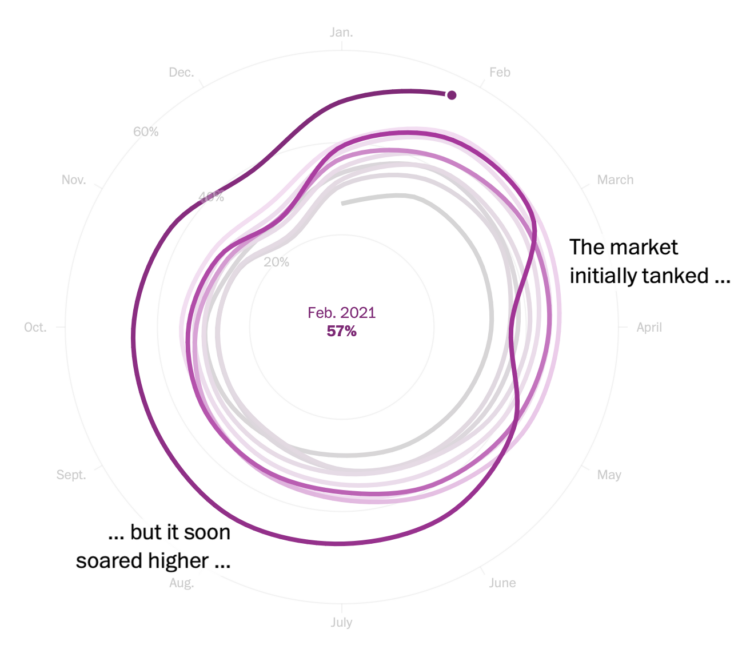
NYT’s The Upshot analyzed spin rate on pitches before and after enforcing a ban on sticky substances that provide more grip on the ball. The rule has been in place for decades but wasn’t enforced. However, there’s been more strikeouts than usual, which makes for less exciting sports, which means less people watch, and therefore, the league makes less money. So, bye sticky stuff.
-
K-pop seems to be inescapable these days, which really confuses me. Marian Liu, Youjin Shin, and Shelly Tan for The Washington Post explored the rise in popularity and what makes the songs and artists so popular.
-
James O’Donoghue made this straightforward animation that shows how long it takes for a ball to drop one kilometer on different planets:
It might be surprising to see large planets have a pull comparable to smaller ones at the surface, for example Uranus pulls the ball down slower than at Earth! Why? Because the low average density of Uranus puts the surface far away from the majority of the mass. Similarly, Mars is nearly twice the mass of Mercury, but you can see the surface gravity is actually the same… this indicates that Mercury is much denser than Mars.
Okay, sure, but what’s heavier on Mars: a ton of feathers or a ton of bricks? [via kottke]
-
Members Only
-
When countries gained access to vaccines, there was an initial burst of vaccinations, but the rate leveled off in most places. Then a variant arrives, and an incentive or another push for vaccinations increases the rate. Reuters looks at the rate shift in different countries, in the context of trying to reach 70 percent vaccinated.
The set of difference charts took me a minute to digest, but then seems straightforward after. More orange fill means much slower than the initial vaccination rate, and more green fill means a bigger bump after a lull.
-
Noah Kalina has been taking a picture of himself every day since January 11, 2000. He posted time-lapse videos in 2007, 2012, and 2020. Last year was the 20th of the project.
Usually Kalina’s videos are a straight up time-lapse using every photo. But in this collaboration with Michael Notter, 7,777 Days shows a smoother passage of time. Notter used machine learning to align the face pictures, and then each frame shows a 60-day average, which focuses on an aging face instead of everything else in the background.
-
To show water levels in California’s drying reservoirs, The Washington Post used upside down triangles to represent each reservoir.
I like the idea to use an encoding that kind of looks like a reservoir, but my brain can’t help but read the fill level through height instead of area. Maybe the tradeoff isn’t worth it in this case? Compare this against a circle representation from 2015.
-
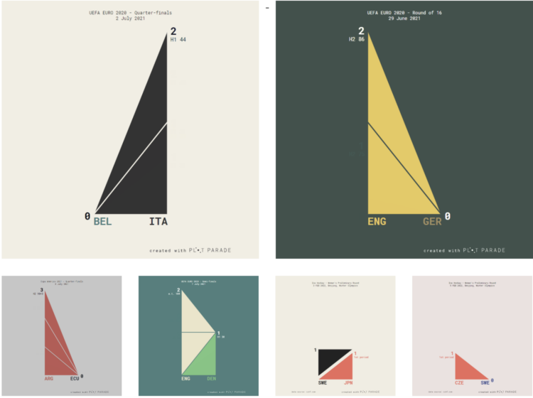
Krisztina Szűcs used sets of animated triangles to show how each match played out. The triangles in the middle move up as each team scores, and the triangles on the side represent penalty kicks.
-
Paul Ford has been learning R to better understand the field of Statistics. The takeaway:
Deep in its heart, R is a language for making charts, and it’s genuinely fun to go into its world: statistics, natural sciences, sociology — all right there. You will never pry me away from JavaScript or Python or the whole web stack of standards and protocols. They’re how I make things happen in the world, and they are very much my home base, but using more specific tools is always an education. It’s like suddenly discovering a new wing of a big museum, and realizing that there’s still a lot to learn.
I would say it’s a language for analyzing data, and charts are a big part of the process. But the big sell of R has always been its specificity. The need to understand data drives its design and growth, which means you avoid starting a lot of analyses from scratch.
-
Members Only
-
ProPublica continues their analysis of an anonymous dump of tax records, this time with a focus on billionaire sports owners:
The law favors people who are rich because they own things over people who are rich because they make a high income from their work. Wages — the main source of income for most people, including athletes — are taxed at the highest rates of all, topping out at a marginal rate of 37% plus an extra 3.8% for Medicare. The government takes a smaller share of money made from, say, selling a stock. That’s not to mention the benefits available to people who own businesses, such as the paper losses created by buying a sports team.
Easy solution: We’ll all just buy a sports team.
-
Big tech — Amazon, Apple, Google, and Facebook — got big and then got bigger with acquisitions of smaller companies. The Washington Post took a comprehensive look at all of the acquisitions over the years:
They all followed a similar pattern. First, they became dominant in their original business, like e-commerce for Amazon and search for Google. Then they grew tentacles, making acquisitions in new sectors to add revenue streams and outflank competitors.
-
Ian Leahy and Yaryna Serkez for NYT Opinion look at income and tree canopy in major cities. Higher median income neighborhoods correlate with cleaner and cooler air.
-
PhotoChrome is a straightforward tool that lets you use search terms to find a color palette. Just enter a query, and it spits out a color scheme of hex values based on matching images.
It’s like Picular from a few years ago but more focused with a copy-paste.
-
Aerial photographer Lior Patel followed a herd of sheep in Yokneam. The results are much more interesting than they sound. [via Colossal]
See also the work of Tim Whittaker who produced a video of the same ilk. I don’t know what to call it, but I am very much into this genre of calming sheep herding videos for the mind. Although I feel like herding up close must be kind of stressful.
-
Members Only
-
NPR put together a set of stories, videos, and interactives about bringing more joy into your life, which of course is always welcome.
-
FlowingData turned 14 years old last week. Is that old? It feels old.
The site started as a sandbox to put class projects. Flat HTML files. JPEG files. Google Maps placemarkers. Flash. Vanilla JavaScript.
As I studied from across the country, it turned into a place to share links with classmates. Did you see that project on Infosthetics? How did Stamen make that map? These big infographics are getting out of hand.
I experimented. To my surprise and delight, stuff I made traversed the internets. Some work landed in my friends’ and family’s feeds through roundabout routes. I learned how visualization could reach a lot of people and get them excited about data.
Statistics grew out of that required course that everyone hated. Data also grew. It got big. It became a science.
Visualization grew with the data. Once thought of as just an analytical tool (to some), it developed into a medium for communication, expression, and storytelling.
As I finished my PhD, thinking about my future, I took job interviews. I think as the interviewee, you’re supposed to try to impress the interviewers. But deep down, it was the other way around for me. I was looking for someone to convince me that what they had to offer was better than running FlowingData. I didn’t find anything.
So, here I am, 6,243 posts, guides, tutorials, links, and projects later. Sheesh.
Thanks for reading. Thank you to supporting members. If you’re not a member yet and you’d like to keep the data flowing, I’d of course appreciate your support. I’m hoping to do this for many more years.
-
Introduction to Modern Statistics by Mine Cetinkaya-Rundel and Johanna Hardin is a free-to-download book:
Introduction to Modern Statistics is a re-imagining of a previous title, Introduction to Statistics with Randomization and Simulation book. The new book puts a heavy emphasis on exploratory data analysis (specifically exploring multivariate relationships using visualization, summarization, and descriptive models) and provides a thorough discussion of simulation-based inference using randomization and bootstrapping, followed by a presentation of the related Central Limit Theorem based approaches.
Read it in the browser or buy a print version. A good deal either way.
-
It’s been hot in the Pacific Northwest the past few days. NYT’s The Upshot plotted the temperatures against previous max temperatures since 1979. Hot.