Everywhere you go, gas prices show up on big boards, like a proxy measurement for the times.
When gas prices are really low, something exciting is happening, and in my case when I was a teen, your mom tells you to drive across town to line up for the gas that dropped under a dollar. When gas prices are high, like they are these days, something must be up.
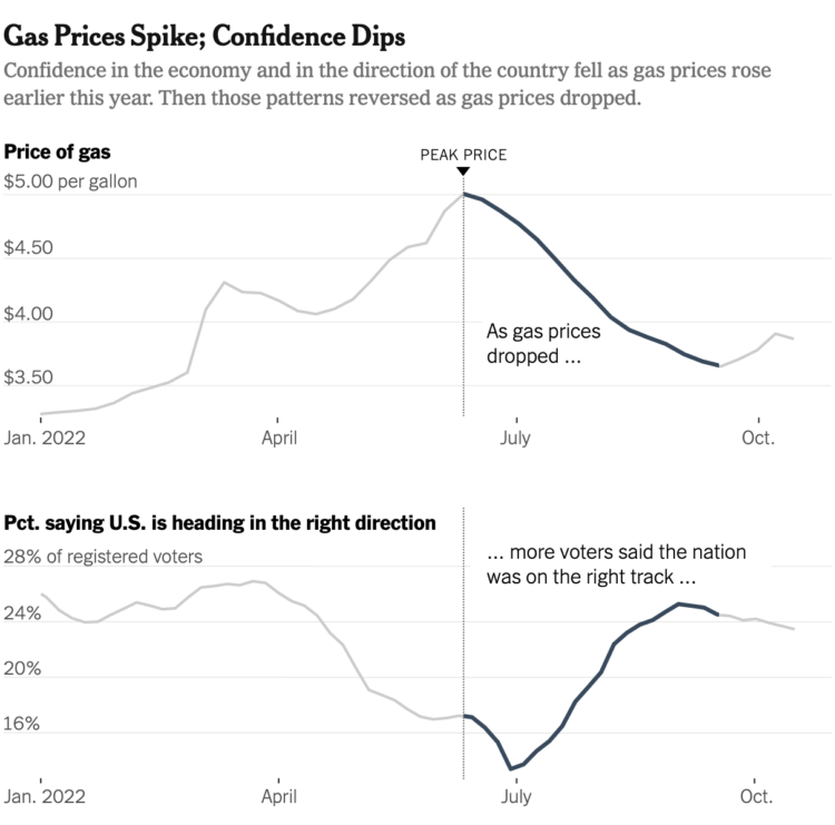
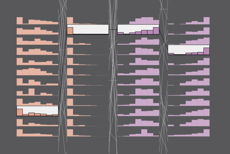
Emily Badger and Eve Washington, for The New York Times, show how that feeling is tied to consumer confidence:
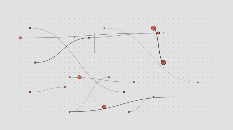
Philip Bump, for The Washington Post, used connected scatterplots to show how gas prices are tied to approval ratings:
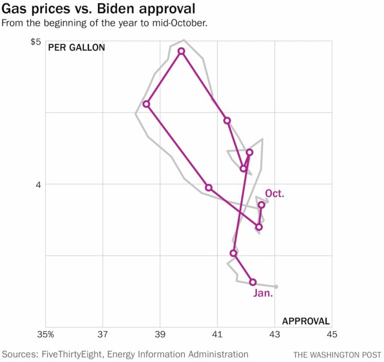
Connected scatterplots are kind of a tricky read at first, but approval and prices appear to go up and down at the same time. Look at it like a regular scatterplot at first, and then follow the line for time.
I wonder what this looks like if you go farther back. I’m guessing similar. What else is tied to gas prices? Will electricity prices eventually replace the familiar gas prices? Is it reasonable to tie our hopes and dreams to the price of a gallon? Is sentiment flipped for people who primarily ride bikes to get places? I have so many questions.
 Visualize This: The FlowingData Guide to Design, Visualization, and Statistics (2nd Edition)


