FlowingData readers who have been around for a while will remember I made a map early this year that showed the growth of Target stores across America. It starts with the first one in 1962 and then goes from there. It was a follow-up to the Walmart map, which I shared the code and data for.
Read More
-
-
I think ever since visualization got started, people have been asking this question.
Some… okay, many describe it as purely an analytical tool. Others (i.e. me) are a little more liberal with their use of the term while the rest are somewhere in between. Some insist that the stuff we see on information aesthetics belong in an entirely different category and that that stuff isn’t visualization at all.
As art, science, design, statistics, computer science, etc. start to melt together, the line between what is and isn’t visualization grows more blurry.
What do you think? Is visualization only analytical? Can visualization be art? Are the infographics that frequent the front page of Digg visualization or are they just pretty pictures? Can visualization be just a pretty picture? Leave your thoughts in the comments below.
-
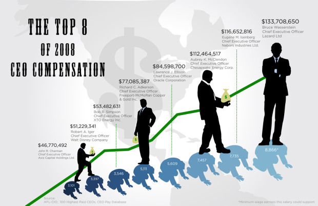
GOOD magazine’s most recent transparency contest asked designers to focus their powers on showing CEO compensation in the United States.
Read More -
Jer Thorp, an artist and educator from Vancouver, Canada, visualizes when people “wake up” on Twitter, or when they say good morning, rather. Here it is in its 3-d globe glory. It’s called GoodMorning!. Notice the wave.
Okay, wait, I know you’re already furiously leaving or thinking about a comment on how absolutely useless and non-concrete this is – and Jer is the first to admit that – but there is obviously something to learn here.
However, it’s late, and I’m tired, so I’ll leave that up to you. But off the top of my head, I’m thinking a more relevant subject like disease or need of help and color coding that’s more meaningful. Your turn.
[via datavisualization.ch]
-
Haha, Jason Segel is hilarious. In this episode of How I Met Your Mother Segel’s character Marshall has an interesting addiction that I think many FD readers can relate to.
Read More -
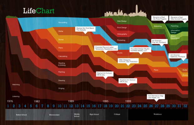
Ben Fogarty uses a stacked area chart to represent his life. To us outsiders looking in it’s not much more than that, but to Ben I am sure there is a story in every peak and valley. It’s like a “this is your life” slideshow in data.
This is the drive behind your.flowingdata. I don’t think YFD is even remotely close yet to developing a personal narrative, but it’s something to shoot for. I can imagine a lifetime of data replaying and watching it unfold like a movie. That’d be amazing. Then again, I might also end up like Jerry in Act 3 of Episode 88 in This American Life. Fingers crossed for the former.
[via WeLoveDataVis]
-
-
Like I said, data graphics that aren’t interactive are a lot better in print. I’m not sure what it is exactly but it’s the same feeling as holding a physical book in your hands over reading an electronic version online. It just feels right.
Read More -
The Stock Ticker Orbital Comparison, or STOC for short, from media student James Grant, uses a planetary system metaphor to display activity with the S&P 500. Each circle represents a stock and they orbit a planet-like (or sun?) thing in the middle.
Read More -
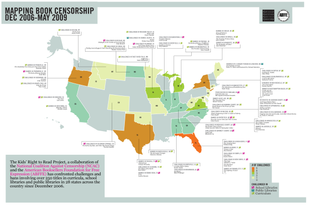
What would a freshman English class be without Of MIce and Men? No George or Lenny? People in Appomattox, Virginia seem to think it’d be just fine.
The National Coalition Against Censorship, however, has different ideas on the matter. For the past couple of years the NCAC has confronted such bans and challenges from libraries and curricula. Above is a map of bans and challenges over from December 2006 to May 2009. Other notable works include The Golden Compass, Girl, Interrupted, and yes, brace yourself, The Adventures of Huckleberry Finn.
[via DataViz]
-
While on the topic of job loss and unemployment, here’s an animated map from Tip Strategies that shows job gains and losses over time.
Red means loss and green means gain, and as you can see above, there isn’t much green (read that zero) on the map. The larger the circle is, the greater the number of net loss or gain compared to that of the numbers of the year before in the respective metropolitan statistical area.
Read More -
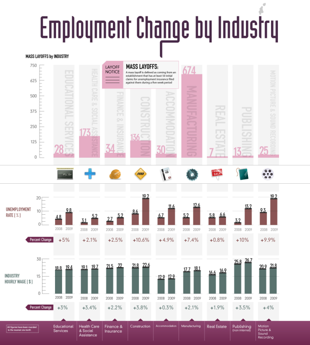
As we all know, many people, much more than usual, have lost their jobs during the past few years. Visual Economics shows layoffs and changes in unemployment rate by industry over the last year. Obviously manufacturing has taken a huge hit along with construction.
Health care and social assistance has also seen a lot of mass layoffs, but that one I don’t really get. I’ve been under the impression there was high demand in that area. Maybe I’m wrong.
In any case, one thing that I would definitely change in this graphic, other than getting rid of those out-of-place icons, is the percent change for unemployment rate.
I thought to myself, “That bar for 2009 is over twice as tall and it’s not even a 100% increase?” Then I realized they were percentage differences, which isn’t as important the actual percent change of the rates.
Then we’d see that the unemployment rate for manufacturing has increased over 140% and for construction it’s gone up over 120%.
[Thanks, Jason]
-
Again, FlowingData had another record month in terms of growth, and I cannot thank you all enough for reading and spreading the word. Thank you. We’ve got quite the community developing here.
In case you missed them, here are the top posts from the past month ranked by a combination of page views, comments, and trackbacks:
- What Visualization Tool/Software Should You Use? – Getting Started
- Highs and Lows of Being a Young Man
- 3 In-depth Views of Flight Delays and Cancellations
- The World of Seinfeld
- Vintage Infographics From the 1930s
- Ben Fry Visualizes the Evolution of Darwin’s Ideas
- Stimulus Funding Map is ‘Slick as Hell’
- 10 More Infographic Reasons Why You Should Go Green
- A Road Map to Success
- TV Size Over the Past 8 Years
From the Forums
And here’s some of the good stuff that’s been going on in the forums in no particular order.
- Visualization/analysis tool for SSH/FTP stats – ina.Cirdaye wants your thoughts on his new tool.
- Notable Political Visualizations – How has visualization played a role in making (important) decisions in government?
- Visual Metrics to Inform: Petro-Wealth Importance
- Animated Bar Chart for CO2 emissions
- Sunlight Foundation is Looking for Data Viz Specialist – Work towards a more transparent government.
Do you have a data visualization question or have something data-ish to share? The FlowingData forums is the best place to do it, especially since I (really) suck with email now.
-
Like I mentioned before, Robert Kosara (EagerEyes), Andrew Vande Moere (information aesthetics) and I are hosting a workshop on Visualization on the Web this Sunday (October 11) in Atlantic City as a part of VisWeek. So if you’re in town, make sure you drop by.
We accepted topic proposals earlier last month, and those will be presented (briefly) during the workshop, and we’ll break into discussion from there. It’ll be an informal event.
Even if you didn’t submit a paper or register, you’re welcome to join. Everyone is welcome. There should be plenty of space.
Find more information on EagerEyes. Remember, this Sunday, October 11, 2:00-5:30.
-
Twitter shows trending topics, but it’s for the entire user base. You can only see what everyone on Twitter is talking about at any given time. Trendsmap, on the other hand, shows trending topics by location. See what’s trending in any part of the world in real-time.
Read More -
It’s exciting times for data heads. The launch of Data.gov back in May got things jump started; San Francisco recently announced DataSF; and now New York is getting in on the party with the announcement of their own Data Mine (live at 1pm EST today) and the NYC Big Apps competition.
Read More -
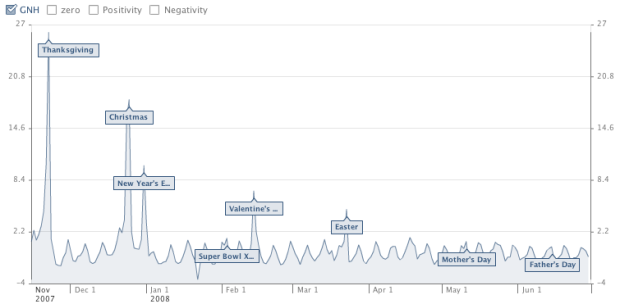
As we all know, Facebook lets people update their friends with status updates, and with millions of users, that’s a lot of data. Look at the aggregated data over time, and you could see some interesting trends.
The Facebook Data Team recently measured happiness in the United States based on these updates with a metric they call United States Gross National Happiness.
Read More -
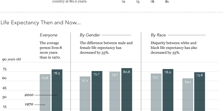
In this graphic, we take a look at some data on how long you’re expected to live.
Live in Hawaii and you just might live a little longer.
Hawaii has an average life expectancy at birth of 80.0 years. It’s 72.0 years in Washington, D.C., the lowest life expectancy in the country.
-
Let’s say you have this idea for a visualization or application, or you’re…
-
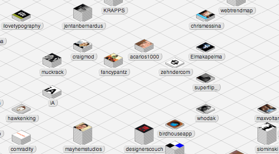
This is a guest post by Craig Mod, who collaborated with Information Architects, to develop Web Trend Map. The site, which is largely inspired by iA’s previous work, lets you curate links with sources you trust. This post describes the multiple iterations and decisions made during the design process.
Design and development of webtrendmap.com v1.0 took three months. During this period the interaction design and interface underwent countless subtle permutations. What we ended up with is almost totally unlike what we started with. There was a lot of painful iteration. A lot of gut wrenching backtracking.
Let’s drill down and take a look at how we iterated on one key webtrendmap.com visual element: the Stack. Read More

Recently for Members
Second Edition
 Visualize This: The FlowingData Guide to Design, Visualization, and Statistics (2nd Edition)
 Visualize This: The FlowingData Guide to Design, Visualization, and Statistics (2nd Edition)
New tools, refined process.
Browse by Chart Type See All →


