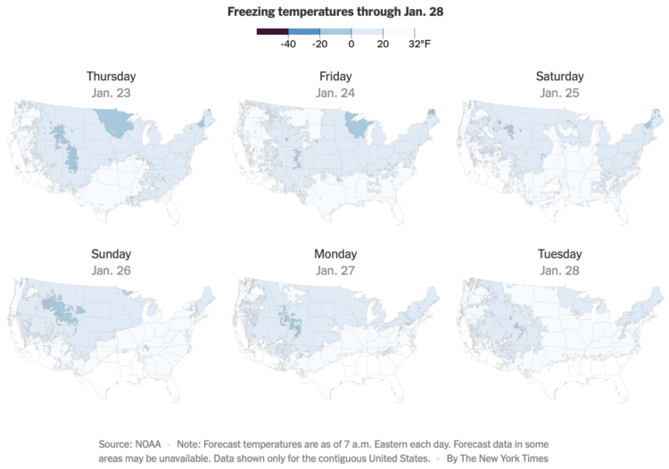
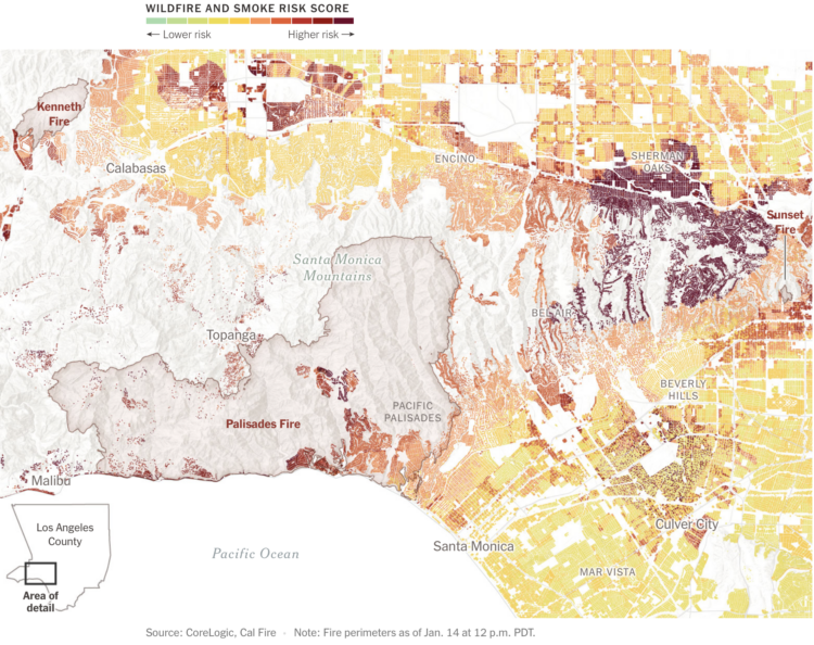
• Lorenzo Franceschi reporting for Motherboard on a leaked Facebook document:

    “We do not have an adequate level of control and explainability over how our systems use data, and thus we can’t confidently make controlled policy changes or external commitments such as ‘we will not use X data for Y purpose.’ And yet, this is exactly what regulators expect us to do, increasing our risk of mistakes and misrepresentation,” the document read. (Motherboard retyped the document from scratch to protect a source.)

    In other words, even Facebook’s own engineers admit that they are struggling to make sense and keep track of where user data goes once it’s inside Facebook’s systems, according to the document. This problem inside Facebook is known as “data lineage.”

    Hm.

  • Crystal Owens, Max Fan, John Hart, and Gareth McKinley from Massachusetts Institute of Technology published their research on how the cream in an Oreo behaves when you split the sandwich, in Physics of Fluids:

    Using a laboratory rheometer, we measure failure mechanics of the eponymous Oreo’s “creme” and probe the influence of rotation rate, amount of creme, and flavor on the stress–strain curve and postmortem creme distribution. The results typically show adhesive failure, in which nearly all (95%) creme remains on one wafer after failure, and we ascribe this to the production process, as we confirm that the creme-heavy side is uniformly oriented within most of the boxes of Oreos. However, cookies in boxes stored under potentially adverse conditions (higher temperature and humidity) show cohesive failure resulting in the creme dividing between wafer halves after failure. Failure mechanics further classify the creme texture as “mushy.” Finally, we introduce and validate the design of an open-source, three-dimensionally printed Oreometer powered by rubber bands and coins for encouraging higher precision home studies to contribute new discoveries to this incipient field of study.

    This is very important. [via kottke]

  • COMING MAY 29

    Pre-order on Amazon
  • Members Only
    Tutorials  / 

    Represent individual counts with grouped units to make data feel less abstract.

  • Sam Biddle and Jack Poulson for The Intercept reporting on Anomaly Six, a company that knows a lot about a lot of people through phone data:

    To fully impress upon its audience the immense power of this software, Anomaly Six did what few in the world can claim to do: spied on American spies. “I like making fun of our own people,” Clark began. Pulling up a Google Maps-like satellite view, the sales rep showed the NSA’s headquarters in Fort Meade, Maryland, and the CIA’s headquarters in Langley, Virginia. With virtual boundary boxes drawn around both, a technique known as geofencing, A6’s software revealed an incredible intelligence bounty: 183 dots representing phones that had visited both agencies potentially belonging to American intelligence personnel, with hundreds of lines streaking outward revealing their movements, ready to track throughout the world. “So, if I’m a foreign intel officer, that’s 183 start points for me now,” Clark noted.

  • Sentiment analysis can be fun to apply to varying types of text, but the usefulness of the results, as Rachael Tatman argues, is often low:

    [T]he places where it makes sense for a data scientist or NLP practitioner working in industry to use sentiment analysis are vanishingly rare. First, because it doesn’t work very well and second, because even when it does work it’s usually measuring the wrong thing.

    Although it’s not a lost cause. Tatman also points out areas where sentiment analysis could provide value.

  • Rent increased pretty much everywhere in the United States over the past year. Abha Bhattarai, Chris Alcantara and Andrew Van Dam for The Washington Post use a map to show you by how much:

    Nationally, rents rose a record 11.3 percent last year, according to real estate research firm CoStar Group. That fast pace of growth remained elevated in the first months of 2022, as many parts of the country continued to notch double-digit jumps in rent prices.

  • In high school, we spend most of our days with friends and immediate family. But then we get jobs, start a family, retire, and there’s a shift in who we spend our days with.

  • Members Only

    When you choose visual encodings before considering the data, you usually end up with results that aren’t so great.

  • Given our love for making our opinions heard for products on the internets, Earth Reviews from Neal Agarwal extends the possibilities. Review acne, frogs, snow, gum, doors, and many other important things that require important reviews. Make your voice heard.

  • Zack Capozzi, for USA Lacrosse Magazine, explains how he calculates win probabilities pre-game and during games. On interpretation, which could easily apply to other sports and all forecasts:

    But interpretation here matters quite a bit. And this is frustrating for some people, but that 61 percent should be interpreted as: “if these teams played 100 times, we would expect Marquette to win 61 of those games.” It definitely does not mean that the model is 61 percent confident that Marquette will win.

    This is a bit odd, but this also means that if the Win Probability model gives Team A a 90% chance to beat Team B, there is nothing wrong with the model if Team B ends up winning the game. The issue would arise if, out of 100 90-percent win probability games, the favorite wasn’t winning around 90 of those games. When the model says 90 percent, you want it to mean 90 percent.

    I wonder how many people incorrectly interpret the probability as “61 percent confident”. I bet a lot.

    I do know that ever since the Golden State Warriors lost to the Cleveland Cavaliers in the 2016 NBA Finals — while holding a 90-something percent win projection by FiveThirtyEight — I stopped paying attention to win probability. But learning more about the calculation made it more interesting.

  • Atomic Agents is a JavaScript library by Graham McNeill that can help simulate the interactions between people, places, and things in a two-dimensional space. Saving for later. Looks fun.

  • In 2021, a large portion of North America was stuck in a heat dome with record temperatures and wildfires. Gordon Logie for Sparkgeo mapped the before-and-after of major wildfires during the year in British Columbia, with a combination of satellite imagery, photos, and scrolling. Logie then shows major floods, which are not necessarily caused by the fires, but are highly correlated.

    The transitions for the before-and-after show the wildfire damage clearly. Instead of using the slider format, which kind of uncovers an after image, you can see the already boundaried regions change right away.

  • For TechCrunch, Zack Whittaker reporting:

    In its second ruling on Monday, the Ninth Circuit reaffirmed its original decision and found that scraping data that is publicly accessible on the internet is not a violation of the Computer Fraud and Abuse Act, or CFAA, which governs what constitutes computer hacking under U.S. law.

    The Ninth Circuit’s decision is a major win for archivists, academics, researchers and journalists who use tools to mass collect, or scrape, information that is publicly accessible on the internet. Without a ruling in place, long-running projects to archive websites no longer online and using publicly accessible data for academic and research studies have been left in legal limbo.

  • With the NBA playoffs underway, it can be fun to watch the best players and wonder what it’d be like if they were drafted earlier by a different team. For The Pudding, Russell Goldenberg did this for every player and team since the 1989 draft. Goldenberg made a similar thing five years ago, but this time there’s a team component.

    Another five years from now, in Redraft 3.0, I fully expect “better” picks to also consider the team makeup at the time of drafting. For example, check if it makes sense to draft another power forward when you already have a star power forward and need a shooting guard.

  • Taxes are due today in the U.S. (yay). Geoffrey A. Fowler for The Washington Post on the part when tax services like TurboTax and H&R Block ask for your data:

    What he discovered is a little-discussed evolution of the tax-prep software industry from mere processors of returns to profiteers of personal data. It’s the Facebook-ization of personal finance.

    America’s most-popular online tax-prep service, Intuit’s TurboTax, also asks you to grant it additional access to the data in your return to “enrich your financial profile, communicate with you about Intuit’s services, and provide insights to you and others.”

    […]

    The good news is because of Internal Revenue Service rules, this is one data request you can actually say “no” to while continuing to do your taxes online. And if you already clicked “agree” and now have changed your mind, there are some steps you can take, too.

  • NZ Herald talked to Ross Ihaka, one of the creators of R:

    Today, R is depended upon around the world by analysts, data scientists and big-name companies like Facebook, Google, Amazon and the New York Times, and it’s garnered Ihaka something of a rockstar status in the field of data science and statistics.

    He’s received numerous accolades over the years recognising his work, such as the Royal Society of New Zealand’s prestigious Pickering Medal, and the Statistical Computing and Graphics Award from the American Statistical Association.

    Asked how many people use R on a daily basis, Ihaka’s guess is in the millions but he’s not quite sure how many million.

    One of the reasons R is called R is because Ihaka and co-creator Robert Gentleman both had first names that started with the letter.

  • Earlier this year, an underwater volcano erupted in the island nation of Tonga. For The New York Times, Aatish Bhatia and Henry Fountain describe the effects of the eruption, which lasted for days and rippled around the world. The introductory animated globe shows the pressure wave and gives a good sense of the eruption’s massive scale.

  • Members Only

    Manually editing charts is worthwhile, despite the possibility of manually making mistakes.

  • Based on leaked IRS data for the 400 wealthiest Americans, ProPublica provides a comparison of their incomes and the lower taxes they paid between 2013 and 2018. This might be best piece so far from ProPublica’s IRS series in terms of understanding the big picture from their dataset. Also, that “smaller than a pixel” note for the average American is doing some heavy lifting.

  • Here’s the breakdown by age for American adults in 2021, based on data from the Pew Research Center.