After I produced a map that shows the growth of Walmart, there were tons of comments that were along the lines of, “I would love to see this for insert company here.” I was happy to see the enthusiasm, but the hard part is getting the data for all store locations and opening dates.
Read More
-
-
The first Visualize This for poverty rate in America was a very good start to something I hope to continue here on FlowingData. There were a lot of good entries and plenty of interesting discussion on what worked and what didn’t. Some used existing tools while others went custom; some used a combination of both. There were entries that went for emotion and others that were built for pattern-finding. My pick for best is Luca Masud‘s take on things with D.C. as focal point.
Read More -
Some of the best stuff comes out of student projects. During the Screendesign workshop in Fachhochschule Potsdam last summer, students were asked to collect, analyze, and visualize personal data. Topics ranged from haircuts to movie consumption to telephone habits. The assignment was largely inspired by Nick Felton’s Feltron Report:
I loved every single issue of the Feltron annual report. From the first time I saw it I was convinced it was a great topic for a personal project – or for a university course. So the project setting became “personal annual report”. Since a long time, I’m interested in visualization methods from journalistic infographics to scientifc information visualisation – so I’m convinced it’s a great and important topic to encourage people getting involved with. And it is a field that never stops evolving, where you are never about to reach the ground, no matter how deep you dive (yeah, this is for interactive media or even media in general, but it feels stronger to me when it comes to data visualization).
I really like to see courses like this centered around visualization and then the results from some inspired students. It goes to show how this area is growing. I just wish I got to take these types of courses.
[Thanks, Christophe]
-
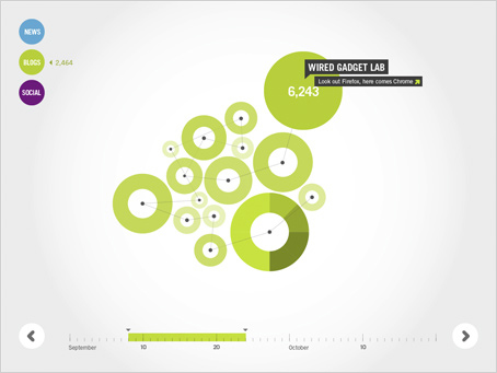
Grid/plane, a studio centered in Portland Orgeon, collaborated with Instrument, to visualize media buzz across various social media outlets. The client? Google.
Working in tandem with Google Analytics, the Flash-based, interactive tools allow users to explore relationships and see the effects of blogs, as well as mainstream and social media over time.
While this particular project wasn’t really focused on Google search results, can you imagine how cool it would be if it were? One day we will get visualization in lieu of listed results. Trust me. We will also have power laces, self-drying jackets, and flying Deloreans. I’ve seen it with my own eyes.
Read More -
A quick reminder: tomorrow is the last day to put in your entry for the first edition of Visualize This. There have been a lot of interesting visualization entries so far, so even if you’re not planning on making a graphic, make sure you put in your two cents for which one you think is best.
-
The worst thing about Los Angeles is the traffic hands down. As you sit there in a traffic jam, you first wonder what the hold up is, and as an hour of 5 mph traffic passes on a 70 mph speed limit freeway, you think of the cities you could’ve driven to in the time you are stuck in traffic. Stephen J. Beard and Rich Exner from The Plain Dealer try to explain the annoying phenomena in the above infographic. Yeah, traffic patterns are a bit more complex, but oh well. It’s still informative.
[via Cool Infographics]
-
Doogie Horner from Comic vs. Audience created the above flow chart for heavy metal band names. So in case you’re in search of name for your heavy metal band, start at the skull and work your way out. Just for ideas though. Don’t be a biter. For example: Death -> Pleas for Help -> Adolescent Poetry -> System of a Down. Regular FlowingData readers might also recall Doogie’s similar flow charts for comedy and what to say during sex.
[Thanks, Jess]
-
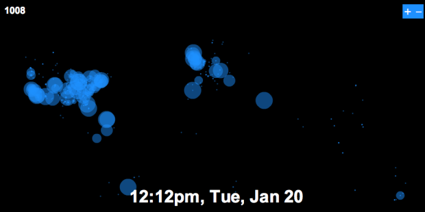
On Tuesday, January 20, 2009 at 12pm, Barack Obama officially became the 44th president of the United States of America. As we all watched Obama being sworn in front of the massive crowd, Twitter was abuzz with excitement. Just how excited was the Twittersphere? Watch for yourself. The map starts early Monday morning. As the day moves on more people wake and tweet at a steady rate with increasing volume as the time comes nearer. Europe gets in on some of the action when the US goes back to sleep. Tuesday morning comes in with a new beginning in the air. Then boom, it’s time, and Twitter bursts with excitement.
-
Remember Twistori? It’s the Twitter mashup that shows tweets of love, hate, think, believe, and wish. I guess naturally, there’s an inauguration version. It’s not as effective, but still worth a look.
-
The Photosynth of first-hand reader photographs is now up on MSNBC. If you’re not familiar with Photosynth, here’s a brief description:
Photosynth is a potent mixture of two independent breakthroughs: the ability to reconstruct the scene or object from a bunch of flat photographs, and the technology to bring that experience to virtually anyone over the Internet.
Essentially it’s a completely different way to look at thousands of photos. Photosynth stitches together images from many vantage points to create a panoramic view of the scene – in this case the view from the inaugural stands. Zoom in and out pan left, right, up, and down. It’s almost as if you were there. Watch the TED talk for more:
-
There’s a lot going on today, and of course the news interactive teams are pushing out. The New York Times pushes out an updated infographic that shows inaugural words all the way back to George Washington in 1789. Then there’s the guide that I mentioned earlier and the mosaic of reader photos. I’m still waiting for CNN’s views with photosynth and satellite views that Wolf keeps on promising. Updates to come.
-
It’s Inauguration Day! There’s a happy buzz in the air, and you can’t help but feel excited. I of course turn to The New York Times for a comprehensive guide.
-
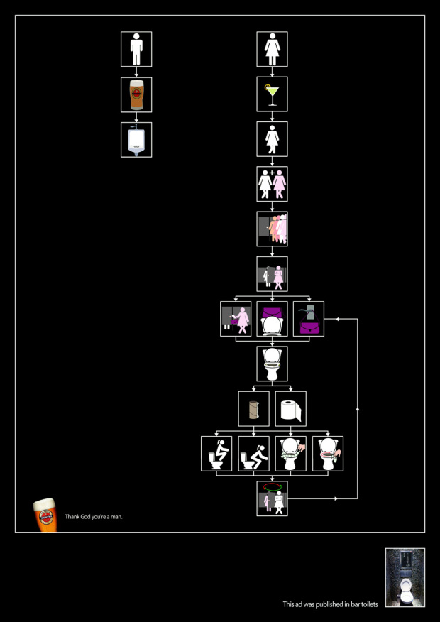
These ads for Goldstar beer were hung above bar toilets. They’re comical flow charts that provide some “insight” on the man versus woman, um, decision-making process – clothes, love, and the bathroom. I wonder if the posters were hung in both men and women’s restrooms or just men’s. I guess the “Thank God you’re a man” bit wouldn’t go over too well with the opposite sex.
Read More -
People have fallen in love with word clouds that make pictures. Zoom in and you see a bunch of individual words. Zoom out and you see a famous person’s face. It is a dictionary or a portrait? Mystical. TBWA/Chiat/Day, an advertising agency in Nashville, Tennessee of all places, brings the concept to promotion for the 2009 Grammy Awards – in animated form. Float through the cloud of songs and lo and behold, it’s Stevie Wonder.
It’s only a matter of time until someone creates the next version of Wordle. Let people upload a picture and some words and then charge people a few bucks for a printed poster. It’d be a huge hit. It’s the perfect gift I tells ya. I’m looking at you, Jeff. We need to talk.
[via uncovering data]
-
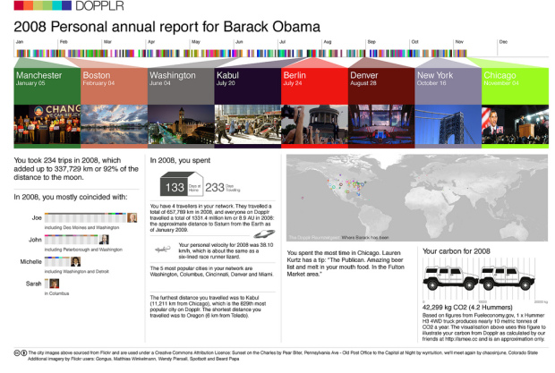
Dopplr is a service that lets you share your travel schedule with friends and then highlights times when you and your friends will be in the same place. For example, if you’re traveling to Las Vegas in December, Dopplr will tell you if any of your friends are going too. OK. So yesterday Dopplr started sending out “Personal Annual Reports” to all of its users. The report shows what friends your travels coincided most with, where you traveled, how you traveled, and your carbon for 2008. What a great idea.
Above is a report for Barack Obama. It should surprise nobody that Joe Biden tops the list on who Obama most coincided with, and then John McCain follows in a close a second.
-
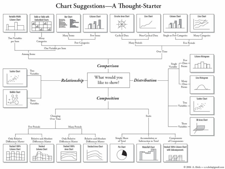
Amit Agarwal, of Digital Inspiration, posts thisAndrew Abela creates this flow chart that helps you decide, well, what type of chart to use. Start in the middle with what you want to show – comparison, relationship, distribution, or composition – and then work your way out to the number of variables. Pretty timely for our brand new Visualize This project.[via Digital Inspiration]
-
I’m going to try something new here at FlowingData in a section called Visualize This. Every two weeks I will post a dataset to the FlowingData forums for all of you to visualize. Download the data, visualize it (graph, chart, map, infographic, animation, etc), and post your work to the thread. As we’ve seen already, there are many ways to visualize a single dataset, and with multiple pairs of eyes, we get stories from different points of view. I will post the best visualization at the end of each cycle.
My hope for Visualize This is that we all learn from each other as well as use the opportunity to improve our visualization technique. From experience, I’ve found that the only way to really learn how to visualize data is by doing. Digital photography forums follow a similar format, and I think the idea can easily carry over to visualization.
Your Mission, If You Choose to Accept it…
To start things off, I’ve posted data for poverty rate by state and age in America. With the current state of the economy and the changes that are on their way, the dataset seemed fitting. Post your work here, and let’s start Visualize This on the right foot. Have fun!
If you haven’t registered yet, make sure you do that first. Also, if you have any ideas for future datasets we might want to use, go ahead and post those here.
Are you up for the challenge?
-
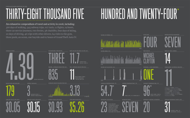
After Nicholas Felton’s ever popular 2005, 2006 and 2007 annual report on himself, you knew this was coming. The 2008 Feltron Annual Report is now up for your viewing pleasure. There’s a lot more mapping, data, and pages this time around.
Read More -
Ford sales are suffering. In an attempt to improve, they’re going green with hybrid vehicles, and in doing so, had to shift their design. In their initial studies with IDEO, the Palo Alto-based design group, they found that drivers who were interested in fuel efficiency were “playing a game.” Getting more miles to the gallon was like earning points. With that in mind, Ford worked with Smart Design to create a high-resolution LCD dashboard to show drivers how efficiently they drive.
In order to play into the research finding that drivers are looking for a high score when it comes to fuel efficiency, one high-resolution LCD screen on the dash features an eye-catching rendering of curling vines blooming with green leaves. It’s more than a decorative element; it’s a data-visualization tool intended to change the way people drive. If a driver wastes gas by aggressively accelerating or slamming on the brakes, for example, the vine withers and leaves disappear. More leaves appear if individuals drive more economically. The system will be standard on all new Fusion Hybrids, which will start at about $27,000.
There’s still another 6 months until we see the results of this design shift, but what do you think of this futuristic-looking dashboard?
[via BusinessWeek | Thanks, Alastair]
-





 Visualize This: The FlowingData Guide to Design, Visualization, and Statistics (2nd Edition)


