This video (below) explains how we got into this credit crisis. It’s a lot of greedy business folk who borrow, borrow, and then borrow more money. Why do they borrow the money? How do they make money by borrowing money? Watch the animated infographics for an explanation.
Read More
-
-
-
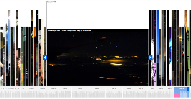
Stamen Design, whose work you’ve most definitely seen, comes out with their most recent collaboration with Flickr, the photo and video sharing service. It’s called Flickr Clock. It lets you browse Flickr videos contributed to the Flickr Clock Group Pool. Videos are arranged as slices by time uploaded (or is it time contributed to the group?) and sized by their original upload resolutions. Click on a slice, and the video opens up like above.

Underneath is a time browser for a zoomed out view with chunks by the hour. Click, drag, and browse or just sit back and let autoplay do the work for you if you’re too lazy to move your mouse. The wider the chunks are, the more videos that were uploaded during the hour.

Flickr Clock isn’t my favorite Stamen work (that title still belongs to Cabspotting), but I like it. It’s fun. What do you think about Flickr Clock?
-
In collaboration with generative artists Marius Watz, field, and others, along with Universal Everything and Wieden+Kennedy, Nokia has put together a beautiful art series involving communication as a promotion to their new E71 smartphone. The series include two interactive pieces and several videos.
One interactive piece takes video from your webcam, audio from your mic, and text that you type as input to create a generative art piece that you can send to friends and download as desktop wallpaper. Here’s what mine looks like:
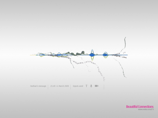
The gray blobbies are from me waving my arm around, the blue waves are from me whistling, and the text strands are from me typing “welcome to the jungle” in the input box. It’s pretty fun to play with.
The second one is a small (and pretty elegant) application that you download onto your E71. Use the application to send a text message and along with that message comes a generated image that looks something like the first image in this post. It’ll be different bits of art as you send different messages.
Then there are the videos – all interesting and beautiful on their own:
Great stuff.
By the way, I have the Nokia E71. It’s an awesome phone, in case you’re looking for a Blackberry alternative. Awesome design and really good feel to it. The GPS has helped guide me many many times and the keypad makes typing easy, which is perfect for my little self-surveillance project.
[Thanks, Sermad]
-
 Our 10k giveaway is now complete. Congratulations to all the winners, and a big thank you to all of you who participated. I thoroughly enjoyed some of the entries, especially the reader introductions (nice to know you all are living, breathing humans :) and the data visualization definitions. It just goes to show how diverse FlowingData readers are.
I also want to take one last chance to thank the 10k giveaway sponsors. They put up some really awesome prizes for all of you. Please do give them a visit if you get the chance. Here’s a recap of all the prizes and where they came from:
- Tableau Software Desktop Personal Edition – Tableau Software
- (3) Death and Taxes 2009 Poster – Jess Bachman from WallStats
- 389 Years Ago Poster + Limited Edition Color Variant – Also from WallStats
- SiSense Standard, one-year subscription – SiSense
- (3) FusionCharts Professional License – Infosoft Global
- Information Dashboard Design: The Effective Visual Communication of Data
- Processing: Creative Coding and Computational Art
- The Tipping Point: How Little Things Can Make a Big Difference
Again, a big thank you to all of you. Thank you for reading FlowingData and keep spreading the word – statistics is the new sexy and data visualization’s future is bright :).
-
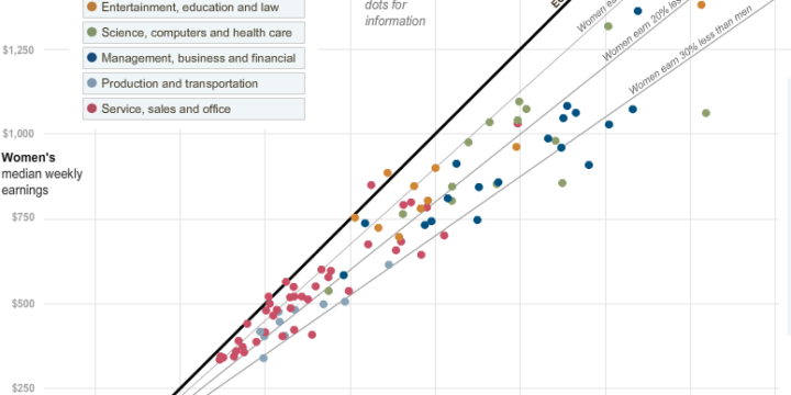
Hannah Fairfield and Graham Roberts from The New York Times show the disparity in salary among men and women. Each dot represents a job and the dark black diagonal line is equal wages. Jobs that appear below the line, are those where women, on average, make less than men in a comparable profession. There are six jobs above or on that line by my count. It looks like the higher the wage, the greater the disparity, but like most things the explanation is a little more complex than discrimination.
Read More -
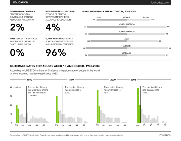
You might recall that the United Nations Statistics Division launched UNdata about one week short of a year ago, which was an improvement on the previous United Nations Commons Database. UNdata provides a gateway into 22 United Nations databases and 66 million records. Yeah, it’s a lot of data, but what do we do with it? What does it mean? Progress: A Graphical Report on the State of the World is a modest attempt to make some sense of it all; and by all, I mean a small subset.
Read More -
-
Google’s chief economist tells us statistician will be the sexy job of the next decade. Now Microsoft provides its vision for 2019 (video below):
<a href="http://video.msn.com/?mkt=en-GB&playlist=videoByUuids:uuids:a517b260-bb6b-48b9-87ac-8e2743a28ec5&showPlaylist=true&from=shared" target="_new" title="Future Vision Montage">Video: Future Vision Montage</a> The future for 2019 looks a lot like data visualization and some serious data processing, yeah? So you better get ready. Hop on to the band wagon before all the seats are taken. The future sure is lookin’ good. Check out the extended version of the above video in the link below.
[via istartedsomething | Thanks, dx0ne]
-
 If you haven’t read Malcolm Gladwell’s Tipping Point: How Little Things Can Make a Big Difference, you’re gonna wanna do that. I mean, there’s a reason this book was a national bestseller. Good thing the next prize up for grabs is… Malcom Gladwell’s Tipping Point. This giveaway is a quick one. The deadline is Feb 27, 8pm EST.
 How to Enter
Super easy. Leave a comment below. That’s it! The winner will be randomly selected at the deadline. Good luck.
UPDATE: This giveaway is now oooovvva. Thanks for participating, everyone! This is the last prize announcement in for our 10k giveaway, but there are still three giveaways still going on here, here, and here about to come to an end so get your entries in quick.
-
I figured out how I am going to get rich, and I’m going to share my secret with you. I’m going to become a high-profile banking executive, do a horrible job, get fired, and then end up rolling in cash. You think to yourself, “Uh, that doesn’t sound right you crazy kook.” Ah, but that’s where you’re wrong. That’s the American way! In the below infographic slash comic, we see executives stepping down from their top-floor, corner office with millions of dollars and a golden parachute to slow down the fall.
Read More -
If there’s anything good that has come out of America’s financial crisis, it’s the interesting and high-quality infographics. This isn’t one of them. Below is an ill-conceived bubble chart from BillShrink that “shows” average U.S. consumer spending. Notice anything wrong with it?
Bar versus bubble debate aside, there is a ton of room for improvement as well as huge need for some fact-checking and common sense. For a blog on a site for personal finance, the graphic is, well, not something to be proud of. FlowingData readers know that I like to stay away from heavy-handed critique on what works and what doesn’t (I leave that to you guys), but this BillShrink graphic is just so clearly confusing that it’s worth pointing out what doesn’t work so we can learn from others’ mistakes. Can you find the flaws?
[Thanks, Jess]
-
The New York Times homepage has a lot of news to report. While well-organized and well-designed, the Times recognizes that there’s still room for improvement as seen in their article skimmer prototype:
Here at The Times, we often hear a common story of usage from our customers: Reading the Sunday Times, spreading out the paper on a table while eating brunch. For many of our customers, this ritual is fundamental to their enjoyment of the weekend, and its absence would be jolting.
With this in mind, we present an as-yet-unnamed article skimmer. Think of it as an attempt to provide the Sunday Times experience anytime. Of course, there are parts we can’t replicate: the satisfying crinkle of the paper; the circular stain of your coffee; the smell of newsprint.
Article headlines and snippets are arranged by grid and divided by news categories. Jump to a specific category with the sidebar on the right or browse up and down with the arrow keys on your keyboard. I personally think it makes skimming easier. What do you think?
[via NYT First Look via Waxy]
-
I keep saying the sexy job in the next ten years will be statisticians. People think I’m joking, but who would’ve guessed that computer engineers would’ve been the sexy job of the 1990s?
Hal Varian, The McKinsey Quarterly, January 2009Varian then goes on to say:
The ability to take data – to be able to understand it, to process it, to extract value from it, to visualize it, to communicate it’s going to be a hugely important skill in the next decades, not only at the professional level but even at the educational level for elementary school kids, for high school kids, for college kids. Because now we really do have essentially free and ubiquitous data. So the complimentary scarce factor is the ability to understand that data and extract value from it.
I think statisticians are part of it, but it’s just a part. You also want to be able to visualize the data, communicate the data, and utilize it effectively. But I do think those skills – of being able to access, understand, and communicate the insights you get from data analysis – are going to be extremely important. Managers need to be able to access and understand the data themselves.
Wait a minute. Is this a pitch for FlowingData? I think so :). Check out the full article for more (or listen to the podcast). It’s an interesting read.
-
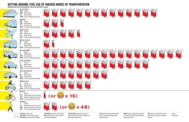
GOOD Magazine, in collaboration with Robert A. Di Leso, Jr., explores fuel use by various modes of transportation. In what is essentially a fancied up bar chart, we see how many gallons of fuel it takes for a passenger to travel 350 miles by cruise ship, Amtrak, Boeing 737, Sedan, hybrid, etc. A couple of non-fuel modes of transportation are included as well using caloric conversions. It’ll take about 48 Whoppers with cheese to walk 350 miles. Good to know, especially since I was planning on walking 350 miles today. Totally kidding. I’m walking 360. Like a circle.
[Thanks, Lawrie]
-
-
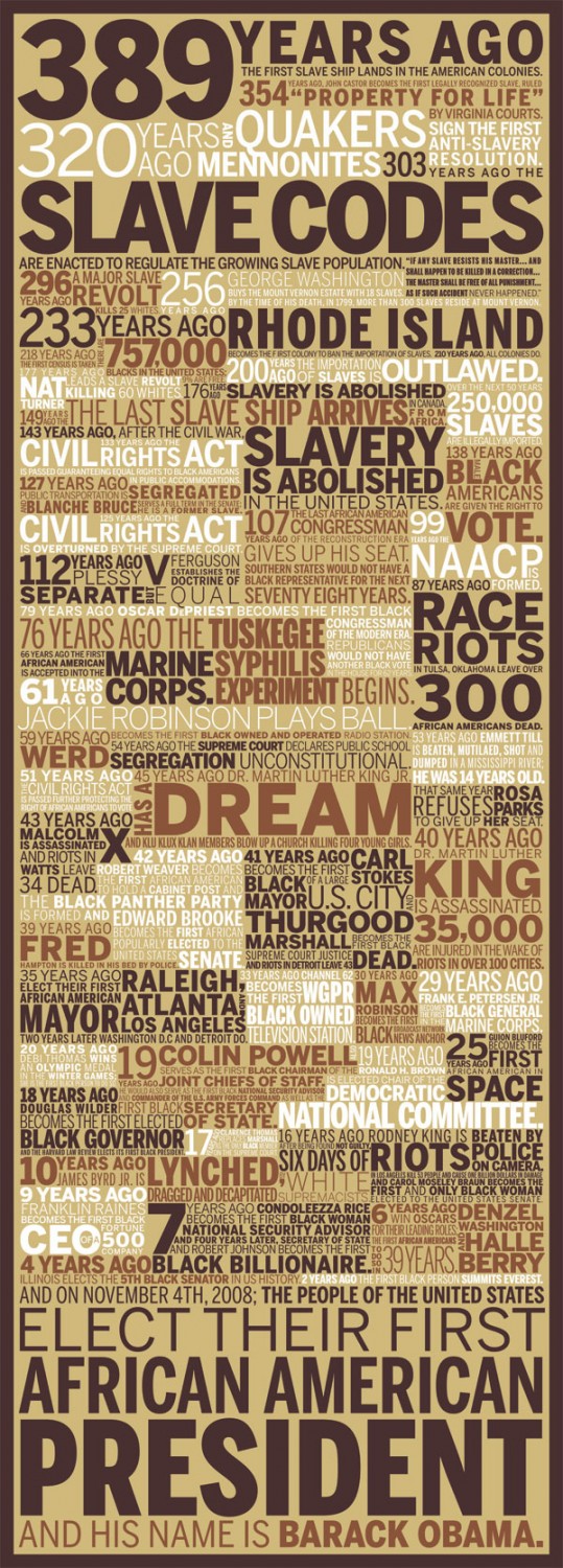
 I’m a WallStats fan, so I was especially excited when Jess put up two 389 Years Ago posters for the 10k giveaway. One is limited edition, and the other is really limited edition. Whoever wins these bad boys should thank their lucky stars. The deadline for this giveaway is Friday, Feb 27 at 8pm EST.
Prize Description
The 389 Years Ago Poster by Jess Bachman is a “typographic mashup of black history” and was inspired by Barack Obama’s victory in November. It’s a honker of a poster measuring in at 16″ wide and 46″ tall. It begins 389 years ago when the first slave ship landed in American colonies and then progresses to the first African American president, Barack Obama. There are only 389 of the above poster. One of them could be yours. On top of that, there is also a color variant of the 389 poster:
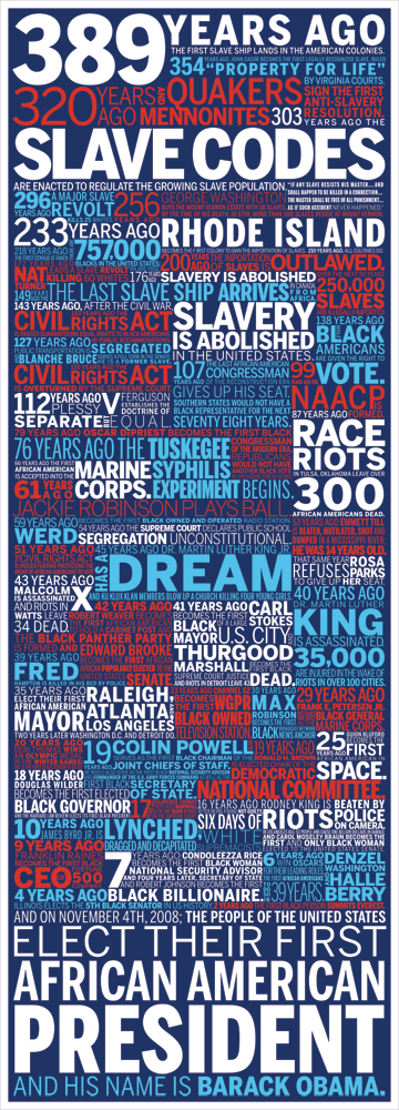
There are only 44 of these, and one of them is part of this giveaway.
How to Enter
Post to this thread in the FlowingData forums. Introduce yourself, tell us what you’re interested in, your favorite food, drink, animal, number, etc and where you will put the poster if you win it. Two winners will be chosen at random on Friday – one for the original 389 poster and one for the color variant. One entry per person please. Good night and good luck. That was a good movie.
UPDATE: We’ve wrapped this one up. Thanks for participating, everyone. I thoroughly enjoyed all the introductions in the forums. Congratulations to our two poster winners! I’m jealous.
-
You might not realize it, but there’s a lot of junk that orbits around the Earth. The North American Aerospace Defense Command (NORAD) tracks anything in orbit that’s bigger than a softball and then disseminates that information in the form of an orbit descriptor called a Two Line Element (TLE). Matthew Kozak visualizes this data on an interactive 3D globe. It’s implemented in Processing, and maybe best of all, the source code is available.
[Thanks, @Dan]
-
 I majored in computer science. I hated it. I ran from it like the black plague. That was then though. This is now. It turns out that programming can actually be fun, and when you know how to program – if even just a little bit – it completely changes the way you deal with and visualize data, which is why Processing: Creative Coding and Computational Art is next up on the giveaway.
 The deadline for this one is the end of today: Feb 20 at 8pm EST.
Prize Description
 Processing is a programming language that can help beginners do stuff with code they never thought possible. The learning curve is pretty shallow, and you get a lot of bang for your buck with surprisingly very little effort. That doesn’t mean it’s limited in what it can do though. Built on top of Java, Processing lets you do pretty amazing things when you know what you’re doing.
Processing: Creative Coding and Computation Art will help you in your path to coding enlightenment. “Create code, art, visualizations, and interactive applications with this powerful yet simple computer language and programming environment / Take a creative and fun approach to learning creative computer programming.” I think that sums it up nicely.
How to Enter
Leave a comment below that answers this question: What is data visualization? Make your answer an essay, a paragraph, a sentence, a word, a picture… OK, pretty much anything. The winner will be randomly selected at the end of today. Good luck.
Find giveaways still in progress here, here, and here.
UPDATE: This giveaway is now closed. The winner will be receiving an email shortly. Thanks for participating all. Keep watch for more giveaways on Monday.
-
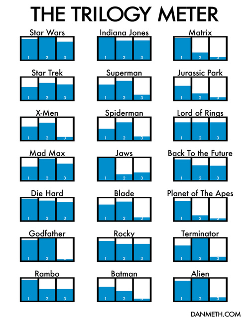
Dan Meth plots out the trilogy meter – a series of charts that show his level of enjoyment of each movie in the trilogy:
These are rated purely on my enjoyment level on each film and nothing else. Frankly I’m surprised by how many sequels were better than the original. And I’m not surprised that the 3rd movie is never the best.
Perhaps more surprising is that Dan’s actually seen so many full trilogies, especially after the second in a series sucking so bad.
[via Dan Meth | Thanks, Chris]



 Visualize This: The FlowingData Guide to Design, Visualization, and Statistics (2nd Edition)


