• Membership
  • Newsletter
  • Projects
  • Learning
  • About
  • Member Login
  • Thanks to Our FlowingData Sponsors

    July 20, 2009

    Topic

    Sponsors

    A big thank you to our FlowingData sponsors who help keep the servers running. Without them, FlowingData would be way too slow for consumption or I would be an even poorer graduate student.

    Please do check out their sites to see the useful visualization tools they have to offer.

    Freakalytics — Get Tableau Training- live, hands-on by author of “Rapid Graphs.” Registration is opening up across the country.

    NetCharts — Build business dashboards that turn data into actionable information with dynamic charts and graphs.

    Tableau Software — Data exploration and visual analytics for understanding databases and spreadsheets that makes data analysis easy and fun.

    IDV Solutions — Create interactive, map-based, enterprise mashups in SharePoint.

    InstantAtlas — Enables information analysts to create interactive maps to improve data visualization and enhance communication.

    Want to sponsor FlowingData, your most favorite blog in the whole wide world? Email me, and I’ll get back to you with the details.

  • From the FlowingData Forums [July 3-17]

    July 17, 2009

    Topic

    Forums

    Visualize This: Obesity Rates by State

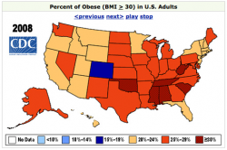
    obesity mapThis segment of Visualize This is all about obesity rates in America. The data comes from the Centers for Disease Control and Prevention (CDC).
    In 2008, every state in the US, except for one had an obesity rate greater than 20%. In 1994, there were zero. Here is the data for 2008. You can find data from 1985 to 2008 from the CDC site. Share your visualizations in this forum thread.

    Thanks to all those who participated in the last Visualize This with Rambo kill counts. A little bit of Tableau, some R, and dare I say, Powerpoint. Be sure to check those out in the forums.

    Interesting Threads

    • Edward Tufte is Talking at the Met – I know many of of you will be interested in this one. Tufte is giving a talk at the Met in NYC on classic drawings. Your ticket comes free with admission.
    • Help a Graduate Student Out – Do you collect data about yourself? Take this survey on personal informatics.
    • Mapping H1N1 Virus: Pattern of Spread Over Time – Do you have any suggestions on how to improve this graphic? Some put in their two cents while others provided their own work with the data.
    • Diseasome, Explore the Human Disease Network – A smooth network graph online to present scientific work.
  • If Aliens Were Tuning Into Our Television Frequencies…

    July 17, 2009

    Topic

    Miscellaneous

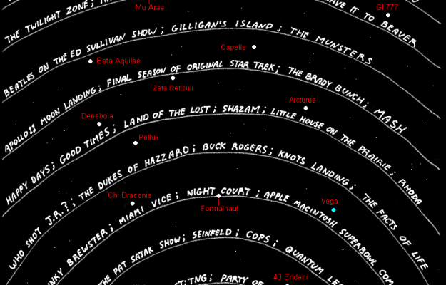
    In a different take on a timeline of television, Abstruse Goose, a web comic, shows us what aliens would be watching if they were able to tune into our television frequencies light years away. It doubly serves as a reminder of how old you are.

    [Thanks, Patrick]

  • Taking a Closer Look at Airplane-Bird Collisions

    July 16, 2009

    Topic

    Data Sources

    While we’re on the subject of flight, ever since that plane landed in the Hudson River a few months ago, the thought of bird-airplane collisions haven’t strayed too far from the media (or my mind each time I fly). In light of all the hoopla, the Federal Aviation Administration (FAA) finally gave in and opened up their bird strike database to the public.

    Below is an interactive exploring this data breaking things down by bird type, location, phase of flight, and time of day. Click through to this post to view.
    Read More

  • Why Are Cheap Airlines So Cheap?

    July 16, 2009

    Topic

    Infographics

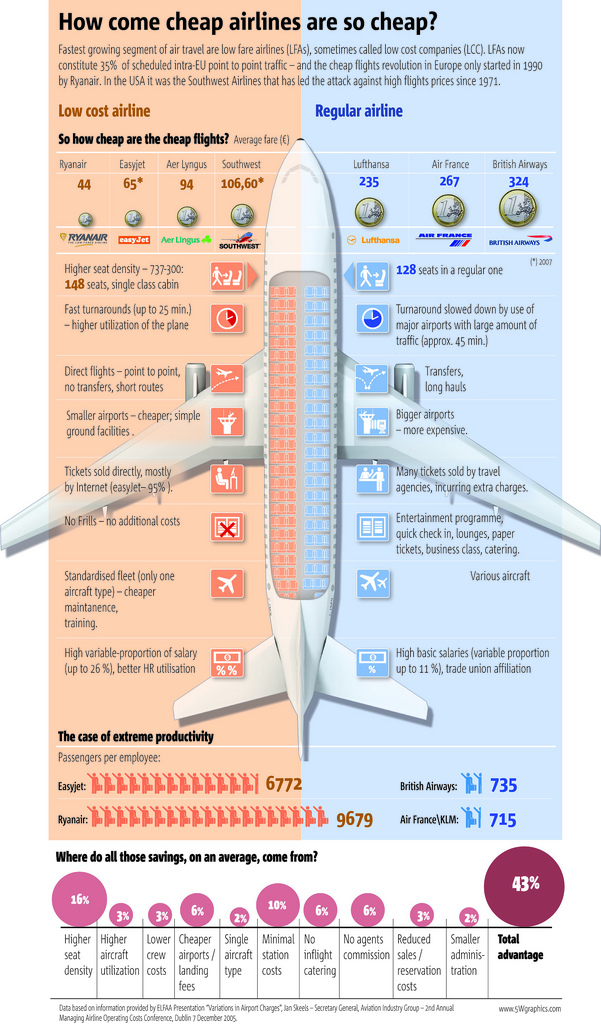
    5W Graphics, whose work you’ve seen by now, compares lower-cost airlines to “regular” airlines. The infographic is from the Spain group, so the focus is on Eurpoean airlines. Apparently the concept of low fair airlines (LFAs) is fairly new in Europe, only starting in 1990 with Ryanair while Southwest Airlines was founded in 1970. I’m more of a JetBlue guy myself. I cherish my legroom and in-flight entertainment.

    [via Cool Infographics]

  • Collect Data About Yourself with Twitter – your.flowingdata is Live

    July 15, 2009

    Topic

    Apps, Projects

    your.flowingdata (YFD), a Twitter application that lets you collect data about yourself, is now LIVE!

    I feel like I’ve been working on this project forever, but it’s finally at a place where I think it’s ready for human consumption. And unlike the previous version, what you track is completely up to you.
    Read More

  • How Does the Average Consumer Spend His Money?

    July 14, 2009

    Topic

    Infographics

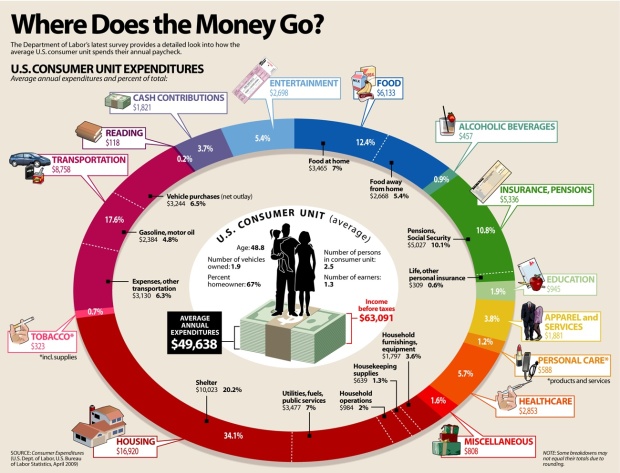
    Add another graphic to the list of ways to show consumer spending. Visual Economics displays data from the most recent spending survey (April 2009) from the Bureau of Labor Statistics. Compare this to last year’s survey results via an NYT interactive.

    The biggest difference I’m seeing is that between last year’s spending on housing (42%) and this year (34%). Maybe that’s why my mother-in-law keeps telling me it’s a good time to buy a house. Do you notice anything interesting?

  • Explore World Data with Factbook eXplorer from OECD

    July 13, 2009

    Topic

    Data Sources, Statistical Visualization

    The Organization for Economic Co-operation and Development (OECD) makes a lot of world indicators available (e.g. world population and birth rate). Much of it goes unnoticed, because most people just see a bunch of numbers. However, the Factbook eXplorer from the OECD, in collaboration with the National Center for Visual Analytics, is a visualization tool that helps you see and explore the data.

    Those who have seen Hans Rosling’s Gapminder presentations – and I imagine most of us have – will recognize the style with a play button and a motion graph in sync with parallel coordinates and a map. Choose an indicator, or several of them, press play, and watch the visualization move through time.

    Also, if you’ve got your own data, you can load that too, which is certainly a nice touch.

    [via BBC News | Thanks, Lawrie & Liam]

  • Religious Teachings On Sex

    July 10, 2009

    Topic

    Infographics

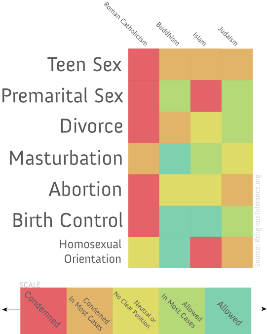
    This graphic on religious teachings and sex is making the social media rounds. The source is questionable and the design is a little iffy, but oh what the heck, it’s Friday. Have a nice weekend all.

    [Thanks, Brian]

  • Health Care Costs Vary Widely By Region

    July 9, 2009

    Topic

    Maps

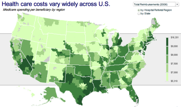
    No, this isn’t a bad fungus spreading northwest towards Washington. This map from the Robert Wood Johnson Foundation (via MSNBC) shows health care costs across the country, and yes, you are included Hawaii and Alaska.

    As you can see health care costs are from uniform country-wide.

    However, the color scale is kind of funky. I’m guessing it was automatically chosen by the mapping software to even split the number of regions amongst the five color bins, which I think kind of throws off the color distribution. I don’t know. I think as a whole, the map is missing some special sauce.

    [Thanks, Christopher]

  • Sneak Peek: New Version of your.flowingdata Coming Soon

    July 8, 2009

    Topic

    Projects, Self-surveillance

    The brand new version of your.flowingdata (YFD) is coming soon, and of course, as a FlowingData reader, you get the first peak. Newer readers might not know what I’m talking about. Well, it’s an online application that lets you collect data about yourself via Twitter.

    Follow @yfd on Twitter to be the first to try it out when it’s ready.
    Read More

  • Colored Tree, Cookies, and Stairs in Visualization Ad

    July 7, 2009

    Topic

    Data Art

    These ads for Hospital Alemán from Saatchi & Saatchi color code physical items for what parents say and what children do.

    TREE_HOSPITAL_COOKIES

    TREE_HOSPITAL_TREE

    It’s not quantitative at all, and a lot of you probably won’t even consider this visualization. It is pretty though, and I could see how this idea might be applied to data.

    [via I Believe in Advertising | Thanks, Ken]

  • Is the Economy Getting Ready to Turn Around?

    July 6, 2009

    Topic

    Economics, Infographics

    Is the economy going to turn around any time soon? How does this economic swing compare to previous cycles? Amanda Cox et al of the New York Times explores these ever so important questions in her recent nine-part interactive series.
    Read More

  • Realtime Information Graphics Show International Data Interchange

    July 3, 2009

    Topic

    Maps

    Zum Kuckuck, a design group in Germany, visualizes data interchange and network traffic with Processing in this beautifully executed installation.
    Read More

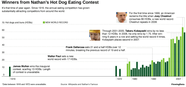
  • Who’s Going to Win Nathan’s Hot Dog Eating Contest?

    July 2, 2009

    Topic

    Polls

    It’s July 4 this weekend. You know what that means, right? It’s Independence Day, and really, there’s no better way to celebrate than to stuff down as many hot dogs down your throat as you can in ten minutes. Or if that doesn’t sound appetizing, you can just enjoy watching the annual Nathan’s hot dog eating contest on Coney Island.
    Read More

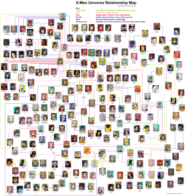
  • X-Men Universe Relationship Map

    July 1, 2009

    Topic

    Network Visualization

    Contrary to what a lot people might think they know from the movies, the X-Men universe stretches out quite a ways with lots of characters and lots of relationships. This super detailed relationship map for all X-Men characters from UncannyXmen shows just that.

    Connections are color-coded to show the type of relationship between a pair of characters. For example, green is a one-sided infatuation, pink is a flirtation by both parties, and a dashed line signifies one of the characters is from an alternative reality. Wolverine sure gets around.

    [via VizWorld]

  • Infographic Provides a Twitter History Lesson

    June 30, 2009

    Topic

    Infographics

    Manolith, in collaboration with InfoShots, tells the story of Twitter. The graphic starts at Twitter’s humble beginnings and ends at present day where you pretty much can’t go a day without hearing about that little bird. I wonder what this Twitter tree will look like next year.

    [via Techcrunch]

  • Workshop: Visualization on the Web – Join Me at VisWeek

    June 29, 2009

    Topic

    News

    Visualization on the Web is growing, but a lot of the really good stuff is just sitting around on someone’s computer. So to get a discussion going about how we can get more visualization out there – theory and application – Robert Kosara of Eager Eyes, Andrew Vande Moere from information aesthetics, and myself are heading up a workshop at VisWeek in October. It’s in Atlantic City.

    We’ll share some of our experiences, but mainly we want to know what’s on your mind. Submit your one-page position statement and tell us about your experiences, propose discussion topics, or ask questions that you’re wondering about. We’ll review the topics and you’ll hear from us by the end of July. Get your submissions in by July 17.

    Find more details here.

  • Review: RoamBi, Seeing Your Data on the iPhone

    June 29, 2009

    Topic

    Reviews, Software

    RoamBiThis is a guest review by Peter Robinet of Bubble Foundry, a web design company that specializes in building websites for Web startups.

    What It Is

    RoamBi is a free data visualization application for the iPhone by MeLLmo. You download datasets to the app and it creates visualizations so you can drill down into the data. The app is pitched as a mobile business tool for viewing sales reports and the like, but the sample visualizations included with the app suggest another possibility: RoamBi could easily be a killer app for statistics-minded sports fans, such as sabermetrics devotees!
    Read More

  • Michael Jackson Billboard Rankings: the Man, the Legend

    June 26, 2009

    Topic

    Statistical Visualization

    Say what you want about Michael Jackson, but there’s no denying the great effect he had on the music world. In honor of the pop king’s passing, practically half of The New York Times graphics department stayed up late last night building this graphic. It takes a look at his majesty’s Billboard rankings over his career compared to other popular music artists.

    Decade after decade Jackson produced numerous hit albums. Click through time to see the mountains of each. Timeless.

    To the man, to the legend, who no one will ever be able to replace:

    [Thanks, Amanda]

  • Page 358 of 392
  • <
  • 1
  • ...
  • 355
  • 356
  • 357
  • 358
  • 359
  • 360
  • ...
  • 392
  • >

Analyze, visualize, and communicate data usefully, beyond the defaults.

Become a member →

Recently for Members

May 15, 2025
Step Chart, Enhanced

May 8, 2025
When the data is not what it seems

May 1, 2025
Finding the Right Charts

April 24, 2025
Visualization Tools, Datasets, and Resources – April 2025 Roundup

April 17, 2025
Breaking Out of Chart Software Defaults

Browse by Chart Type See All →

Grid Map Baseline Chart Ternary Plot Alluvial Diagram Slope Chart Frequency Trails Pie Chart Donut Chart Variable Width Bar Chart Dot Map

Browse By Topic

  • Visualization

    Seeing data

  • Maps

    Seeing geographic data

  • Infographics

    Explaining data

  • Networks

    Connecting data

  • Statistics

    Analyzing data

  • Software

    Working with data

  • Sources

    Getting data

  • Design

    Making data readable

Get the Book

Visualize This: The FlowingData Guide to Design, Visualization, and Statistics

Available now.

Order: Amazon / Bookshop

Made by FlowingData

  • The Process

  • Data Underload

  • Chart Everything

  • Guides

  • Books

  • Shop

  • About
  • Contact
  • Newsletter
  • LinkedIn
  • Instagram
  • Bluesky
  • RSS
Copyright © 2007-Present FlowingData. All rights reserved.