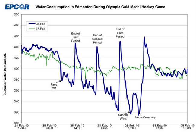
• Membership
  • Newsletter
  • Projects
  • Learning
  • About
  • Member Login
  • One Life, One Stacked Area Chart

    October 15, 2009

    Topic

    Infographics, Self-surveillance

    Ben Fogarty uses a stacked area chart to represent his life. To us outsiders looking in it’s not much more than that, but to Ben I am sure there is a story in every peak and valley. It’s like a “this is your life” slideshow in data.

    This is the drive behind your.flowingdata. I don’t think YFD is even remotely close yet to developing a personal narrative, but it’s something to shoot for. I can imagine a lifetime of data replaying and watching it unfold like a movie. That’d be amazing. Then again, I might also end up like Jerry in Act 3 of Episode 88 in This American Life. Fingers crossed for the former.

    [via WeLoveDataVis]

  • Is 10/GUI the Future Replacement of the Mouse and Keyboard?

    October 14, 2009

    Topic

    Miscellaneous

    10/GUI, a prototype interface by R. Clayton Miller, is a new way of interacting with the computer. We’re all familiar with touch screens, but what Miller proposes is separating the touch from the screen and bringing your hands back to where you normally would use a keyboard and a mouse.
    Read More

  • Make Your Walls Way Cooler With Data

    October 14, 2009

    Topic

    Projects

    Like I said, data graphics that aren’t interactive are a lot better in print. I’m not sure what it is exactly but it’s the same feeling as holding a physical book in your hands over reading an electronic version online. It just feels right.
    Read More

  • The S&P 500 as a Planetary System

    October 13, 2009

    Topic

    Data Art

    The Stock Ticker Orbital Comparison, or STOC for short, from media student James Grant, uses a planetary system metaphor to display activity with the S&P 500. Each circle represents a stock and they orbit a planet-like (or sun?) thing in the middle.
    Read More

  • You Are Not Allowed to Read this Book

    October 12, 2009

    Topic

    Maps

    What would a freshman English class be without Of MIce and Men? No George or Lenny? People in Appomattox, Virginia seem to think it’d be just fine.

    The National Coalition Against Censorship, however, has different ideas on the matter. For the past couple of years the NCAC has confronted such bans and challenges from libraries and curricula. Above is a map of bans and challenges over from December 2006 to May 2009. Other notable works include The Golden Compass, Girl, Interrupted, and yes, brace yourself, The Adventures of Huckleberry Finn.

    [via DataViz]

  • The Geography of Job Loss

    October 9, 2009

    Topic

    Maps

    While on the topic of job loss and unemployment, here’s an animated map from Tip Strategies that shows job gains and losses over time.

    Red means loss and green means gain, and as you can see above, there isn’t much green (read that zero) on the map. The larger the circle is, the greater the number of net loss or gain compared to that of the numbers of the year before in the respective metropolitan statistical area.
    Read More

  • Mass Layoffs by Industry

    October 9, 2009

    Topic

    Infographics

    As we all know, many people, much more than usual, have lost their jobs during the past few years. Visual Economics shows layoffs and changes in unemployment rate by industry over the last year. Obviously manufacturing has taken a huge hit along with construction.

    Health care and social assistance has also seen a lot of mass layoffs, but that one I don’t really get. I’ve been under the impression there was high demand in that area. Maybe I’m wrong.

    In any case, one thing that I would definitely change in this graphic, other than getting rid of those out-of-place icons, is the percent change for unemployment rate.

    I thought to myself, “That bar for 2009 is over twice as tall and it’s not even a 100% increase?” Then I realized they were percentage differences, which isn’t as important the actual percent change of the rates.

    Then we’d see that the unemployment rate for manufacturing has increased over 140% and for construction it’s gone up over 120%.

    [Thanks, Jason]

  • Best of FlowingData: September 2009

    October 8, 2009

    Topic

    Best of FlowingData

    Again, FlowingData had another record month in terms of growth, and I cannot thank you all enough for reading and spreading the word. Thank you. We’ve got quite the community developing here.

    In case you missed them, here are the top posts from the past month ranked by a combination of page views, comments, and trackbacks:

    1. What Visualization Tool/Software Should You Use? – Getting Started
    2. Highs and Lows of Being a Young Man
    3. 3 In-depth Views of Flight Delays and Cancellations
    4. The World of Seinfeld
    5. Vintage Infographics From the 1930s
    6. Ben Fry Visualizes the Evolution of Darwin’s Ideas
    7. Stimulus Funding Map is ‘Slick as Hell’
    8. 10 More Infographic Reasons Why You Should Go Green
    9. A Road Map to Success
    10. TV Size Over the Past 8 Years

    From the Forums

    And here’s some of the good stuff that’s been going on in the forums in no particular order.

    • Visualization/analysis tool for SSH/FTP stats – ina.Cirdaye wants your thoughts on his new tool.
    • Notable Political Visualizations – How has visualization played a role in making (important) decisions in government?
    • Visual Metrics to Inform: Petro-Wealth Importance
    • Animated Bar Chart for CO2 emissions
    • Sunlight Foundation is Looking for Data Viz Specialist – Work towards a more transparent government.

    Do you have a data visualization question or have something data-ish to share? The FlowingData forums is the best place to do it, especially since I (really) suck with email now.

  • Join Us in Atlantic City this Sunday – VisWeek Workshop

    October 7, 2009

    Topic

    Site News

    Like I mentioned before, Robert Kosara (EagerEyes), Andrew Vande Moere (information aesthetics) and I are hosting a workshop on Visualization on the Web this Sunday (October 11) in Atlantic City as a part of VisWeek. So if you’re in town, make sure you drop by.

    We accepted topic proposals earlier last month, and those will be presented (briefly) during the workshop, and we’ll break into discussion from there. It’ll be an informal event.

    Even if you didn’t submit a paper or register, you’re welcome to join. Everyone is welcome. There should be plenty of space.

    Find more information on EagerEyes. Remember, this Sunday, October 11, 2:00-5:30.

  • Trendsmap Shows Twitter Trends Geographically

    October 7, 2009

    Topic

    Maps

    Twitter shows trending topics, but it’s for the entire user base. You can only see what everyone on Twitter is talking about at any given time. Trendsmap, on the other hand, shows trending topics by location. See what’s trending in any part of the world in real-time.
    Read More

  • NYC BigApps Competition – $20k In Prize Money

    October 6, 2009

    Topic

    Data Sources

    It’s exciting times for data heads. The launch of Data.gov back in May got things jump started; San Francisco recently announced DataSF; and now New York is getting in on the party with the announcement of their own Data Mine (live at 1pm EST today) and the NYC Big Apps competition.
    Read More

  • Facebook Measures Happiness in Status Updates

    October 5, 2009

    Topic

    Statistical Visualization

    As we all know, Facebook lets people update their friends with status updates, and with millions of users, that’s a lot of data. Look at the aggregated data over time, and you could see some interesting trends.

    The Facebook Data Team recently measured happiness in the United States based on these updates with a metric they call United States Gross National Happiness.
    Read More

  • How Long People Live in America

    October 2, 2009

    Topic

    Projects  /  life expectancy

    In this graphic, we take a look at some data on how long you’re expected to live.

    Live in Hawaii and you just might live a little longer.

    Hawaii has an average life expectancy at birth of 80.0 years. It’s 72.0 years in Washington, D.C., the lowest life expectancy in the country.

  • Data Sources, Guides  /  resources

    30 Resources to Find the Data You Need

    Let’s say you have this idea for a visualization or application, or you’re…

    Read More
  • Data Interface Iterations: Designing webtrendmap.com’s Stacks

    September 30, 2009

    Topic

    Apps

    This is a guest post by Craig Mod, who collaborated with Information Architects, to develop Web Trend Map. The site, which is largely inspired by iA’s previous work, lets you curate links with sources you trust. This post describes the multiple iterations and decisions made during the design process.

    Design and development of webtrendmap.com v1.0 took three months. During this period the interaction design and interface underwent countless subtle permutations. What we ended up with is almost totally unlike what we started with. There was a lot of painful iteration. A lot of gut wrenching backtracking.

    Let’s drill down and take a look at how we iterated on one key webtrendmap.com visual element: the Stack. Read More

  • Google Acquisitions Subway Map

    September 29, 2009

    Topic

    Misc. Visualization

    Tack another graphic to the growing list of subway map metaphors. Meet the Boss “maps” Google acquisitions and investments, color-coding tracks by industry. The maroon track, for example, represents video, hence YouTube, which also interconnects with advertising and web services.

    The design is nothing new (and kind of overdone), but the data are pretty interesting. I’ve never even heard of most of the acquisitions.

    Does anyone know who was the first to use the subway map metaphor?

    [via TechCrunch]

  • Share and Sell Data with Infochimps (100 Invites)

    September 25, 2009

    Topic

    Data Sources

    infochimpsThere’s a lot of data on the Web, but it’s all very scattered. At the same time, there’s a lot of data sitting on people’s hard drives that we don’t have access to. There are various reasons why people don’t share, but mainly, they just don’t see the point.

    Infochimps tries to solve both of these problems with an open data marketplace.
    Read More

  • Chart Junk vs. Eye Candy: What’s the Difference?

    September 25, 2009

    Topic

    Design
    lollipop
    Photo by horizontal.integration

    There’s this one phrase that really bothers me when it comes to data graphics. No doubt you’ve heard it or read it, and maybe it even popped into your head once or twice.

    The phrase I’m talking about is: “Edward Tufte is crying.”

    People like to say this when they see a graphic that doesn’t fit the ET law of high data/ink ratio. Then after the commenter has declared that ET is in fact a very emotional man, the graphic is classified “chart junk.”

    First off, I’m pretty sure ET isn’t that melodramatic. He doesn’t cry over a bad graph nor does he die a little inside or roll over in his grave if he were dead. I don’t think an angel get its wings every time he rings a bell either. Although I could be wrong about the latter.

    Second, not everything that fails to fit the mold of a traditional graph, visualization, or whatever you want to call it, is chart junk. One person’s chart junk is another person’s eye candy. What you see just depends on what angle you’re looking at it from.
    Read More

  • Online Dating Service Analyzes Intro Messages – How to Get a Response

    September 24, 2009

    Topic

    Statistics

    Online dating can be tricky. What do you say? How do you reply to people? What should you put in your profile? Should you use that profile picture from 15 years ago?

    Well, fret no more, because OkCupid, an online dating service, analyzed over 500,000 introduction messages and whether or not they got a response from the message receiver. For example, the above graphs shows reply rates for intro messages that used netspeak. Here’s a tip: don’t use it, probably because it makes you sound like an idiot or you take writing advice from the comments on YouTube.

    Other fine tips include: avoid compliments on physical appearance (because it’s the inside that counts) and don’t try to bring the conversation outside the service (because that’s creepy).

    [via Waxy]

  • TV Size Over the Past 8 Years

    September 23, 2009

    Topic

    Projects

    Apparently the average television size is going to be 60 inches by 2015. Do we really need that much television? I mean, come on.

    I used to watch my mom’s old 9-inch black-and-white television in my room, and I thought it was the greatest thing ever. PacMan on my cousin’s hand-me-down Atari couldn’t look any better. Things are a little different now, yeah? I wonder what my Xbox games would look like on that old TV.

    Anyways, I scraped television size data from CNET reviews, representing the past eight years or so, and actually, growth isn’t as dramatic as you might think.

  • Page 354 of 392
  • <
  • 1
  • ...
  • 351
  • 352
  • 353
  • 354
  • 355
  • 356
  • ...
  • 392
  • >

Analyze, visualize, and communicate data usefully, beyond the defaults.

Become a member →

Recently for Members

May 8, 2025
When the data is not what it seems

May 1, 2025
Finding the Right Charts

April 24, 2025
Visualization Tools, Datasets, and Resources – April 2025 Roundup

April 17, 2025
Breaking Out of Chart Software Defaults

April 15, 2025
Line Chart with Decorative Neon Accents

Browse by Chart Type See All →

Square Pie Chart Slope Chart Line Map Difference Chart Parallel Coordinates Box Plot Beeswarm Spike Map Word Cloud

Browse By Topic

  • Visualization

    Seeing data

  • Maps

    Seeing geographic data

  • Infographics

    Explaining data

  • Networks

    Connecting data

  • Statistics

    Analyzing data

  • Software

    Working with data

  • Sources

    Getting data

  • Design

    Making data readable

Get the Book

Visualize This: The FlowingData Guide to Design, Visualization, and Statistics

Available now.

Order: Amazon / Bookshop

Made by FlowingData

  • The Process

  • Data Underload

  • Chart Everything

  • Guides

  • Books

  • Shop

  • About
  • Contact
  • Newsletter
  • LinkedIn
  • Instagram
  • Bluesky
  • RSS
Copyright © 2007-Present FlowingData. All rights reserved.