• Membership
  • Books
  • Projects
  • Learning
  • About
  • Member Login
  • Can You Guess What These Maps Show?

    November 27, 2009

    Topic

    Maps

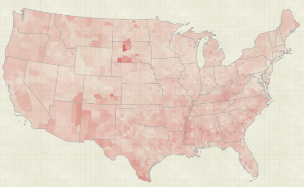
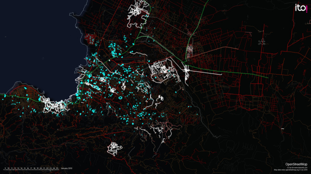
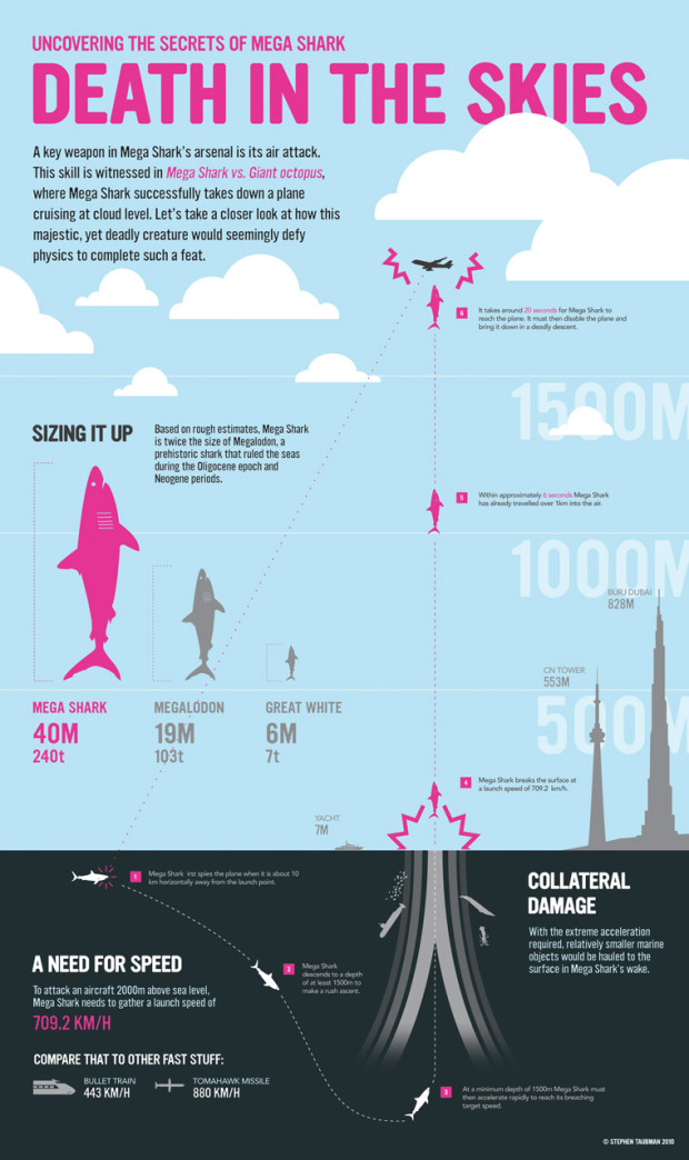
    I’m no doubt still under massive food coma at this time, but in case you’ve regained consciousness or don’t live in the US, check out this collection of maps from The Morning News. Can you guess what each is supposed to show? If you can guess even one of them correctly, I’ll be impressed.

    [Thanks, William]

  • Black Friday Starts Now. 3 Prints for 1!

    November 27, 2009

    Topic

    Site News

    Straight to the point. It’s Black Friday. Here’s the deal. Get 1 print for the price of 3. No wait, switch that. Get 3 prints for the price of 1 when you buy the series.

    Use this code to take advantage: bfridayfps20

    This deal ends on Sunday. Get some prints for yourself or as a gift to your data geek friend or dog today.

    Remember: your order will help more prints go to local education.

    What is FlowingPrints?

    For those new to FlowingData, FlowingPrints is a pet project of mine to put data, well, in print. For this first series, I collaborated with two designers to create three original views of education in America – through data. Check ’em out now. They’ll make your walls ridiculously smart.

  • What’s Cooking on Thanksgiving, Mapped and Ranked

    November 26, 2009

    Topic

    Maps

    Food-wise, Thanksgiving is different across the country. In some places you’re going to get a lot of chitterlings and collard greens, while in others, turkey and mashed potatoes. Personally, I’m a big fan of the 10-course Chinese feast, but to each his own.

    The New York Times (Matthew Ericson and Amanda Cox), map what’s cooking in your neck of the woods based on searches on Allrecipes. The top search, concentrated in the southeast, was sweet potato casserole. I have no idea what that is, but it must be delicious.
    Read More

  • Fox News Makes the Best Pie Chart. Ever.

    November 26, 2009

    Topic

    Mistaken Data, Ugly Charts

    What? I don’t see anything wrong with it.
    Read More

  • Guides  /  proportions, visual language

    9 Ways to Visualize Proportions – A Guide

    With all the visualization options out there, it can be hard to figure…

    Read More
  • Battle of the Coverage Maps: Verizon vs. AT&T

    November 24, 2009

    Topic

    Maps

    Verizon has been running these ads lately that compare their 3G coverage to that of AT&T’s. In the ads a Verizon customer walks along on a speedy phone, and a US map pops up that’s covered in red. Later, an AT&T customer looks frustrated with a sparsely-covered AT&T coverage map. You’ve probably seen them by now, but if not, here are the Verizon ones.
    Read More

  • The Cost of Getting Sick

    November 23, 2009

    Topic

    Statistical Visualization

    GE and Ben Fry (now the director of SEED visualization), show the cost of getting sick, from the individual’s and insurer’s perspective. The data: 500k records from the Medical Expenditure Panel Survey from GE’s proprietary database. The visualization: a polar area pie chart.
    Read More

  • Buzzwords in Academic Papers (Comic)

    November 20, 2009

    Topic

    Statistical Visualization

    This comic was really amusing, although it might be because I’m a big nerd entertained by all things from PHD Comics…

    It’s my blog, and I can laugh if I want to.

    Have a nice weekend, everyone.

    [Thanks, Stephen]

  • Thank You, FlowingData Sponsors

    November 20, 2009

    Topic

    Sponsors

    Thank you to the FlowingData sponsors for keeping the servers alive. Without them, this blog would not be possible, and I wouldn’t be able to do what I do.

    Check out what they have to offer. They make your data useful:

    Xcelsius Present — Transform spreadsheets into professional, interactive presentations.

    NetCharts — Build business dashboards that turn data into actionable information with dynamic charts and graphs.

    InstantAtlas — Enables information analysts to create interactive maps to improve data visualization and enhance communication.

    Tableau Software — Data exploration and visual analytics for understanding databases and spreadsheets that makes data analysis easy and fun.

    Email me at nathan [at] flowingdata [dot] com if you’d like to sponsor FlowingData, and I’ll get back to you with the details.

  • Choose Your Own Adventure – Watch the Stories Unfold

    November 19, 2009

    Topic

    Infographics, Statistics

    Interaction designer Christian Swinehart takes a careful look at the popular Choose Your Own Adventure books from the 1980s. We saw something like this before, but Swinehart takes it a step further.
    Read More

  • The Future: Embedding Data in the Everyday

    November 18, 2009

    Topic

    Infographics

    Imagine a world where data becomes the everyday, simply embedded in what you normally do. It’s really not far off if you think about it. We use charts, graphs, and viz to make important decisions with investments, businesses, and to stay informed on the news, so why not use it in our own lives?
    Read More

  • Visualize This: Class Size and Quality of Education. Your Turn

    November 17, 2009

    Topic

    Visualize This
    classroom
    Photo by Night Owl City

    Last week I posted some parallel coordinate plots that related SAT scores and class size. Now it’s your turn to take a crack.

    You can find the data that I used (and more) from the National Center of Education Statistics. There’s a link to download the data as an Excel file. You can find pupil/teacher ratios here.

    The two best entries each win a copy of David McCandless’ The Visual Miscellaneum: A Colorful Guide to the World’s Most Consequential Trivia as well as eternal glory on FlowingData. Yes. Eternal.
    Read More

  • Review: The Visual Miscellaneum by David McCandless

    November 16, 2009

    Topic

    Infographics

    David McCandless’ The Visual Miscellaneum: A Colorful Guide to the World’s Most Consequential Trivia hit the shelves last week (in the US). As I flipped through 320 pages of original graphics during my flight from New York to California, I thought to myself, “FlowingData readers are going to love this.”
    Read More

  • The Dumbest City in America

    November 13, 2009

    Topic

    Projects

    Fresno flagEver since my hometown Fresno, California was ranked the dumbest city in America (albeit, with a flawed ranking system), the first FlowingPrints series, on the state of education, has taken on new meaning. It became personal, and then it occurred to me that it should be personal for everyone. I think most of us know how important a good education is.

    Needless to say, my old high school and middle school now each have a copy of the series. My mom hand-delivered them (thanks, Mom). I’ve also been sending prints to schools, libraries, and education departments across the country near those who have already bought prints for themselves (thanks, all).

    But I need more help.

    From here on out, until all the prints are gone out of my garage, for every print you buy, I’ll send one to local education. If you simply don’t have any wall space, how about sending the series to a high school near you or your local library? I’ll send another to your local education board.

    Get the warm fuzzies, and spread awareness today. For the cost of a few lattes, you’ll be supporting education, your community, and data. Plus, you’ll be getting some beautifully designed prints.

  • Land Mass and Population by Country

    November 13, 2009

    Topic

    Infographics

    From Herald Daily is this giganto view of land mass and population size by country.
    Read More

  • How to Make a US County Thematic Map Using Free Tools

    There are about a million ways to make a choropleth map. The problem is that a lot of solutions require expensive software or have a high learning curve. It doesn’t have to be that way.

  • Join the Great American Hackathon

    November 11, 2009

    Topic

    News

    Sunlight Labs, one of my new favorite data groups, has partnered with Google, RedHat, Mozilla, and several others to get the open source community involved in open government projects. They’re calling it the Great American Hackathon and it’s happening December 12-13.

    For those unfamiliar with Sunlight, it’s an organization that promotes open government data and transparency, and they fund technology projects (mainly online apps) that move this idea forward.

    Organize an Event

    If you’re a developer or designer and want to help out, organize an event in your local area for December 12-13, and get as many people involved as you can. The more we make use of open government data, the more people that will see its usefulness, and the more people that care, the more the government will put into data. Get involved now.

  • The Pitching Dominance of Mariano Rivera

    November 11, 2009

    Topic

    Infographics

    The New York Yankees just won the World Series. I don’t know much about baseball, but I do know that Mariano Rivera, the Yankee closer, has a lot to do with the success of his team. Whether you like it or not, Rivera dominates batters with just a 0.74 ERA over 88 post-season games.

    The New York Times provides a batter-by-batter look at Rivera’s pitching since 1995. He’s pitched to 501 batters in the post-season. Only 14 runs have been scored off of him.

  • Class Size and SAT Scores By State

    November 10, 2009

    Topic

    Statistics

    Are there any differences in student performance between schools with small classes (as in students per teacher) and those with large classes?

    The natural response is yeah, of course, because if there are less students per teacher, each student gets more individual attention from the teacher. Then again, I went to pretty big elementary and high schools where some classes were in the high thirties. It didn’t seem all that bad.
    Read More

  • Unemployment Rate For People Like You – NYT Interactive

    November 9, 2009

    Topic

    Statistical Visualization  /  New York Times, unemployment

    Shan Carter, Amanda Cox, and Kevin Quealy of The New York Times explore 12-month average unemployment rates for just about any breakdown you can imagine. The main point: not everyone has been affected by the recession equally, and here’s how each group has felt it.

    Start with the filters up top for race, gender, age, and education level. The corresponding time series highlights blue.

    Change the filters – and here’s where the graphic gets a lot of mileage – the lit line moves up or down and the vertical axis updates, depending on what you were originally looking at. That up and down movement makes comparison between demographic groups much easier, especially because there are so many time series on a single plot.

    I’m impressed, NYT. Again.

  • Page 355 of 395
  • <
  • 1
  • ...
  • 352
  • 353
  • 354
  • 355
  • 356
  • 357
  • ...
  • 395
  • >

Analyze, visualize, and communicate data usefully, beyond the defaults.

Become a member →

Recently for Members

June 26, 2025
Visualization Tools and Learning Resources, June 2025 Roundup

June 19, 2025
Making Data Relatable

June 12, 2025
Comparing multiples

June 5, 2025
Caring Data

May 29, 2025
Visualization Tools and Resources, May 2025 Roundup

Second Edition

Visualize This: The FlowingData Guide to Design, Visualization, and Statistics (2nd Edition)

New tools, refined process.

Order: Amazon / Bookshop

Browse by Chart Type See All →

Streamgraph Choropleth Map Frequency Trails Barcode Chart Network Graph Unit Chart Square Pie Chart Organogram Cartogram Treemap

Browse By Topic

  • Visualization

    Seeing data

  • Maps

    Seeing geographic data

  • Infographics

    Explaining data

  • Networks

    Connecting data

  • Statistics

    Analyzing data

  • Software

    Working with data

  • Sources

    Getting data

  • Design

    Making data readable

Made by FlowingData

  • The Process

  • Data Underload

  • Chart Everything

  • Guides

  • Books

  • Shop

  • About
  • Contact
  • Newsletter
  • LinkedIn
  • Instagram
  • Bluesky
  • RSS
Copyright © 2007-Present FlowingData. All rights reserved.