Good Mag put on an infographic contest not too long ago that asked people to design around the idea of neighborhood. Any neighborhood would do, just as long the focus was on local. As you might expect, most of the entries were more design than data, but hey, that doesn’t mean they’re not worth looking at.
Read More
-
-
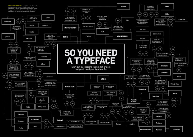
A typeface can make or break your graphic. Use Comic Sans, and no one will take you seriously ever again. Luckily, graphic designer Julian Hansen put together this flowchart for a school project to help you figure out what typeface to use. Most of you will probably be interested in the infographic branch.
Read More -
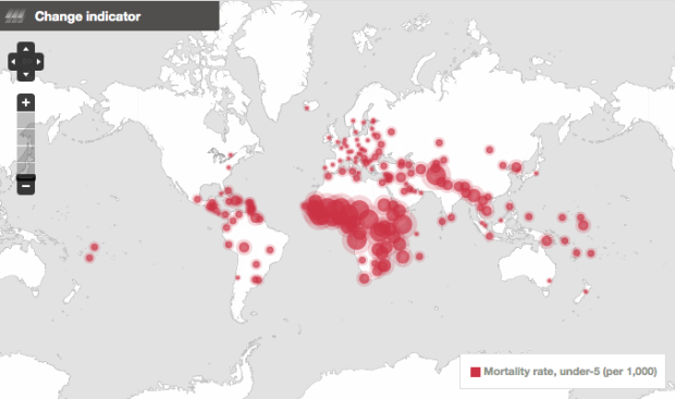
In another step towards open data and all that jazz, the World Bank released World Development Indicators 2010 today, which is meant to serve as a progress report of the world.
The WDI provides a valuable statistical picture of the world and how far we’ve come in advancing development,” said Justin Yifu Lin, the World Bank’s Chief Economist and the Senior Vice President for Development Economics. “Making this comprehensive data free for all is a dream come true.
More importantly though, this comes with the launch of the freely available online database and public API to 1,000+ indicators. There used to be a big fee for this data. I can’t speak for the API, but the website is well-designed. It has profile pages for each country, links to download the indicators in Excel and XML, and hey, are those graphs implemented in HTML5? I spy
<canvas>tags.
Read More -
Jacobo Zanella makes a color palette every day, based on the clothes he’s wearing.
I observe the colors of the shoes and clothes I wear that day, how much skin is exposed, etc., and reproduce that observation digitally, through RGB combinations. No software or programming is involved in the making of the graphs.
String them all together, and you’ve got multi-colors on top (shirts), a lot of black and blue towards the bottom (pants), and whites and grays all the way on the bottom (shoes).
Too bad he’s not logging it programmatically. That could be an interesting view (well, for him).
-
I don’t often give in to impulse buys, but I just ordered Cartographies of Time, and I’m pretty sure it’s going to be well worth the thirty bucks.
Read More -
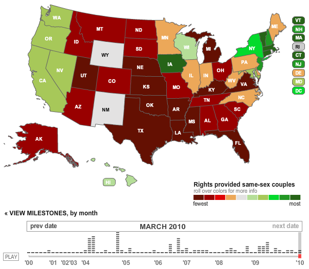
The Los Angeles Times reports on the chronology of gay rights in the United States. States are colored from fewest to most rights for same-sex couples. “Fewest” means the state bans marriage and legal rights. “Most” means gay marriage is legal in the state. Press play, and watch the changes from 2000 to present. Just disregard the clashing red and green color choices.
-

According to WebMD, for 1- to 4-week-olds: “Since newborns do not yet have…
-
In case you’re following the craziness going on over Europe due to that pesky volcano in Iceland, The New York Times provides a tracker for airport closures. The train stations must be packed more than ever before right now.
Read More -
A big thank you to FlowingData sponsors who help keep the lights on here. As you might have noticed, I’ve been trying something new in the sidebar, and I was lucky enough to have these great groups come along for the ride.
Check out what they have to offer. They make it easier for you to understand your data.
InstantAtlas – Enables information analysts and researchers to create highly-interactive online reporting solutions that combine statistics and map data to improve data visualization, enhance communication, and engage people in more informed decision making.
Tableau Software – Combines data exploration and visual analytics in an easy-to-use data analysis tool you can quickly master. It makes data analysis easy and fun. Customers are working 5 to 20 times faster using Tableau.
-
Shirt available on Threadless. I seriously need some infographic tees. Too bad the shirt project isn’t still going on. Suggestions, anyone? [via @alternatekev]
-

Traffic visualizations, mostly in the form of geographic maps, have been popular lately. Governments and organizations have been releasing lots of GPS data, and as a result, we get to see some impressive animations and explore some slick interactives.
We don’t often get to see how cars, trains, subways, airplanes, etc move in physical space, because, well, we’re usually in them, so it’s always interesting to see the big picture. The activity feels very organic as traffic peaks during rush hours and slows down during the night, taxis provide service to and from the airport, and air traffic continues into the late hours. The maps pulsate with energy.
Let’s take a look at some of these great traffic visualizations, some new and some old.
Read More -

Anyone who’s looked at campaign finance data knows it can get messy really quick (especially if you’re getting it directly from the FEC). Sunlight Labs’ newly launched TransparencyData aims to make the process a lot easier.
They’ve merged state data from FollowTheMoney and federal data from OpenSecrets and made it easy to search with a clickable interface. Select from a number of filters such as amount, recipient, or contributor, and then download data in bulk or make use of the API.
Read More -
Aaron Koblin (along with Chris Milk) is up to his crowdsourcing mischief again. It started with sheep, then the dollar bill, to a bicycle built for two, and now the Johnny Cash Project. Along the same lines of Aaron’s other projects, viewers are invited to draw an individual frame to the tune of Ain’t No Grave. In the end, drawings are put together to create a whole new music video for the song. Select any illustrated frame to watch a person’s drawing session.
Read More -
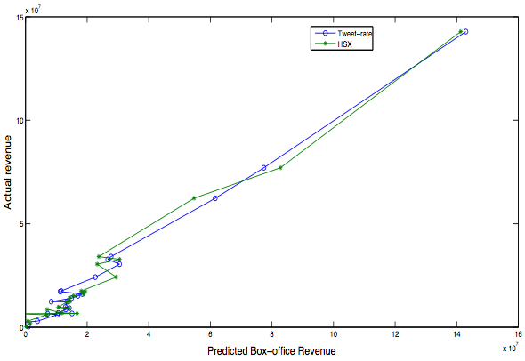
A recent study [pdf] by Sitaram Asur and Bernardo A. Huberman at HP Labs found that it’s possible to use Twitter chatter to predict first-weekend box office revenues simply based on volume of tweets. The predictions were even more accurate when they introduced sentiment analysis (i.e. classified tweets as positive or negative).
Read More -

If you absolutely refuse to touch any code, I suggest Many Eyes or one of the fine FD sponsors, but if you’re looking to get your hands dirty, Processing is a great place to start.
Jer Thorp, whose work we saw not too long ago, posts this introduction tutorial for data visualization with Processing.
I’m going to start from scratch, work through some examples, and (hopefully) make some interesting stuff. One of the nice things, I think, about this process, is that we’re going to start with fresh, new data – I’m not sure what kind of things we’re going to find once we start to get our hands dirty. This is what is really exciting about data visualization; the chance to find answers to your own, possibly novel questions.
The examples are straightforward, the results are interesting, and most importantly, it gives you a lot to work off of with your own data and geometry. Hopefully it’s the first post of many.
-

Carpe diem. Seize the data, boys. Make your lives extraordinary.…
-
Designer Tiago Cabaco explains the conception of wine in this short animated infographic. Some of the effects, like the frame rotation, are a little overused. It actually made me a little dizzy, but it’s short. Still fun to watch.
Read More -
Big news. Former IBMers Fernanda Viegas and Martin Wattenberg just announced their new venture Flowing Media (no relation to FlowingData), a consultancy focused on visualization for consumers and mass audiences.
Those who read FD probably already know of the duo, but for those who don’t, I’m sure you’ve seen some of their work. They sit somewhere in between the art/design and technical side of visualization, which always provides for interesting results. I highly recommend them if you’re in need of some viz help. Needless to say, I’m a fan.
Seeing a trend?
This comes just a few months after Ben Fry’s decision to also venture out on his own (after being with Seed for a year). Like Fernanda and Martin, he’s also in Cambridge, interestingly enough. There must be something in the water over there.
If anything, this is yet another indicator of the growing popularity of data, and more importantly, a desire to do something with it. I’m totally guessing here, but I bet Fernanda and Martin’s inbox was chock-full of project possibilities/offers, which I’m sure played a big role in their decision.
I don’t know about you, but I’m excited about the opportunities out there after I graduate. It’s a great time for data scientists.
-
Designer Juan Pablo Bravo illustrates 100 Pixar characters to scale, from Wally B. and Luxo Jr. to Wall E. and Lotso, from the upcoming Toy Story 3. Main characters are highlighted in yellow. Catch the full giganto version of the graphic on Flickr.
Read More -
With the 2010 UK elections coming up, the Guardian explores possible outcomes, given a certain amount of swing votes. Three views are provided: a grid map (above), your traditional geographic map, and a bar chart. You can select a region of interest, and it stays highlighted as you switch between the options.
Read More
Recently for Members
Second Edition
 Visualize This: The FlowingData Guide to Design, Visualization, and Statistics (2nd Edition)
 Visualize This: The FlowingData Guide to Design, Visualization, and Statistics (2nd Edition)
New tools, refined process.
Browse by Chart Type See All →


