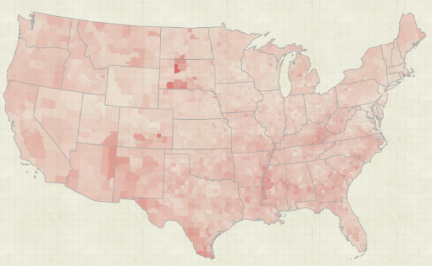
A good portion of my time in high school was spent trying to get into college. The rest of the time I was trying to look cool while doing it. Now of course I know better and fully embrace the inner geek. I’ll never know what life would’ve been like had I thrown caution to the wind back then, but I’m guessing it would’ve been something like this.
Read More
-
-
I’m transitioning to a new server right now, and let me tell you. Moving three years’ worth of files and content is no fun at all. Where’s a sysadmin when you need one? I’m also realizing how out-dated some of my software is, so like any move – in the physical world or digital – I’m in the process of upgrading everything. Bear with me. It might be a bumpy ride.
If you catch something that’s a bit off, please do let me know in the comments. I’ll really appreciate it. Thanks.
-

In 1926, Fritz Kahn illustrated man as a working factory in his famous poster, Man as Industrial Palace. Tiny guys in each body system perform their own specific job. A camera man controls the eyes, groups of thinkers sit up top, and the guys at the bottom handle the dirty work.
Read More -
Open data is great, but it’s useless if you don’t know what to do with it. Sunlight Labs, a group focused on using technology to support open government, recently released ClearMaps. It’s an Actionscript framework for interactive cartographic visualization.
In addition to giving designers and developers more control over presentation the project aims to address some of the common technical challenges faced when building interactive, data driven maps for the web. ClearMaps is designed as a lightweight, flexible set of tools for building complex data visualizations. It is a framework not a plug-and-play component (though it could be a starting point for those wishing to make reusable tools).
It’s still in the early stages, but developers will want to check this out I am sure.
[Thanks, Kevin]
-
A big thank you to FlowingData sponsors. They help keep the blog running and well, let me do what I do here. Check out what these fine groups have to offer. They help you put your data to use.
Tableau Software – Data exploration and visual analytics in an easy-to-use analysis tool.
InstantAtlas – Create and present compelling data reports on geographic maps.
Xcelsius Engage – Create insightful and engaging dashboards from any data source with point-and-click ease.
Business Intelligence – Visual data analysis made easy. Try 30 days for free.
Xcelsius Present – Transform spreadsheets into professional, interactive presentations.
Email me at nathan [at] flowingdata [dot] com for sponsorship details. All spots are currently filled, but you are welcome to put your group’s name on the waiting list.
-
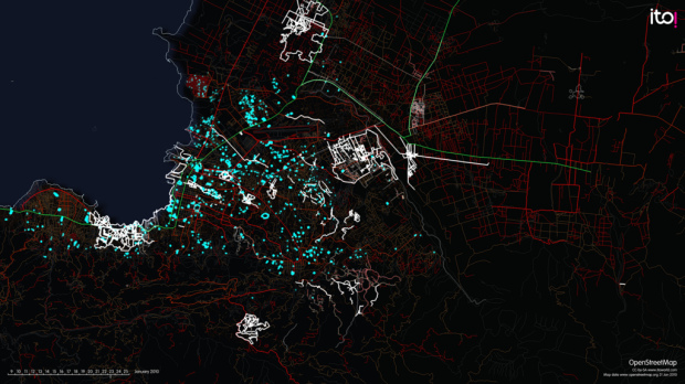
ITO world, who you might remember from a year of OpenStreetMap edits, come back to the map visualization to show the efforts of an impromptu community and Crisis Mappers to produce the most complete and accurate map of Haiti following the earthquake.
Read More -
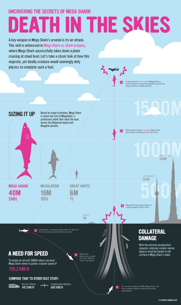
This graphic from designer Stephen Taubman is entertaining in so many ways. It is based on the amazing story of Mega Shark vs. Giant Octopus, one of the greatest movies ever made. I’ve never seen it, but after you watch the clip below, you’ll be running to find a copy.
Read More -
The National Science Foundation announced the 2009 winners of their annual visualization challenge. As usual it’s mostly scientific visualization of biological organisms and phenomena speckled with a few data-focused entries. The above, for example, took first place in the photography category. It’s a picture of tiny fibers, nanometers in diameter, wrapping around a plastic ball while immersed in evaporating liquid.
Read More -

Add another book to the growing library of guides on how to make information graphics the right way. Dona M. Wong, former graphics director of The Wall Street Journal and now strategy director for information Design at Siegel+Gale, provides the dos and don’ts of data presentation in The Wall Street Journal Guide to Information Graphics.
First Impressions
Given Wong’s background, you can make a pretty good guess about the examples used. They’re not graphics from The Journal but they do look a lot like them. The book description also makes a point of highlighting that Wong was a student of Edward Tufte, which was a big hint on what the book is like.
Read More -
After the county map tutorial a few months ago, I decided to write more how-to posts. Since then, with the new tutorials, it’s been great seeing the excitement over visualizing your own data. So now, a question for you.
What visualization tutorials do you want to see next?
Obviously I can’t teach everything since I still have plenty to learn myself, but I’ll be sure to give everything a try. Leave your suggestions in the comments below.
-
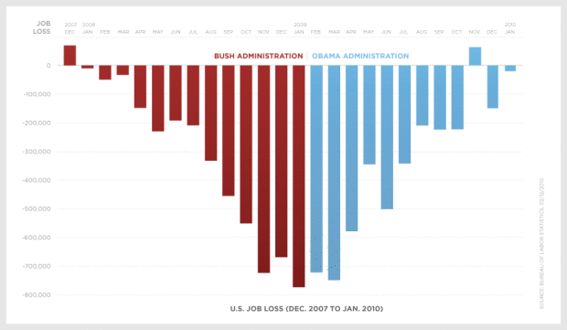
The Obama administration just posted a graph showing monthly job loss from December 2007 (Bush in red) up to last month. Discuss.
[via @nickbilton]
Update: There’s a video version now [via infosthetics].
Read More -

Tableau Software, popular for making data more accessible, mainly in the business sector, just opened up with Tableau Public. The application is similar in spirit to other online data applications like Many Eyes and Swivel. It lets you share data and visualizations online. However, Tableau Public doesn’t have a central portal or a place to browse data. Rather it’s focused on letting you explore data and stitch modules together on your desktop and then embed your findings on a website or blog.
Read More -
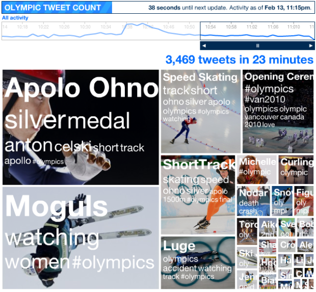
The Olympics are in full swing, so of course Twitter is abuzz with every big event. Want to keep track of the trends in real-time? Watch the Olympic pulse, by Stamen Design, on the NBC site.
Read More -

Tales around the Web for everyone’s favorite holiday.
Obligatory Valentine’s Day map – Aww, how sweet. Indiemapper sends its love in what else, map form, and even accompanied by the proper equations.
Science Valentine – Stick man of xkcd writes a valentine with just the data. This is what happens when you only let your brain lead. As they say, lead with your heart… and you won’t end up a boring sack of facts who no one likes. [thanks, all]
Love on the (Facebook) wall – It’s the greatest love story of all time. Woman gets divorced. Old friend comments on her wall. Comment turns to chat, chat turns to text, and text turns to phone call. Man proposes to woman via comic.
-
RIT student Nikki Graziano photographs math functions in the real world. Some are a stretch but others are dead on.
Read More -
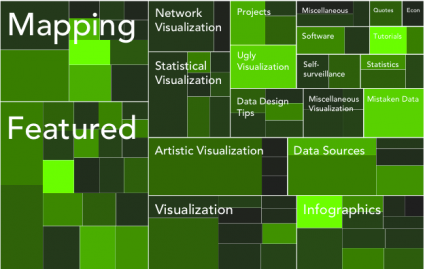
An Easy Way to Make a Treemap
If your data is a hierarchy, a treemap is a good way to show all the values at once and keep the structure in the visual. This is a quick way to make a treemap in R.
-

The online dating world can be a confusing place. How do you interact with others? Who should contact? What should you say about yourself? There are a lot of decisions to make, but it all starts with your profile picture when it comes to grabbing the attention of potential dates. Online dating site, OkCupid, analyzed over 7,000 profile pictures, debunking four myths:
- It’s better to smile
- You shouldn’t take your picture with your phone or webcam
- Guys should keep their shirts on
- Make sure your face is showing
Some of the results are pretty surprising. For example, men’s photos were most effective when they weren’t looking at the camera and not smiling:

It was the opposite for women. A flirty face or smiling while looking at the camera showed most effective:

Catch the full analysis here.
[Thanks, Tom]
-
Anatoly Zenkov provides this nifty tool (Mac and PC) to track your mouse pointer. Really simple. Just start it, let it run, minimize the window, and carry on as usual. In the end, you get this image that looks something like a Pollock. Circles show areas where the pointer didn’t move while the tracks show movement.
Read More
Recently for Members
Browse by Chart Type See All →


Browse By Topic
Get the Book
 Visualize This: The FlowingData Guide to Design, Visualization, and Statistics
 Visualize This: The FlowingData Guide to Design, Visualization, and Statistics
Available now.