
Technology and investment group HackFwd describes what it’s like to work with them in a flowchart. In a nutshell: start with inspiration, work hard, impress people, work hard, and reap the rewards. And then start all over again.
Technology and investment group HackFwd describes what it’s like to work with them in a flowchart. In a nutshell: start with inspiration, work hard, impress people, work hard, and reap the rewards. And then start all over again.
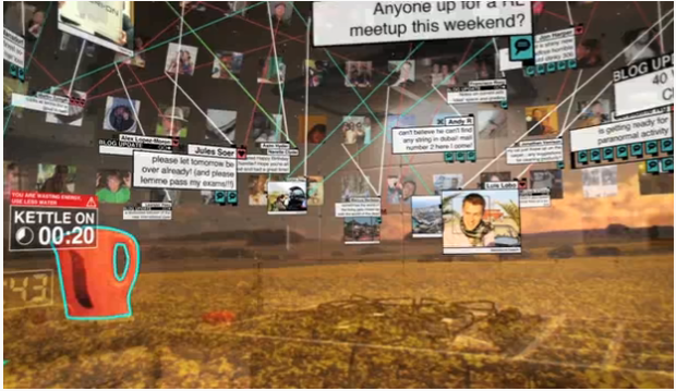
Augmented reality, a computer trick to place the virtual within the real world, has barely cracked its way into most of our lives, but it’s easy to see how such a tool could get out of hand. At some point, we’re going to have to raise our hands and say, “Okay, stop that’s enough information. My head hurts.” Or will we? Recent architecture grad Keiichi Matsuda explores the possibility of an augmented (hyper)reality where information is everywhere you go (video below). Read More
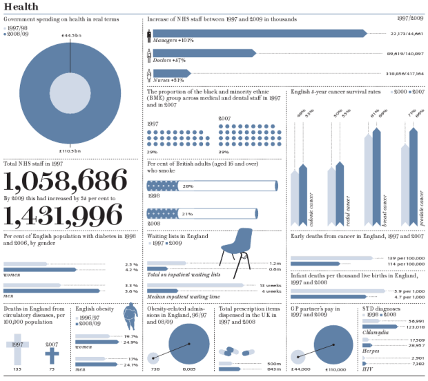
Prospect Magazine takes a look at how Britain has changed by the numbers from 1997 to present:
Richer, fatter, living longer, more indebted, drunker, better connected, politically disillusioned: there’s no metric that can describe whether we are happier or living better lives after 13 years of Labour. But there are plenty to show how we have changed during a period of fulsome spending, borrowing and technological transformation.
The four pages of graphics are well-organized with just the right balance of color and iconography, to keep the reader engaged without going oatmeal on the numbers.
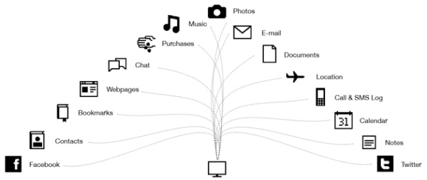
Take a moment and think off all the data you put other there on separate Web services. Email, photos, status updates, documents, location, contacts, and the list goes on. Many of the services are really good, but what if they went down? Where would are your data go? Or what if you could bring all that data into one place, so that you didn’t have to login to Flickr, Twitter, Foursquare, and Facebook. Poyozo tries to get all your data in one place – on your own computer – and help “make life make sense.”
Poyozo gives you your own data back by downloading the information you’re currently giving to the web on to your own computer. You can opt-in to importing your data from Facebook, Twitter, Foursquare, Last.fm, Google Calendar, any email service, any RSS feed, Flickr, Wesabe, Listit, Skydeck, Dopplr, your Firefox browsing history, the local weather, and your location, allowing you to access all of this personal data as easily as the companies that run these services can.
Simply install the Firefox plugin, choose what services you want to scrape, and you’re good to go. Poyozo then provides an API that you can use to access and query your data. Visualize it any way you want. Read More
I can’t count how many times I’ve googled a programming-related question and found myself at Stack Overflow, the question and answer site for programmers. MetaOptimize is like a Stack Overflow for data geeks:
You and other data geeks can ask and answer questions on machine learning, natural language processing, artificial intelligence, text analysis, information retrieval, search, data mining, statistical modeling, and data visualization.
Here you can ask and answer questions, comment and vote for the questions of others and their answers. Both questions and answers can be revised and improved. Questions can be tagged with the relevant keywords to simplify future access and organize the accumulated material.
Those with some data munging under their belt might find MetaOptimize useful. If you’re a n00b, you might want to stick to the FD forums.
[Thanks, John]
Visualization in JavaScript is all the rage these days. Just a couple of years ago, this would’ve seemed ridiculous because the engines were too slow, but no more of that. To that end, Nicolas Garcia Belmonte just released his JavaScript InfoVis Toolkit 2.0. It’s got your treemaps, stacked area charts, pie charts, weighted graph, so on and so forth. You can see all the demos, plus code examples to get the full picture.
This is not dissimilar to Protovis from the Stanford visualization group. Although, I’m told the JIT is fully functioning in Internet Explorer. Protovis only partly works in IE right now.
internet.artizans reflects on the usefulness of open data:
I’m inspired by the idea that nuggets of opened data could seed guerilla public services, plugging gaps left by government, but i don’t see any of that in the data.gov.uk apps list. The reasons aren’t technical but psychosocial – the people and communities who could use this data to help tackle their own disadvantage and marginalisation don’t have the self-confident sense of entitlement that makes for successful civic hacktivism.
The groups that really need it also often don’t have the tech or know-how to make use of – or even collect useful data – to make a case for anything. People like us, the data and tech-savvy can help.
[via migurski]
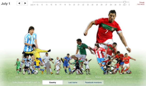
I always know when something exciting happens in the World Cup when my Facebook stream is flooded with announcements of a goooooooaaaal. On any given day, certain players are more talked about than others. The New York Times explores the day-to-day fluctuations of player mentions in Facebook status updates. Read More
I’m in the fifth year of my statistics PhD, and the time has finally come where I need to lock myself in my office and write a thesis. It’s going to be amazing fun, I assure you. I’m hoping I’ll reach true nirvana somewhere along the way.
Since I’ve all but finalized my thesis defense date for the end of this summer, it’s going to be a hectic three months. This month, I’ll be working hard to roll out a usable and useful application that some of you will be able to use. There will be more details, but it has to do with memories, calendars, and it’s in the same spirit of your.flowingdata.
After that, I’ll write.
I’m telling you this, because my brain is going to be in another place for the next few months. I fully intend to regularly update FlowingData. I’m too OCD not to, but if I happen to miss a day, you’ll know why.
Email responses will also slow to a snail’s pace. But please do keep sending in suggestions to suggestions@flowingdata.com. Your post ideas will help the flow coming since I won’t be able to stay on top of things as well as I’d like to.
Finally, if you have any visualization-related questions, you should definitely post it to the forums before emailing me. There are nice people who hang out there sometimes, so you’re more likely to get a response through there than through my neglected inbox.
Alright. Here we go. Let the fun begin.
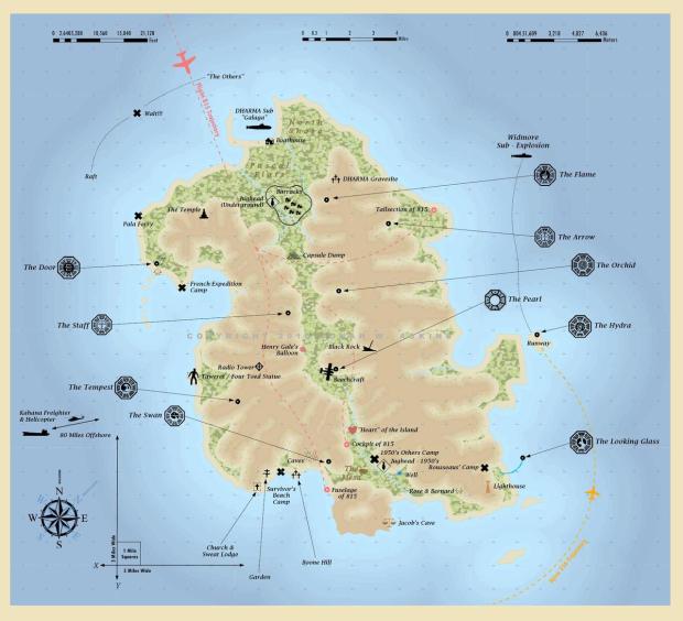
GIS guy Jonah Adkins maps the geography of Lost (the tv series). It looks like I missed out on quite a bit. Unfortunately, I only got up to the point in the first season where they saw a dead person hanging in a tree. I could not deal with all the insane cliffhangers.
I’m sure many of you were fans though, so you can stare at the maps for a while to temporarily fill the gaping hole in your life since the show ended.
[via We Love Datavis]

I really want to like this graphic on the “worth” of FIFA players. The colors pop and the topic is potentially interesting. There are some graphics 101 pitfalls going on here though. How can you make this display better? Leave your two cents in the comments below.
[via We Love Datavis]

In part of their initiative to get young and old people to hang out, We Are What We Do, in collaboration with Google, built Historypin. The map application invites people to upload their pictures and pin them in street view. The effort creates something of a digital time machine where old and young can find common ground.
Obviously, the more people who use it, the more useful it becomes. There doesn’t seem to be ton of pictures yet, so all you get is Google street view in a lot of places.
It’s easy to see the potential though. Just imagine being able to watch the evolution of your city, town, or neighborhood, like a block-specific museum with people’s personal stories and old photos with modern context.
[via infosthetics]
My many thanks to the FlowingData sponsors who help keep the gears turning and let me do what I do. FlowingData wouldn’t be around without them. Check ’em out. They do data right.
Tableau Software – Combines data exploration and visual analytics in an easy-to-use data analysis tool you can quickly master. It makes data analysis easy and fun. Customers are working 5 to 20 times faster using Tableau.
InstantAtlas – Enables information analysts and researchers to create highly-interactive online reporting solutions that combine statistics and map data to improve data visualization, enhance communication, and engage people in more informed decision making.
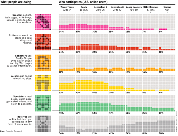
Arno Ghelfi for Businessweek reports on who’s doing what online, separated by age. The grid aesthetic totally works for the Internet theme, which can feel robotic and bit-wise at times.
From top to bottom are the more active users to the more passive. Age groups run left to right. So as we sweep top left to bottom right, we see the younger generation who is more likely to write blogs and upload videos to YouTube, to an older crowd who are more likely to be content consumers.
Update: Doh, this is from 2007. This cross-country move is throwing me out of wack. Oh well, it’s still an interesting piece of Internet history.
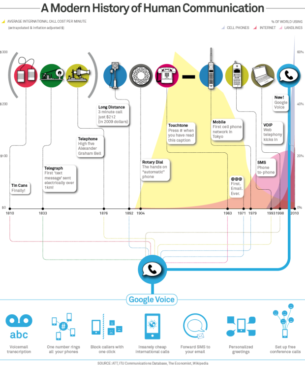
With the announcement of Google Voice for everyone, the big G describes the history of human communication in the graphic above – and consequently, how Voice is the next step in the evolution. We begin with the tin cans in 1810, to the telephone in 1876, then the first email in 1971, and tada, we arrive at Google Voice in the present. Average international call cost per minute serves as the backdrop.
I gotta get me one of those vintage mobile phones of 1979.
[via]

Field Design takes a look at a day in London:
LDN24 is a new public art installation for the Museum of London. It draws filmic impressions and the facts and figures of London life into a picture of 24 hours in the life of the city. Statistics and statements from the web and a huge database are printed along the LED screen by the seconds’ hand of a 24 hours clock. Weather, traffic and news updates, the Thames’ tides, Tube updates and recent fire incidents are pulled live from numerous RSS feeds, Twitter and news portals.
I can easily see myself standing there entranced by the display for a long while – if I were from London. What I really want is a big circular display like for a day in the life of Nathan.
Read More
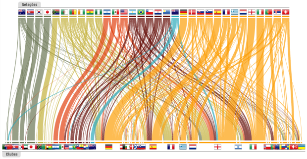
The World Cup is an event where countries from all over the world compete, but what about the teams themselves? Players may play for a single country, but many are ‘imported’ from elsewhere in the world as their day jobs are actually elsewhere. This isn’t a new thing, but teams have certainly become more multicultural over the years. Read More
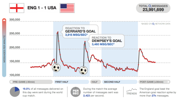
I love how major sporting events can captivate an entire country or region, especially when there’s the data to show the collective pulse. We saw it during the Canada-United States hockey gold medal match. Everyone flushed together. Similarly, O2, a UK mobile service provider, shows us texting volume during the World Cup and highlights the points of interest. England scores a goal and there’s a flood of text messages. Goooal. Read More

Buck, in collaboration with TakePart and An Inconvenient Truth director, Davis Guggenheim, describe the education crisis in America in motion graphics for upcoming documentary, Waiting for “Superman”. Watch the video below. It’s a more or less a run of education vitals, but it flows well and has a nice look and feel.
Plus, it’s an important subject we should know about. Maybe a new movement will get going once education gets the “inconvenient” treatment.
Read More

The third installment of Pixar’s Toy Story is making a killing at the…
 Visualize This: The FlowingData Guide to Design, Visualization, and Statistics (2nd Edition)
New tools, refined process.


