-
You read that right. There’s going to be a FlowingData book, published by the fine folks at Wiley. With all the books out there about design methods and best type of graph to do this and that, I thought it was time for a guide on how to actually put all that into practice.
When I first started getting into data graphics, I read all the books I could about good design with data. But when it came time to actually make something, I was lost. I had no clue how to use the software that was available to me. So all that other stuff I read was pretty worthless, just sitting there in my brain. This book will help you with that part.
Think lots of tutorials that take you from start to finish and teach you not just the what, but also the how.
More updates to come.
-
In 2009, legislation mandated that doctors make use of electronic medical records by 2013 to help make the healthcare process run smoother and more efficiently. This information video (below) produced by HonestPancake explains the basics of the why and how. It’s also sort of an advertisement for GE Healthcare’s Centricity Advance.
Read More -

Through high school and sometimes beyond we’re taught history as absolute fact. It’s in the books so it happened. A lot of it is true, but there are often disagreements, as history can look different depending on your point of view. In The Iraq War: A Historiography of Wikipedia Changelogs, James Bridle places 12,000 changes and almost 7,000 pages for the corresponding Wikipedia entry in book form. Sometimes history isn’t so straightforward. [booktwo]
-
O’Reilly Radar surveys the state of mapping APIs from old sources (like Google) and new ones (like CloudMade). Spoiler alert: there’s a lot of opportunity out there.
Maps took over the web in mid-2005, shortly after the first Where 2.0 conference. They quickly moved from fancy feature to necessary element of any site that contained even a trace of geographic content. Today we’re amidst another location and mapping revolution, with mobile making its impact on the web. And with it, we’re seeing even more geo services provided by both the old guard and innovative new mapping platforms.
-
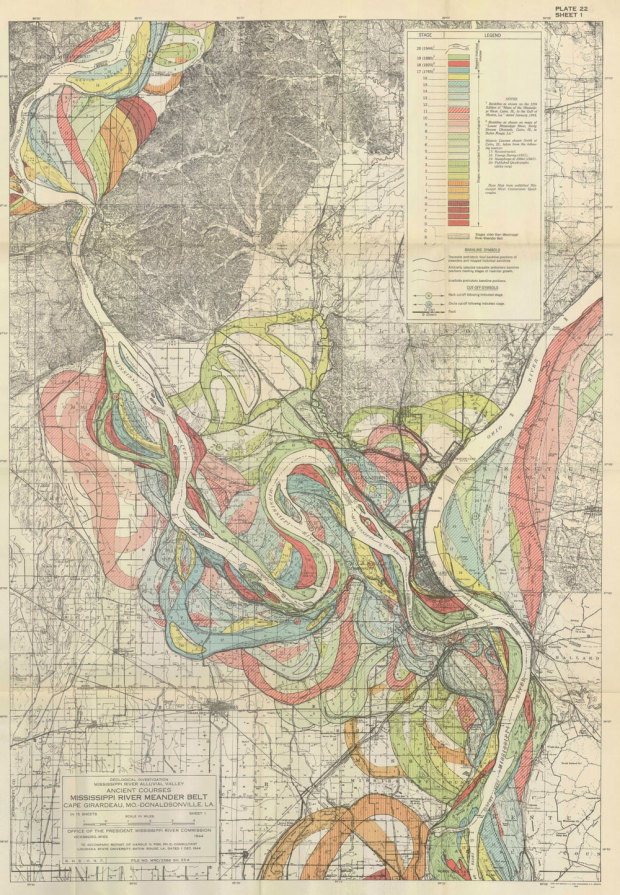
We often think of rivers as following a given path for the course of its life, but really, the path changes over time as the flow cuts into the earth. The water flows through old and new and back again. In 1944, cartographer Harold Fisk mapped the current Mississippi River. It’s the white trail. Then Fisk used old geological maps to display old paths. They’re the old colored paths. And what you get is this long run of windy, snake-like things. [Twisted History | Thanks, Michael]
-
Some people live in areas where a one-hour commute both ways is common, while others practically live across the street from their workplaces. Engineer slash designer Harry Kao has an interactive look at commuting by zip code:
In Traffic: Why We Drive the Way We Do (and What It Says About Us), the author states that commute times throughout history have remained steady at roughly a half hour in each direction. Advances in transportation technology (our feet, horses, bicycles, trains, automobiles, flying cars, etc.) allow us to live farther from where we work. This got me thinking about my own commute from Berkeley to San Francisco, how it compares to those of my neighbors, and how commutes vary across the country.
Using commute data from Census Transportation Planning Package and travel times from the Google Maps API, an interactive map lets you see where people in your area commute to or from. Enter your zip code and explore.
Read More -
Your email says a lot about who you are, who you interact with, and what you’re up to at any given time. Maybe it’s receipts from that online travel site or notifications from Facebook. There are lots of tidbits you can extract from your inbox. But how? PhD candidate Bill Zeller provides you with Graph Your Inbox.
Read More -
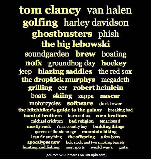
Online dating site OkCupid continues their run of amusing yet thorough analysis of their users. This time: the real stuff white people like. Well actually, the stuff that all races like:
We selected 526,000 OkCupid users at random and divided them into groups by their (self-stated) race. We then took all these people’s profile essays (280 million words in total!) and isolated the words and phrases that made each racial group’s essays statistically distinct from the others’.
Top phrase for white males? Tom Clancy. White female? The Red Sox. Black males? Soul food. Black females? Soul food. Asian males? Taiwan. Asian females? Coz. Yeah, I don’t know what that is either.
[Thanks, John]
-
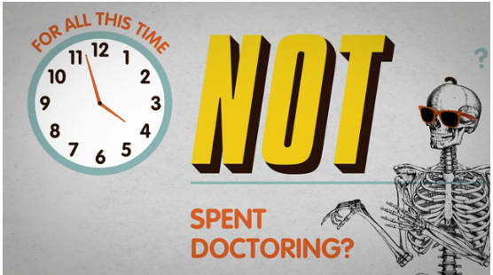
In a different take on the infographic, RSA Animate illustrates the ideas and concepts proposed by invited speakers at RSA lectures. A recorded audio version lecture runs in the background a hand, possibly the same hand who played Thing on the Addams Family, draws what the lecturer is saying.
Below is the illustrated version of Professor Phillip Zimbardo’s lecture on the secret powers of time. The original video of Zimbardo speaking at a podium follows. Same message, but very different visuals.
Read More -
Blend Interactive maps points of control for the Web 2.0 Summit in the style of the Risk board game. Areas of the Web are shown as continents, and countries are the areas where major players have “claimed.” Click on the movements button to see what areas each company has ventured in to, and click on icons to get more info. A more neutral-colored map might have benefited the paths and icons, but it’s still fun to look at. And yes, the geography of the map is fake.
[Web 2.0 Summit | Thanks, KM]
-
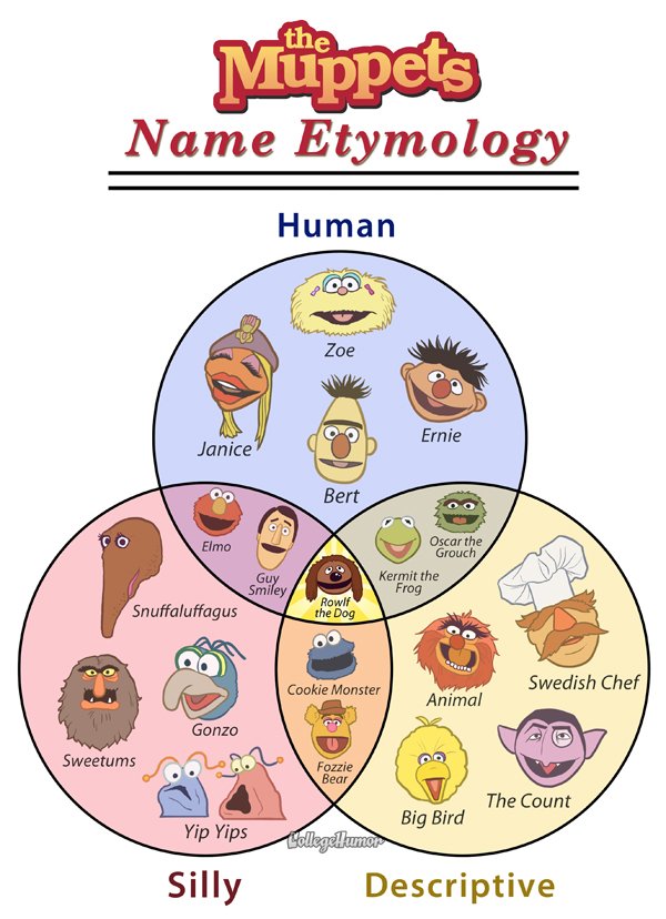
I know you were confused about Muppet names. I hope this venn diagram helps you figure things out and you can get on with your life. [via | Thanks, David]
-
Far better an approximate answer to the right question, which is often vague, than an exact answer to the wrong question, which can always be made precise.
—John Tukey -

Too many slots. Too many buttons. Spanish bank BBVA and design consultancy IDEO rethink the ATM:
ATMs were first introduced over 40 years ago and since then many features have been incrementally added to the machines, in order to fulfill the dream of a truly “automated teller”. Modern ATMs offer a wide range of banking transactions; nevertheless the actual interaction has remained largely untouched.
Fewer slots. Fewer buttons. More privacy and personalization.
[via]
-
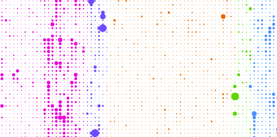
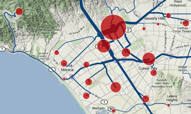
Foursquare, the location-based social network, lets people share their location with others in the form of checkins. Map all of those checkins, and you get a sense of social hotspots across a city. This is what Anil Bawa-Cavia did in his project archipelago. Based on 845,311 checkins and 20,285 locations, he mapped activity for New York, London, and Paris.
In these maps, activity on the Foursquare network is aggregated onto a grid of ‘walkable’ cells (each one 400×400 meters in size) represented by dots. The size of each dot corresponds to the level of activity in that cell. By this process we can see social centers emerge in each city.
Here are the maps for each city.
Read More -
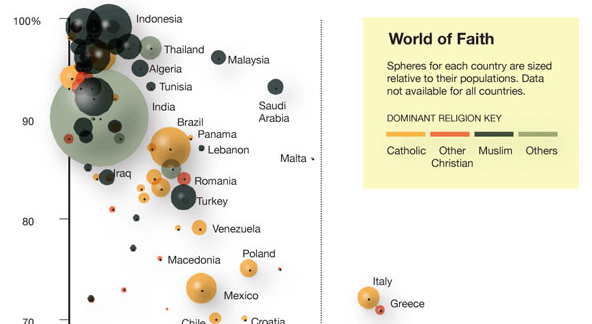
Using data from a recent Gallup report showing a correlation between wealth and faith, Charles M. Blow reports in graphic form. Each sphere, sized by population, represents a country. Spheres are colored by dominant religion in that country.
Read More -
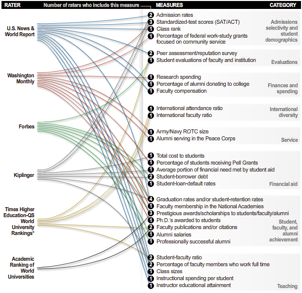
There are a bunch of college ratings out there to help students decide what college to apply to (and give something for alumni to gloat about). The tough part is that there doesn’t seem to be any agreement on what makes a good college. Alex Richards and Ron Coddington describe the discrepancies.
Read More -
I asked this same question a couple of years back. I wonder: has the software that people use for visualization and data graphics changed at all? Punch your answer in the poll below. If you select ‘other’ let us know your tool of choice in the comments.
P.S. I know many of you use a combination of these. Pick your favorite if that’s the case.
Read More -

Physicist Kristian Cvecek hangs out in the forest sometimes to take these beautiful pictures of firefly trails, using slow shutter speeds on his camera. Even better than the long exposure shot of a Roomba. [via]
-
If you’ve ever created an interactive graphic or anything else that requires that you feed in data, you will love this barebones data conversion tool by Shan Carter. Copy and paste data from Excel, which I feel like I’ve done a billion times, and then take your pick from Actionscript, JSON, XML, and Ruby. Simple, but a potential time saver. [via]

Recently for Members
Second Edition
 Visualize This: The FlowingData Guide to Design, Visualization, and Statistics (2nd Edition)
 Visualize This: The FlowingData Guide to Design, Visualization, and Statistics (2nd Edition)
New tools, refined process.
Browse by Chart Type See All →


