The second edition of Visualize This is published. The book made its way out this past week for those who pre-ordered (thank you!), but you can get a copy right away now.
This is a different book from the original. There is new software, new examples, and new methods that stem from a decade and a half more of visualizing and analyzing data, a polished process, and an evolving visualization field.
The end goal is still to get you making charts right away.
Learn how to ask questions about data, make any chart, and design around insights.
Changing Visualization
I wrote the first edition of Visualize This in 2010. At the time, visualization was more narrow in what it could and should be. If a chart didn’t tick certain boxes off a list, many dismissed it as garbage. Not very nice.
I wanted a nicer, more approachable book to help develop a reader’s curiosity in visualization and data through fun examples and step-by-step tutorials. Apply the analysis process, code, and design ideas in your work in a concrete way.
It seemed to succeed? Over the years, people whose work I enjoy and shared on FlowingData sent notes to tell me Visualize This was their introduction to visualization. And now it’s their career? Just, wow.
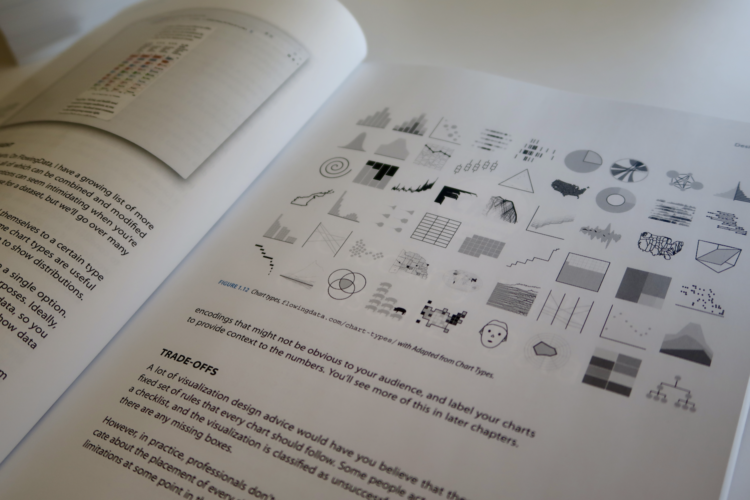
As data grew more common, visualization developed past the bar chart (still a go-to though). New visual forms and uses bubbled up. Data can move. You can interact with it. A beeswarm chart was barely a thing, and now it’s commonplace.
People have small computers in their pockets now. How do we show more on smaller screens? Instead of more pixels or to turn people’s phones and laptops into bricks of fire, you analyze the data, ask questions, and highlight insights. Focus.
Visualize This (2nd ed.) focuses more on this part of the process — making sense of data — which is the main reason FlowingData still exists. (Thanks for sticking with me.) Novelty in visualization will only get you so far.
Better Tools
Of course the visualization tools changed too. The upside of a book that uses current tools with step-by-step examples is that you can easily follow along on your computer. You can see the same thing on your screen as you do in the book.
The downside is when the tools fade or better tools come along to replace the dated ones. The first edition used almost a full chapter on Flash and ActionScript, which were killed off years ago. There was a section that used JavaScript, but it was with the Protovis library, which was the predecessor to the more current D3 library.
My own toolset also grew, which you see in this second edition. Again, I’m not trying to push you towards a specific tool. My goal is to help you decide which tool or subset of tools works best for you.
Visualize This (2nd ed.) covers point-and-click tools, such as Datawrapper, RAWGraphs, and the more general Adobe Illustrator, and also gets you started with R, Python, and HTML/CSS/JavaScript. In between the code and steps is the thought process and reasoning, which you can apply to your own tools and datasets. My thanks to Jan Willem Tulp for jumping on as technical editor to make sure all the software examples worked and made sense.
A Shifted Perspective
When I wrote the first edition, FlowingData was only three years old. I was still in school and had a ton of learning ahead of me.
FlowingData is going to be seventeen this year. I finished my PhD, worked with more data, made many more charts, and refined my process. FlowingData became my full-time job.
Along the way, I got married, had kids, saw new things, grew more white hairs, and well, I got older and experienced more.
Visualize This (2nd ed.) reflects how I work now and what I would teach a beginner now. If you want to better understand data, make charts that communicate to people, and produce nice things with real data, then Visualize This (2nd ed.) should help you get there now. Start at the beginning by working with raw datasets and analyzing for insights. Then follow through with finished data graphics.
Get the Book


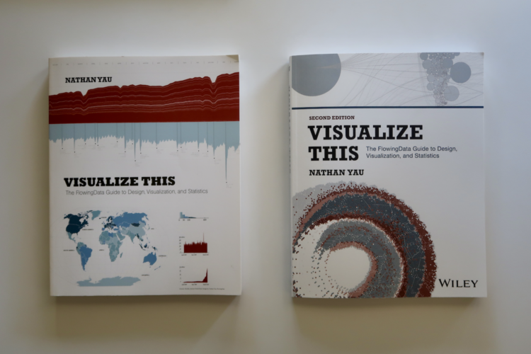
 Visualize This: The FlowingData Guide to Design, Visualization, and Statistics (2nd Edition)


