When you slow down your car, energy dissipates into the air as heat. What if your car could instead make use of that energy? Your car could run that much more efficiently and get more miles per gallon. GE explains such a system called dynamic braking (video below).
Read More
-
-
 Looking to get more serious about your data analysis? Data Analysis with Open Source Tools by Philip K. Janert can help you with that.
 The back cover reads:
Collecting data is relatively easy, but turning raw information into something useful requires that you know how to extract precisely what you need. With this insightful book, intermediate to experienced programmers interested in data analysis will learn techniques for working with data in a business environment. You’ll learn how to look at data to discover what it contains, how to capture those ideas in conceptual models, and then feed your understanding back into the organization through business plans, metrics dashboards, and other applications.
It’s a little over 500 pages and thorough about describing how to analyze your data. However, it is light in the “with open source tools” part of the title. Most of the time is spent explaining concepts, and then each chapter ends with a workshop, which includes some code. There are examples throughout, but few provide an explanation of how a plot was made or the implementation of a method. So definitely not a book for beginners.
Read More -
 In case you haven’t heard, O’Reilly’s new Strata Conference on “making data work” is coming soon February 1-3 in Santa Clara, California. It’s three days chock-full of data talks, tutorials, and events. And January 9 is the last day to get the early registration price.
 So if you’re thinking about going, I’d register soon. You might as well save a couple hundred bucks. Plus if you register via FlowingData, you get 25% off (and support your favorite data site in the process), which is applied at checkout.
There are a ton of speakers, including DJ Patil from LinkedIn, Philip Kromer from Infochimps, Hilary Mason from bit.ly, and Kim Rees from Periscopic (and technical editor for the upcoming FlowingData book). No doubt you will learn a lot and meet plenty of interesting people who are also into data.
-
This Tract, by Michal Migurski of Stamen, with some help from Craig Mod, lets you view details of your block by way of Census data. It’s still using 2000 data but was built in anticipation of the 2010 release, which should come in a couple of months. So we’ll probably see some improvements from now until then.
Enter your location or browse the slippy map for information on race, income, gender, education, age, and housing. There are also aggregates for your Census tract, county, state, and country.
Read More -
Zachary Seward for the Wall Street Journal gives some thought to what he does online via applications like Twitter and Foursquare. He notes, “[I just] ended up with this wealth of data.”
Lifelogging is often attached to obsessive tickmarking in notebooks and counting things that don’t need to be quantified. It keeps getting easier to collect data about yourself though, and in due time, lifelogging will feel so natural, you won’t even have to think about it until you’re reviewing your very own [insert name here]-tron report.
-
Rick Aschmann has made a hobby out of studying and mapping North American English dialects:
This is just a little hobby of mine, that I thought might be interesting to a lot of people. Some people collect stamps. Others collect coins. I collect dialects.
Aschmann goes on to explain the map:
There are 8 major English dialect areas in North America, listed below the map at left. These are shown in blue, each with its number, on the map and in the Dialect Description Chart below, and are also outlined with blue lines on the map. The first 6 of these begin at the eastern seaboard and proceed west, reflecting western settlement patterns.
There are even several hundred YouTube links clickable through the map that serve as subdialect samples. What dialect do you speak?
[Aschmann]
-
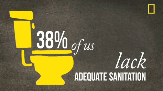
National Geographic argues a need for balance across the world population in the latest motion graphic video. As is usually the case with these, the video hits you with a lot of aggregate percentages and averages, but it’s well-produced and good enough to make you care.
Read More -
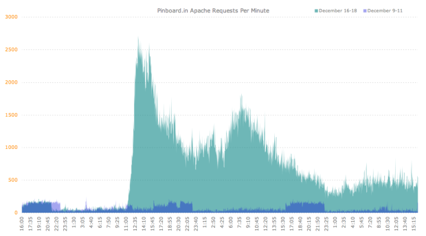
On news that Delicious is on Yahoo’s sunset list, thousands of people decided it was time to take a look at simplified competitor Pinboard. The much lower blue area is normal activity for the Pinboard servers, during a three-day period. The green represents activity after the Yahoo leak.
As a Delicious user for years, I really hope sunset means move to another company rather than shutdown.
Or maybe I’ll start bookmarking on my desktop via browser. Gasp. I don’t want to think about it. Oh the horror. The horror.
[Idle Words via @PinboardIn]
-
Interesting thread on Quora. I never gave it much thought, although I do have an infographics category, along with a few visualization categories. If I were to take a stab with a sentence I’d say: a visualization is the representation of data via geometry and math while infographics are a subset of visualization, where an actual human being had a hand in explaining the (hopefully interesting) points in the data in question.
Your turn. Sound off in the comments below.
-
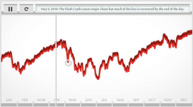
CNNMoney audiolizes the stock market in 2010 with the Dow Piano. Each day’s closing level determines the pitch played, and trading volume determines how loudly a note is played. Welcome to Dow Jones the musical.
[CNNMoney | Thanks, Dominique]
-
Inception was a complex film, so there was understandably some confusion over the levels and who was where. A couple of flowcharts tried to explain, but there was still some debate. So here is the flowchart to trump all other Inception flowcharts. It’s by Christopher Nolan himself. Any questions?
[In Contention via Waxy]
-
The Joy of Stats, hosted by Hans Rosling, is now viewable in its entirety (video below):
Hans Rosling says there’s nothing boring about stats, and then goes on to prove it. Only with statistics can we make sense of the world and harness the data deluge to serve us rather than drown in its confusion.
A one-hour long documentary produced by Wingspan Productions and broadcast by BBC, 2010.Originally, it was only viewable in the UK, and then there were some clips, but finally, you can watch the whole thing. It’s an hour long so you might want to bookmark it for later, but it’s entertaining all the way through. Plus, it’s the week between Christmas and New Year’s so I know you’re not working.
Read More -
In 1864, drawing on the most recent 1860 Census data, the United States Coast Survey issued this choropleth map depicting counties with relatively high slave populations. President Lincoln was seen looking over the map so often that it was included in Francis Bicknell Carpenter’s painting “President Lincoln Reading the Emancipation Proclamation to His Cabinet.”
Carpenter spent the first six months of 1864 in the White House preparing the portrait, and on more than one occasion found Lincoln poring over the map. Though the president had abundant maps at his disposal, only this one allowed him to focus on the Confederacy’s greatest asset: its labor system. After January 1, 1863—when the Emancipation Proclamation became law—the president could use the map to follow Union troops as they liberated slaves and destabilized the rebellion.
How’s that for a powerful map?
[New York Times | Thanks, Justin]
-
-
-
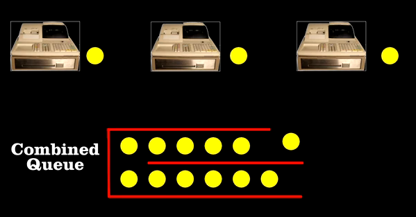
Why does it almost always seem like you’re in the slow line at the grocery store or in the driving lane with the most cars on the freeway? Bill “Engineer Guy” Hammack explains in terms of queuing theory in the video below:
Bill reveals how “queueing theory” – developed by engineers to route phone calls – can be used to find the most efficient arrangement of cashiers and check out lines. He reports on the work of Agner Erlang, a Danish engineer who, at the opening of the 20th century, helped the Copenhagen Telephone Company provide the best level of service at the lowest price.
Erlang found out how many telephone lines the company needed, given the average number of calls per hour. Similarly, you can figure out how many checkout lines you need, given the average number of customers. It turns out the best arrangement is to have a single line, and the next customer goes to the next available register. There’s less chance of blockage from a single delay.
But people don’t like doing that apparently, and so assuming random selection, ending up in the slow line comes down to simple probability.
Read More -
The Facebook Data Team had a quantitative look at status updates by age and content:
The chart on left confirms the typical stereotypes about younger and older people. Younger people express more negative emotions (including anger) and swear more. They use more pronouns referring to oneself (“I”, “my”, etc.) and talk more about school. Older people write longer updates, use more prepositions and articles, and talk more about other people, including their family.
Word categories are sorted by correlation, from greatest to least. Blue indicates positive correlations while red indicates negative.
Read More -
Antrepo wonders what it might be like if the labels on consumer products were stripped of all their flare and were to go semi-minimal and completely minimal.
Obviously some of them wouldn’t work from a practical perspective, because well, customers would have no idea what the product was, but from an information design and visualization perspective, it’s fun to think about. Strip out the extraneous until you can strip no more.
-
You’ve most likely seen a couple of views of the universe to provide a sense of scale. Main point: you’re tiny. Here’s another video. This one focuses on star sizes. it starts with our solar system and then moves up to VY Canis Majoris, the largest known star in the universe. The video was actually made last year, but still fun to watch. It’s got a few drops of dramatic music in there, too.
Read More -
For the Google Demo Slam, three animators Tu+, Namroc, and Metcalf Anything put together an animation completely in Google Docs. Three days, 450 slides, and they got the video below. A tool might be limited, but you can still get a lot done with a little bit of imagination.
Read More


 Visualize This: The FlowingData Guide to Design, Visualization, and Statistics (2nd Edition)


