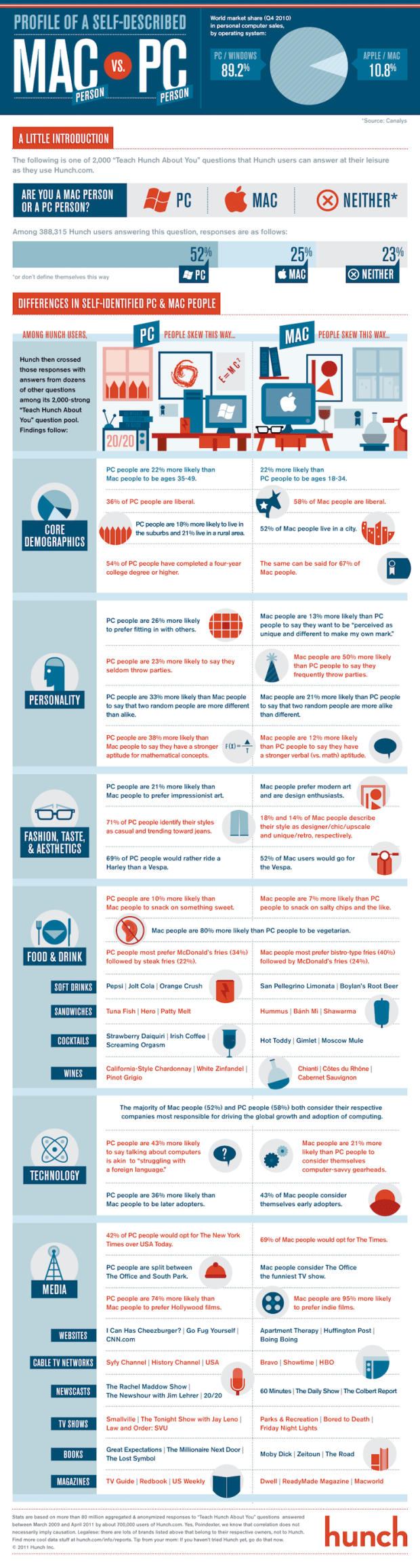
Recommendation site Hunch is another one of those applications that knows a ton of random stuff about its users. In case you’ve never signed up, you start by answering a bunch of seemingly unrelated questions, and based on your answers, Hunch offers recommendations by correlating your answers with preferences for you and others. This graphic, in collaboration with Column Five Media, shows differences between Mac and PC people within the Hunch community.
Among the findings: Mac people are 95 percent more likely to prefer indie films; PC people are 26 percent more likely to prefer fitting in with others; and as for cable TV networks, Mac people prefer Bravo, HBO, and Showtime, whereas PC people prefer Syfy, History, and USA.
[Hunch | Thanks, @trendyle]


 Visualize This: The FlowingData Guide to Design, Visualization, and Statistics (2nd Edition)


