I wish there was a way to slow down time. Another month whirled by just like that. In case you missed them, here are the most popular posts from the past month. Thanks again for sharing, tweeting, and liking. Every bit helps this little blog of mine reach a larger audience.
- Flash vs. HTML5
- Seven year itch: When do people get married and divorced?
- Plush statistical distribution pillows
- How to map connections with great circles
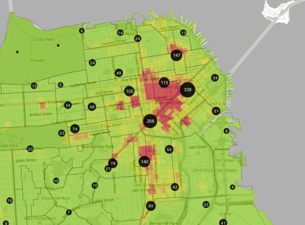
- Find everywhere you can go in 15 minutes or less
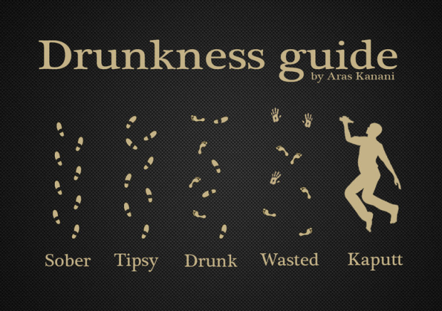
- MacGyver recipe book – All 7 seasons of diversions and mischief
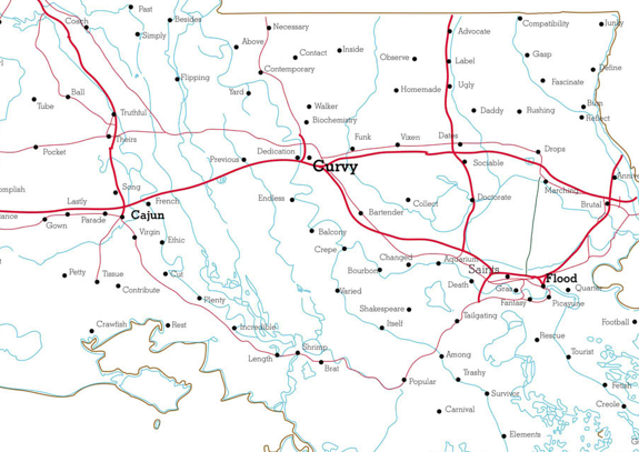
- Geography of hate
- A century of deaths and a lot of fake blood
- Why you shouldn’t eat farmed fish – a graphical explanation
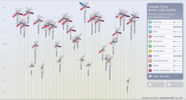
- Better Life Index measures well-being across countries


 The Pew Research churns out a lot of

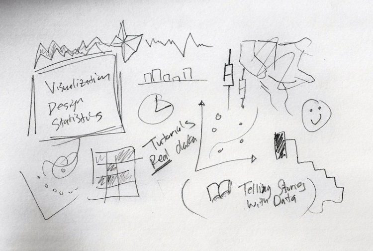
 Visualize This: The FlowingData Guide to Design, Visualization, and Statistics (2nd Edition)


