Twitter is an organic online location, full of retweets, conversations, and link sharing. Jeff Clark tries to show these inner workings with his newest interactive, Spot. Enter a query in the field on the bottom left, and Spot retrieves the most recent 200 tweets. You then can choose among five views: group, words, timeline, users, and source.
Each tweet is represented by the tweeter’s profile picture, and they rearrange themselves as you switch between views. The latter three views, timeline, users, and source, arrange tweets into bar charts. Fairly straightforward.
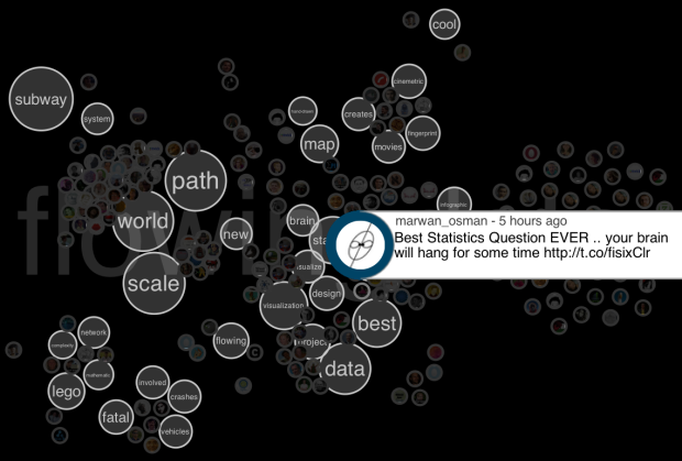
Spot gets interesting with the first two views though, groups and words. Tweets are arranged based on the words they use.
Above, for example, is the word view on the search “flowingdata.” Tweets cluster around words like world and data. Below is the same search, but with the groups view. Users who tweeted similar text (usually retweets) are grouped together. What jumped out at me was the group on the bottom with a single user’s face. That turned out to be a spammer.

Give it a try for yourself here.
 Visualize This: The FlowingData Guide to Design, Visualization, and Statistics (2nd Edition)
Nicely done.
I particularly found the “WORD” view as a useful way to get an overview of search-related topics. It groups tweets around them in a fuzzy way and let you see a quantitative trend. This is clearly something that cannot easily do with tables, compared to the other views.
Would be great to be able to interactively remove some words (such as silent words) and then make other words bigger. Also, the 2D layout makes the tweet-after-tweet exploration process quite difficult (e.g. how do I know I alread read a tweet?).. Therefore showing already selected tweets might help I guess (with a reddish border).
Here is a quite similar visualization in the same “organic” class http://dev.fabelier.org/bubble-t/
It’s been awarded by the Google Dataviz Contest on the French Elections last month. It also maps Twitter avatars as balls, but it is more dedicated to live monitoring of Tweet streams (in this case Tweets talking about the candidates). It also aggregates the tweet counts (at the bottom of the interface) during the last hours, days and a sparkline+wordcloud, etc. to so see trends.
PS: I posted my comments on this blog since 1) the http://neoformix.com does not allow comments, 2) my comments were longer than 140 characters