• Membership
  • Newsletter
  • Projects
  • Learning
  • About
  • Member Login
  • A global mood ring called Twitter

    October 7, 2011

    Topic

    Statistics  /  mood, Twitter

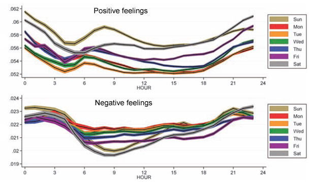
    In a follow-up to their mood maps, Scott Golder and Michael Macy of Cornell University look at mood cycles during the hours of the day:

    They found that, on average, people wake up in a good mood, which falls away over the course of the day. Positive feelings peak early in the morning and again nearer midnight, while negative feelings peak between 9pm and 3am. Unsurprisingly, people get happier as the week goes on. They’re most positive on Saturdays and Sundays and they tend to lie in for an extra two hours, as shown by the delayed peak in their positive feelings. The United Arab Emirates provide an interesting exception. There, people work from Sunday to Thursday, and their tweets are most positive on Friday and Saturday.

    It’s strange that good mood peaks around midnight. Maybe the people who are in a bad mood slowly go to sleep, leaving only those in a good mood to tweet. Then again, negative mood also seems to peak around midnight. Peculiar. I don’t have access to the full article, so if anyone does, I’d be interested to hear Golder and Macy’s interpretations.

    [Discover Magazine via @albertocairo]

  • Picturing the creative process

    October 6, 2011

    Topic

    Infographics  /  process

    The creative process changes by person and project, but there are obstacles and steps along the way that you tend to pass with each. Graphic designer Melike Turgut maps his own process. Start from the inside (research, reading, and learning), and make your way out (questions, ideas, and refinement).

    [Melike Turgut via @brainpicker]

  • Twitter users as organisms, Tweetures

    October 6, 2011

    Topic

    Data Art  /  creatures, Twitter

    Twitter is a bustling place of tweets, retweets, and replies, and the growth and spread of news can be very organic. After all, there are actual human beings using the service. Kunal Anand, Director of Technology at the BBC, played on this idea of Twitter as an ecosystem and created Tweetures.
    Read More

  • Kill Math makes math more meaningful

    October 5, 2011

    Topic

    Statistical Visualization  /  interactive, iPad, Kill Math, video

    After a certain point in math education, like some time during high school, the relevance of the concepts to the everyday and the real world seem to fade. However, in many ways, math lets you describe real life better than you can with just words. Designer Bret Victor hopes to make the abstract and conceptual to real and concrete with Kill Math.
    Read More

  • All numbers lead to one

    October 4, 2011

    Topic

    Network Visualization  /  Collatz, conjecture

    In 1937, mathematician Lothar Collatz proposed that given the following algorithm, you will always end at the number 1:

    1. Take any natural number, n.
    2. If n is even, divide it by 2.
    3. Otherwise, n is odd. Multiply it by 3 and add 1.
    4. Repeat indefinitely.

    Developer Jason Davies puts it into reverse and shows all the numbers that fall within an orbit length of 18 or less. Press play, and watch the graph grow. Mostly a fun animation for nerds like me.

    [Collatz Graph]

  • Submarine cable system connecting the world

    October 3, 2011

    Topic

    Maps  /  bandwidth, interactive, submarine

    TeleGeography maps underwater cables that connect countries and continents:

    TeleGeography’s free interactive submarine cable map is based on our authoritative Global Bandwidth research, and depicts 188 active and planned submarine cable systems and their landing stations. Selecting a cable route on the map provides access to data about the cable, including the cable’s name, ready-for-service (RFS) date, length, owners, website, and landing points. Selecting a landing point provides a list of all submarine cables landing at that station.

    Just imagining cables that stretch that far seems pretty amazing.

    [Thanks, Harvey]

  • Flowchart: Which of NPR’s top 100 science fiction and fantasy books should you read?

    September 30, 2011

    Topic

    Miscellaneous  /  books, flowchart, NPR

    SF Signal constructs a big arse flowchart to help you sift through NPR’s listener-picked top 100 science fiction and fantasy books. It’s big and scrolltastic. Check out full and printable version here. I end up at The Time Machine by Wells. You?

  • Most popular infographics generalized

    September 30, 2011

    Topic

    Miscellaneous  /  generic, humor

    Yep, still amusing. [via]

  • The Many Words for Visualization

    September 29, 2011

    Topic

    Discussion  /  terminology

    There are a lot of words to describe visualization and visualization-related things. It can be confusing. You just came across this thing with data and stuff, but what do you call it? Here I define what all those words mean. Keep in mind, I’m not so, uh, good with words and, uh, stuff, so yeah.

    Disclaimer: This is how I perceive the words. They are not official dictionary or academic definitions. Don’t use these in your next report or paper, unless you want to be laughed at.
    Read More

  • Live data wall and immersive film at THINK exhibit

    September 28, 2011

    Topic

    Data Art  /  event, IBM

    The THINK exhibit from IBM just opened up at Lincoln Center in New York, complete with data wall and immersive film. The former visualizes surrounding data in real-time, such as traffic, solar energy, and air quality. The formers puts you in a place with 40 seven-foot screens.
    Read More

  • The Fortune 500, 1955 to 2010

    September 28, 2011

    Topic

    Statistical Visualization  /  Ben Fry, Fortune 500, interactive

    Since 1955, Fortune Magazine has published a list of America’s 500 largest companies. What companies have risen to the top? Which ones have fallen? Ben Fry, of Fathom Information Design, visualizes the companies of past and present and how their rankings, revenue, and profit have changed.
    Read More

  • Deleted Geocities archive visualized as city

    September 27, 2011

    Topic

    Visualization  /  city, Geocities

    In a time long ago, there existed a place on the Internet called Geocities. People created pages and pages of blinking icons, brightly colored background, and everyone loved it. There was even MIDI music to set the mood. In 2009, Geocities was deleted, but the memories lived on thanks to the Archive Team. Information designer Richard Vijgen visualized these pages in an interactive piece called The Deleted City.
    Read More

  • Who does all the text messaging? Young adults by far.

    September 26, 2011

    Topic

    Projects  /  featured, Pew Research, texting

    The Pew Internet and American Life Project published the results of their texting study, showing that young adults text more than anyone else. The report refers to a lot of averages across demographics, but it seems that there were a lot of heavy texters driving up those averages. The medians are a lot lower. The chart above shows the latter.

    Even the median for young adults is still high though relative to other groups.

    At 29, I’m right at the edge of that young adult group, and I text maybe once or twice a month on average. Forty per day seems outrageously high. Kids these days.

  • Guides  /  beginners, census, pitfalls, Q&A

    5 misconceptions about visualization

    Last month, I had the pleasure of spending a week at the Census…

    Read More
  • Rectangular subdivisions of the world

    September 22, 2011

    Topic

    Maps  /  Eric Fischer, Flickr, subdivision

    Eric Fischer, who continues his string of mapping fun and doesn’t even do it for his day job, maps the world in binary subdivisions. Each bounding box contains an equal number of geotagged tweets. Read More

  • Musical spectrum analysis

    September 22, 2011

    Topic

    Data Art  /  music, spectrum, video

    Jon-Kyle Mohr visualizes the musical spectrum of a song in this mesmerizing video. As the song plays, frequencies bubble up in the 6-o-clock position, and the trace remains as the circle rotates.

    [Video Link via feltron]

  • Imager shows cross-sections of everyday objects – analog version

    September 21, 2011

    Topic

    Visualization  /  GE, imager, slices

    GE shows how their body imaging technology can take detailed pictures of insides without cutting, using fruit, a baseball, engine motor, and violin to demonstrate.

    Many body imaging devices follow a principle called tomography (the ‘T’ in CT, PET and SPECT systems), which take images of body “slices” using everything from projection data to powerful magnets. But have you ever wondered how such routine procedures can help clinicians see things that used to require a sharp knife? Watch how GE’s body imaging technology can paint a bigger picture of what’s happening beneath our skin.

    Update: I wasn’t paying close enough attention, and it turns out that these are actual, physical sliced objects. Like, with a saw. Now I’m left wondering what the point is.

  • Quick time series visualization with Cube

    September 21, 2011

    Topic

    Software  /  Cube, Mike Bostock, time series

    Seeing how things change over time can be important for a business so that you can figure out what works best. Square, the company that turns your iPhone into a credit card reader, just released Cube, an open-source system to help you visualize time series data. It’s built on MongoDB, Node, and D3.
    Read More

  • Page 305 of 391
  • <
  • 1
  • ...
  • 302
  • 303
  • 304
  • 305
  • 306
  • 307
  • ...
  • 391
  • >

Analyze, visualize, and communicate data usefully, beyond the defaults.

Become a member →

Recently for Members

May 8, 2025
When the data is not what it seems

May 1, 2025
Finding the Right Charts

April 24, 2025
Visualization Tools, Datasets, and Resources – April 2025 Roundup

April 17, 2025
Breaking Out of Chart Software Defaults

April 15, 2025
Line Chart with Decorative Neon Accents

Browse by Chart Type See All →

Frequency Trails Spiral Chart Dot Density Map Mosaic Plot Histogram Connected Scatter Plot Packed Bubble Chart Density Plot Area Chart

Browse By Topic

  • Visualization

    Seeing data

  • Maps

    Seeing geographic data

  • Infographics

    Explaining data

  • Networks

    Connecting data

  • Statistics

    Analyzing data

  • Software

    Working with data

  • Sources

    Getting data

  • Design

    Making data readable

Get the Book

Visualize This: The FlowingData Guide to Design, Visualization, and Statistics

Available now.

Order: Amazon / Bookshop

Made by FlowingData

  • The Process

  • Data Underload

  • Chart Everything

  • Guides

  • Books

  • Shop

  • About
  • Contact
  • Newsletter
  • LinkedIn
  • Instagram
  • Bluesky
  • RSS
Copyright © 2007-Present FlowingData. All rights reserved.