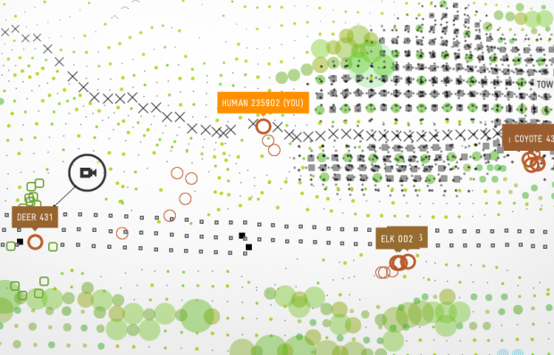
Visualize This: The FlowingData Guide to Design, Visualization, and Statistics

Learn to data.

  • You might recall that the United Nations Statistics Division launched UNdata about one week short of a year ago, which was an improvement on the previous United Nations Commons Database. UNdata provides a gateway into 22 United Nations databases and 66 million records. Yeah, it’s a lot of data, but what do we do with it? What does it mean? Progress: A Graphical Report on the State of the World is a modest attempt to make some sense of it all; and by all, I mean a small subset.
    Read More

  • If you haven’t won anything in our 10k giveaway yet, there’s about 4 more hours to enter three remaining giveaways here, here, and here. Enter now, because you know there is no better price than free. That is all. Good luck. Ok bye.

  • Google’s chief economist tells us statistician will be the sexy job of the next decade. Now Microsoft provides its vision for 2019 (video below):

    <a href="http://video.msn.com/?mkt=en-GB&#038;playlist=videoByUuids:uuids:a517b260-bb6b-48b9-87ac-8e2743a28ec5&#038;showPlaylist=true&#038;from=shared" target="_new" title="Future Vision Montage">Video: Future Vision Montage</a>

    The future for 2019 looks a lot like data visualization and some serious data processing, yeah? So you better get ready. Hop on to the band wagon before all the seats are taken. The future sure is lookin’ good. Check out the extended version of the above video in the link below.

    [via istartedsomething | Thanks, dx0ne]

  • If you haven’t read Malcolm Gladwell’s Tipping Point: How Little Things Can Make a Big Difference, you’re gonna wanna do that. I mean, there’s a reason this book was a national bestseller. Good thing the next prize up for grabs is… Malcom Gladwell’s Tipping Point. This giveaway is a quick one. The deadline is Feb 27, 8pm EST.

    How to Enter

    Super easy. Leave a comment below. That’s it! The winner will be randomly selected at the deadline. Good luck.

    UPDATE: This giveaway is now oooovvva. Thanks for participating, everyone! This is the last prize announcement in for our 10k giveaway, but there are still three giveaways still going on here, here, and here about to come to an end so get your entries in quick.

  • I figured out how I am going to get rich, and I’m going to share my secret with you. I’m going to become a high-profile banking executive, do a horrible job, get fired, and then end up rolling in cash. You think to yourself, “Uh, that doesn’t sound right you crazy kook.” Ah, but that’s where you’re wrong. That’s the American way! In the below infographic slash comic, we see executives stepping down from their top-floor, corner office with millions of dollars and a golden parachute to slow down the fall.
    Read More

  • If there’s anything good that has come out of America’s financial crisis, it’s the interesting and high-quality infographics. This isn’t one of them. Below is an ill-conceived bubble chart from BillShrink that “shows” average U.S. consumer spending. Notice anything wrong with it?

    Bar versus bubble debate aside, there is a ton of room for improvement as well as huge need for some fact-checking and common sense. For a blog on a site for personal finance, the graphic is, well, not something to be proud of. FlowingData readers know that I like to stay away from heavy-handed critique on what works and what doesn’t (I leave that to you guys), but this BillShrink graphic is just so clearly confusing that it’s worth pointing out what doesn’t work so we can learn from others’ mistakes. Can you find the flaws?

    [Thanks, Jess]

  • The New York Times homepage has a lot of news to report. While well-organized and well-designed, the Times recognizes that there’s still room for improvement as seen in their article skimmer prototype:

    Here at The Times, we often hear a common story of usage from our customers: Reading the Sunday Times, spreading out the paper on a table while eating brunch. For many of our customers, this ritual is fundamental to their enjoyment of the weekend, and its absence would be jolting.

    With this in mind, we present an as-yet-unnamed article skimmer. Think of it as an attempt to provide the Sunday Times experience anytime. Of course, there are parts we can’t replicate: the satisfying crinkle of the paper; the circular stain of your coffee; the smell of newsprint.

    Article headlines and snippets are arranged by grid and divided by news categories. Jump to a specific category with the sidebar on the right or browse up and down with the arrow keys on your keyboard. I personally think it makes skimming easier. What do you think?

    [via NYT First Look via Waxy]

  • I keep saying the sexy job in the next ten years will be statisticians. People think I’m joking, but who would’ve guessed that computer engineers would’ve been the sexy job of the 1990s?

    Hal Varian, The McKinsey Quarterly, January 2009

    Varian then goes on to say:

    The ability to take data – to be able to understand it, to process it, to extract value from it, to visualize it, to communicate it’s going to be a hugely important skill in the next decades, not only at the professional level but even at the educational level for elementary school kids, for high school kids, for college kids. Because now we really do have essentially free and ubiquitous data. So the complimentary scarce factor is the ability to understand that data and extract value from it.

    I think statisticians are part of it, but it’s just a part. You also want to be able to visualize the data, communicate the data, and utilize it effectively. But I do think those skills – of being able to access, understand, and communicate the insights you get from data analysis – are going to be extremely important. Managers need to be able to access and understand the data themselves.

    Wait a minute. Is this a pitch for FlowingData? I think so :). Check out the full article for more (or listen to the podcast). It’s an interesting read.

  • GOOD Magazine, in collaboration with Robert A. Di Leso, Jr., explores fuel use by various modes of transportation. In what is essentially a fancied up bar chart, we see how many gallons of fuel it takes for a passenger to travel 350 miles by cruise ship, Amtrak, Boeing 737, Sedan, hybrid, etc. A couple of non-fuel modes of transportation are included as well using caloric conversions. It’ll take about 48 Whoppers with cheese to walk 350 miles. Good to know, especially since I was planning on walking 350 miles today. Totally kidding. I’m walking 360. Like a circle.

    [Thanks, Lawrie]

  • Want some easy-to-use online dashboard software? The next prize up for grabs is for you then – a one-year subscription to SiSense. This one will be especially useful for anyone who runs a business.

    The deadline for this giveaway is Monday, March 2, 8pm EST.
    Read More

  • I’m a WallStats fan, so I was especially excited when Jess put up two 389 Years Ago posters for the 10k giveaway. One is limited edition, and the other is really limited edition. Whoever wins these bad boys should thank their lucky stars. The deadline for this giveaway is Friday, Feb 27 at 8pm EST.

    Prize Description


    The 389 Years Ago Poster by Jess Bachman is a “typographic mashup of black history” and was inspired by Barack Obama’s victory in November. It’s a honker of a poster measuring in at 16″ wide and 46″ tall. It begins 389 years ago when the first slave ship landed in American colonies and then progresses to the first African American president, Barack Obama. There are only 389 of the above poster. One of them could be yours. On top of that, there is also a color variant of the 389 poster:

    There are only 44 of these, and one of them is part of this giveaway.

    How to Enter

    Post to this thread in the FlowingData forums. Introduce yourself, tell us what you’re interested in, your favorite food, drink, animal, number, etc and where you will put the poster if you win it. Two winners will be chosen at random on Friday – one for the original 389 poster and one for the color variant. One entry per person please. Good night and good luck. That was a good movie.

    UPDATE: We’ve wrapped this one up. Thanks for participating, everyone. I thoroughly enjoyed all the introductions in the forums. Congratulations to our two poster winners! I’m jealous.

  • You might not realize it, but there’s a lot of junk that orbits around the Earth. The North American Aerospace Defense Command (NORAD) tracks anything in orbit that’s bigger than a softball and then disseminates that information in the form of an orbit descriptor called a Two Line Element (TLE). Matthew Kozak visualizes this data on an interactive 3D globe. It’s implemented in Processing, and maybe best of all, the source code is available.

    [Thanks, @Dan]

  • I majored in computer science. I hated it. I ran from it like the black plague. That was then though. This is now. It turns out that programming can actually be fun, and when you know how to program – if even just a little bit – it completely changes the way you deal with and visualize data, which is why Processing: Creative Coding and Computational Art is next up on the giveaway.

    The deadline for this one is the end of today: Feb 20 at 8pm EST.

    Prize Description

    Processing is a programming language that can help beginners do stuff with code they never thought possible. The learning curve is pretty shallow, and you get a lot of bang for your buck with surprisingly very little effort. That doesn’t mean it’s limited in what it can do though. Built on top of Java, Processing lets you do pretty amazing things when you know what you’re doing.

    Processing: Creative Coding and Computation Art will help you in your path to coding enlightenment. “Create code, art, visualizations, and interactive applications with this powerful yet simple computer language and programming environment / Take a creative and fun approach to learning creative computer programming.” I think that sums it up nicely.

    How to Enter

    Leave a comment below that answers this question: What is data visualization? Make your answer an essay, a paragraph, a sentence, a word, a picture… OK, pretty much anything. The winner will be randomly selected at the end of today. Good luck.

    Find giveaways still in progress here, here, and here.

    UPDATE: This giveaway is now closed. The winner will be receiving an email shortly. Thanks for participating all. Keep watch for more giveaways on Monday.

  • Dan Meth plots out the trilogy meter – a series of charts that show his level of enjoyment of each movie in the trilogy:

    These are rated purely on my enjoyment level on each film and nothing else. Frankly I’m surprised by how many sequels were better than the original. And I’m not surprised that the 3rd movie is never the best.

    Perhaps more surprising is that Dan’s actually seen so many full trilogies, especially after the second in a series sucking so bad.

    [via Dan Meth | Thanks, Chris]

  • Where does all of our tax money go? Well, here’s your chance to find out. Graphic designer Jess Bachman from WallStats has kindly put up three Death and Taxes posters for our 10k giveaway. This one ends Sunday, Feb 22 at 8pm EST.

    Prize Description

    After the popularity of the 2008 Death and Taxes poster, naturally there had to be a Death and Taxes: 2009.

    “Death and Taxes: 2009” is a representational poster of the federal discretionary budget; the amount of money that is spent at the discretion of your elected representatives in Congress. Basically, your federal income taxes. The data is from the President’s budget request for 2009. It will be debated, amended, and approved by Congress by October 1st to begin the fiscal year.

    The poster provides a uniquely revealing look at our national priorities, that fluctuate yearly, according to the wishes of the President, the power of Congress, and the will of the people. If you pay taxes, then you have paid for a small part of everything in the poster.

    Here are a couple of shots:

    Check out the full, zoom-able, pan-able version to get the full effect. Jess goes into tremendous detail on how our tax money is spent and it’s one of those posters where you’ll see something new every time you look at it. It was even featured on Martha Stewart:

    How to Enter

    Like I said, there are three posters up for grabs in this round of the giveaway. All you have to do is promise that you will tell at least one person about WallStats in the comments below. Easy enough. Three winners will be randomly selected at the end of Sunday. Needless to say, make sure you enter a valid email address so we can contact you when you win. Good luck!

    Stay tuned. There are some book giveaways coming up.

    UPDATE: Finito. If you haven’t received an email from me yet, keep an eye out for more giveaways this week. The other WallStats poster, 389 Years Ago, is coming up very soon.

  • Seed Magazine, a publication dedicated to cool things in science, give us The Universe in 2009:

    In 2009, we are celebrating curiosity and creativity with a dynamic look at the very best ideas that give us reason for optimism. Rethink your assumptions and post better questions about the future.

    The Universe in 09 is essentially a simple mosaic where each tile is an idea. There’s something that resembles a bar graph up top. Each bar represents a category, and as you scroll over a category, the height of the bar represents the numbers of ideas in that category (I think). It’s not meant to be analytical really. It’s mostly for fun, and they did a pretty good job at accomplishing that goal. The interaction is pretty entertaining. Check it out for yourself.

  • This is a special edition of Visualize This. Why? I’m glad you asked. Since our FlowingData 10k giveaway is now underway, it seemed fitting that we put up some prizes this time around. InfoSoft Global has generously donated three FusionCharts Professional Licenses valued at $499 each. This Visualize This will go the length of the 10k giveaway, so you’ve got lots of time to enter. Get your entries in by March 3, 8pm EST for your chance to win a FusionCharts Professional license.

    Prize Description

    FusionCharts lets you create animated and interactive Flash charts for online or desktop. Couple FusionCharts with InfoSoft’s other products like FusionWidgets and FusionMaps, and you’ve got yourself the necessary tools to create a very worthwhile information dashboard. Use it in your web applications, personal data collection, in your business, or anywhere else you need to visualize data. FusionCharts can be integrated with just about all the major web technologies (e.g. ASP, ASP.NET, PHP, JSP, ColdFusion, Ruby on Rails, Python, HTML, MS SQL, Oracle, MySQL, PostgreSQL, CSV…) and the FusionCharts group has aimed to make things easy with very little code. Is that enough to whet your appetite? You’re good? OK.

    How to Enter

    Unlike previous Visualize This projects, I’m not going to post a specific dataset. Instead, create a dashboard using the no-restriction trial version of FusionCharts on the theme of education and then post a link to to your entry to this thread in the FlowingData forums. If you haven’t registered in the forums yet, you’ll want to do that first.

    The trial version of FusionCharts has all the same functionality as the licensed one, so go wild. You are also welcome to use any of other of the InfoSoft products in your dashboard. Make it clean, make it sexy, and most importantly, make it informative.

    Feel free to focus on education data for just your area or make a dashboard for your entire country. Look at elementary schools, colleges, private schools, or all of the above. The key is to make a dashboard for a branch of education that interests you.

    Here are some education data sources to get you started:

    Got any others? Please post them in the comments.

    The three best dashboards (chosen by me and readers) will each be awarded a FusionCharts Professional License. Good luck! I’m looking forward to seeing what you all come up with (and can we please make it more active than the last one?? By the way – thanks, Hadley).

    Download the trial version of FusionCharts here.

    Stay tuned. Awesome infographics posters coming up tomorrow.

    UPDATE: The 10k giveaways is no finito. Thanks for participating everyone.

  • The Barack Obama administration is clearly making an effort to get information out to the public. We saw the plan to distribute billions of dollars to help our economy. Obama has now launched Recovery.gov as a way for you to keep track and understand where $787 billion from the American Recovery and Reinvestment Act is used.
    Read More

  • It’s time for the first competition of our 10k giveaway. Not only is this first prize super awesome, but we’ve made it extremely easy to enter to win. This one’s going to be open until March 2, 8pm EST, so you’ve got PLENTY of time to enter.

    Prize Description

    Tableau Software aims to make “databases and spreadsheets understandable to ordinary people” with an emphasis on statistical visualization and visual analysis. It’s won a number of awards and has applications in business intelligence, web analytics, database marketing, university statistics, data analysis, and the occasional FlowingData Visualize This challenge. Also, one of the co-founders was a founding member of Pixar. Need I say more? Take a look at what you can do with Tableau in their Visual Examples section. The Tableau Personal Edition is valued at $999.

    How to Enter

    This is super easy. First, follow Tableau on Twitter. Second, go to this page. How many days is the Tableau trial version functional for? Send the answer and oh what the heck, your favorite color in an @reply to Tableau on Twitter in the following exact format:

    “@tableau @flowingdata 10k giveaway answer: <some number> <favorite color>”

    Of course replace <some number> and <favorite color> appropriately. Please only send your answer once, and it has to be via Twitter. Don’t post your answers here. On March 2, a winner of a brand-spankin’ new Tableau Personal Edition will be randomly selected. Good luck!

    UPDATE: That’s a wrap! Thanks for participating, everyone.

  • Alright, let’s get this giveaway going. I hope you’re all as excited about this as I am. Below are the prizes that will be given out over the next two weeks in no particular order – most provided by generous sponsors and a few books thrown in by myself.

    The contest sponsors were very generous to donate all these prizes, so I hope that you will return the generosity and give them a big, fat thank you by visiting them.

    The Prizes

    Again, thank you, FlowingData readers for spreading the word, leaving comments, and participating in forum discussions. I’m proud of the community that we’ve developed together, and look forward to whatever it is to come. Also, thank you to FlowingData sponsors for helping FlowingData reach its full potential.

    Let the games begin! Don’t forget to subscribe to the FlowingData feed to stay updated on the giveaway.