Think about when you take a picture of something. It’s kind of like placing a spotlight on that person or object and then pressing a button for a snapshot. In the case of significant landmarks in city, thousands of spotlights are projected every year. For a student project at the Interface Design program at FH Potsdam, Sebastian Schwinkendorf and Matthias Löwe use this idea as the basis of Splendor.
Read More
-
-
Maps aren’t just a way to see directions from point A to point B anymore. In some cases, they’re not even meant to show location. Rorschmap by James Bridle is a kaleidoscopic map that is more eye candy than anything else:
Rorschmap is cartographic navel-gazing, a reframing of the map. It will not help you find anything. We are bored with your squares and your margins. We want new shapes and new dimensions, the unicode snowmen of visual representation. †‡†, as the man said.
Enter a location and Rorschmap does the rest. Click go on the top right and the map will start to pan, which makes for a pretty animation.
[Rorschmap via Waxy]
-
Kevin Slavin, chairman and co-founder of Area/Code, describes how algorithms (processing tons and tons of data) are intertwined with our day-to-day and how they will change our future.
And the thing is is that this isn’t Google. This isn’t information. These aren’t financial stats; this is culture. And what you see here, or what you don’t really see normally, is that these are the physics of culture. And if these algorithms, like the algorithms on Wall Street, just crashed one day and went awry, how would we know, what would it look like?
Probably gloriously frightening. Watch the TED talk below.
[How algorithms shape our world | Thanks, Liam]
-
Simon Rogers, for The Guardian, outlines the new, hot trend on the block data journalism. It’s a good, quick bullet list for what it’s all about. Rogers thinks back:
Two years ago, when we launched the Datablog, all this was new. People still asked if getting stories from data was really journalism and not everyone had seen Adrian Holovaty’s riposte. But once you’ve had MPs expenses and Wikileaks, the startling thing is that no-one asks those questions anymore. Instead, they want to know, “how do we do it?”
Further down, he notes:
You can become a top coder if you want. But the bigger task is to think about the data like a journalist, rather than an analyst. What’s interesting about these numbers? What’s new? What would happen if I mashed it up with something else? Answering those questions is more important than anything else.
That is what an analyst does though. A good one at least. If you’re an analyst (or a statistician) and you’re not asking what’s interesting about the numbers, then you’re in the wrong profession. So really, if you’re a statistician, you very well could take up data journalism. Or another job with data in the title.
A natural reaction to statistics, even among some statisticians, is that once you graduate you either go into research or you work as a number-crunching monkey. If that’s your thing, go for it with gusto, but if not, there’s a lot of opportunity out there and on the way (in a variety of fields) for stat people — data journalists, information designers, data scientists, analysts, data artists, or whatever you want to call it. At the core, it’s working with data, and that’s what statisticians do best.
-
Sarah Kessler and Nick Sigler examine the interconnectedness between major tech companies. I think this might be the beginnings of a tech version of Six Degrees of Kevin Bacon.
-
Mark Johnstone uses a cake metaphor to represent data, presentation, and what you gain. Does the metaphor work? Sound off in the comments below.
-
World population is estimated to be 6.9 billion people, and while that is a lot of people, it suddenly doesn’t seem like that much in these maps by Tim De Chant of Per Square Mile. Simply imagine that the world lived with the same density of a real city, and see how much area they take up. If we all lived like they do in San Francisco (space-wise), we’d take up just under 398k square miles, or rather, only four states. Same density as New York? We’d all fit in Texas.
-
The US continues to rack up more and more debt, with a deficit in the trillions. But how did we get here? Teresa Tritch for The New York Times examines:
In 2001, President George W. Bush inherited a surplus, with projections by the Congressional Budget Office for ever-increasing surpluses, assuming continuation of the good economy and President Bill Clinton’s policies. But every year starting in 2002, the budget fell into deficit. In January 2009, just before President Obama took office, the budget office projected a $1.2 trillion deficit for 2009 and deficits in subsequent years, based on continuing Mr. Bush’s policies and the effects of recession. Mr. Obama’s policies in 2009 and 2010, including the stimulus package, added to the deficits in those years but are largely temporary.
Predicting the future is a tricky game. Even if you do have Grays Sports Almanac.
[New York Times via Waxy]
-
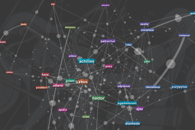
There are lots of people on Twitter who talk visualization. Moritz Stefaner had some fun with Gephi for a view of a whole lot of those people. He calls it the Vizosphere.
Read More -
There are many brands on Twitter that exist to uphold an image of the company they represent. As consumers, we can communicate with these accounts, voicing praise or displeasure (usually the latter). Using a simple sentiment classifier1, I scored feelings towards major brands from 0 (horrible) to 100 (excellent) once a day for five days.
The above for example, shows scores for Netflix, Hulu, and Redbox. Netflix had the lowest scores, whereas Redbox had the highest. I suspect Netflix started low with people still upset over the price hike, but it got better the next couple of days. Then on Saturday, there was a score drop, which I’m guessing was from their downtime for most of Saturday. Hulu and Redbox, on the other hand, held more steady scores.
Read More -
In May 2011, the United States owned $14.3 trillion in debt. A lot of that is money is owed to other countries. Heather Billings and Todd Lindeman of The Washington Post break foreign debt down by continent and then by country.
Read More -
The phrase “you are what you eat” usually refers to health and weight, but the food in your fridge can say a lot about who you are, what you do, and where you’re from. Photographer Mark Menjivar used this premise in his series You Are What You Eat.
Read More -
Poop. Doo doo. Crap. Shit. Oddly enough these are the first words of the Gates Foundation’s new informational video on reinventing the toilet. Learn about the toilet revolution and how to turn crap into valuable crap.
[Video Link | Thanks, Nigel]
-
Remember when Joshua Koffman was posting pictures of the guy who had this stolen Macbook? That was oddly fascinating, even if it was peeking in on a pretty mundane day-to-day. Brian House, who works at The New York Times R&D lab, did something similar sentiment but different approach.
Read More -
BBC Radio 5Live has a new podcast up: Looking at ourselves. The first half takes a trip to the London Transport Museum, and in the second, I chat with Jamillah Knowles about visualization, data, and the book. Download the full podcast here. It’s weird how you sound completely different in real life from what you sound like in your head.
-
Last week I announced the release of Visualize This: The FlowingData Guide to Design, Visualization, and Statistics, and I have to admit: I was addicted to the listing on Amazon, which shows sales rank, that day. At its peak, it broke the Amazon overall top 100, all the way up to #77. Of course the dust has settled, but it’s still been doing well. I can’t thank you all enough for the support.
Read More -
It’s easy to share static graphics. Save an image and then upload it to your own site. Boom, you’re done. However, when it comes to interactive graphics, which come in a variety of file formats, it’s not as straightforward. The Visualizing Player helps with this:
We love and respect what you create and we know how much effort goes into each piece (it’s why everything that gets uploaded to Visualizing is protected under a CC license). One of our core missions here at Visualizing is to build you the best possible platform and the most powerful tools for sharing those creations.
Now when you go to Visualizing, there’s an embed code accompanied with each graphic, and it’s easy to share any visualization on your own blog or site. The embed works for 7 formats: HTML5, Java, Flash, PDF, Video, Image, and URL.
Read More -
It’s a given that some colleges and programs give more A’s than others, but according to data collected by Stuart Rojstaczer from about 230 schools, it seems that average GPAs have been increasing overall.
Read More -
xkcd pokes fun at correlation and causation again. Funny every time.
-
A few months ago there was a lot of hoopla around the iPhone and the recording of your location. Crowdflow wants to take advantage of this opportunity to build an open database of location traces that people can use for research. Using their existing data so far, from 880 phones, Michael Kreil of Crowdflow mapped people moving around in Europe (in Germany for the most part). The results are beautiful.
Read More