• Dominic Basulto parallels the urban metrosexual to those who collect personal data.

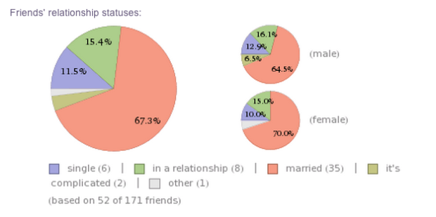
    The same cultural zeitgeist that gave us the metrosexual – the urban male obsessive about grooming and personal appearance – is also creating its digital equivalent: the datasexual. The datasexual looks a lot like you and me, but what’s different is their preoccupation with personal data. They are relentlessly digital, they obsessively record everything about their personal lives, and they think that data is sexy. In fact, the bigger the data, the sexier it becomes. Their lives — from a data perspective, at least — are perfectly groomed.

    The difference is that metrosexuals spend their time accentuating their best features and hiding their flaws, whereas personal data collectors spend their time at Quantified Self meetups telling others the weird and interesting things they found.

  • Robert Kosara contrasts my version of the pay gap graphic with the NYT original and notes how small changes make a big difference in how a graphic reads.

    But what Nathan’s version is missing is the story. The additional data mostly adds confusion: move your mouse over the year in the lower right, and what do you see? Lots of points are moving around, but there doesn’t appear to be a clear trend. The additional categories are interesting, but what do they add?

    Not much. When I was putting together the graphic, I was hoping for a clear trend — something so obvious that didn’t have to be explained. Instead I got fuzzy results. And that’s where I stopped. On the other hand, the NYT version explains those fuzzy results, namely the outliers, such as women CEOs who work for non-profits or the greater percentage of men in medical specialties like surgery.

    In analysis, assuming the users are experts of their data, annotation is less important. It’s about allowing them to stay nimble and ask/answer a lot of questions. Graphics that tell stories with data, however, already have something interesting to say.

  • A couple weeks ago, I looked at gender pay gap data to see how the differences have changed over the past nine years. This was after seeing Narrow the Gapp by Gina Trapani and then a Time Magazine cover story on how more women are becoming the main earners of households. A little after that, Mike Bostock posted his D3 port of GapMinder’s well-known Wealth & Health of Nations, and the New York Times interactive by Hannah Fairfield and Graham Roberts from 2010 came to mind. My idea was to combine the two as a recreation of the latter, with a couple of my own interactions. I went to work on a bunch of horrible government PDFs and then pulled it all together.
    Read More

  • Your online visualization options are limited when you don’t know how to program. The Miso Project, a collaboration between The Guardian and Bocoup, is an effort to lighten the barrier to entry.

    While the goal is to build a toolkit that makes visualization easier and faster, the first release of the project is Dataset, a JavaScript library to setup the foundation of any good data graphic. If you’ve ever worked with data on the Web, you know there are a variety of (usually painful) steps you have to go through before you actually get to fun stuff. Dataset will help you with the data transformation and and management grunt work.

    One of the most common patterns we’ve found while building JavaScript-based interactive content is the need to handle a variety of data sources such as JSON files, CSVs, remote APIs and Google Spreadsheets. Dataset simplifies this part of the process by providing a set of powerful tools to import those sources and work with the data. Once data is in a Dataset, it becomes simple to select, group, and calculate properties of, the data. Additionally, Dataset makes it easy to work with real-time and changing data, which pose one of the more complex challenges to data visualization work.

    Gonna keep an eye on this one. I’m curious to see how the visualization component starts to build out.

  • The BitTorrent protocol lets groups of people download parts of a single file from each other, so instead of one file from a single source, you get multiple bits from different places. Artist Conor McGarrigle shows this activity via an episode of Mad Men, as it’s downloaded.

    The video captures an episode of the popular TV show in the act of being shared by thousands of users on bittorent with the corruption of the file a direct result of the bittorrent protocol. The video acts as a visualisation of bittorrent traffic and the practice of filesharing and avoids infringing the copyright of Madmen as it is incomplete. Curiously the greater number of simultaneous users sharing the file the more aesthetically pleasing are the distortion effects.

    Poetic almost.

    [via Waxy]

  • Live flight tracking site FlightAware shows destinations and current routes. It’s everyday stuff for the most part, but around noon time today, a plane was circling above the ocean and crashed into the Gulf of Mexico.

    CNN reports:

    The Air Force, which had dispatched fighter jets to monitor the twin-engine Cessna 421, reported it crashed about 12:10 p.m., said Lt. Cmdr. Christopher O’Neil, a Coast Guard spokesman. The aircraft had been circling over the Gulf about 200 miles south of Panama City, Florida, another spokesman, Chief Petty Officer John Edwards, told CNN.

    The plane took off from Slidell, Louisiana, en route to Sarasota, Florida, with a single pilot on board, a Federal Aviation Administration source told CNN. It had been circling at an altitude of about 28,000 feet.

    Whoa.

    [via @DataJunkie]