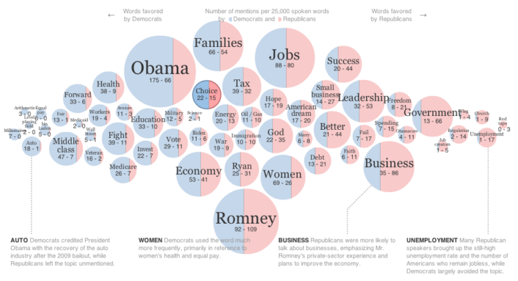
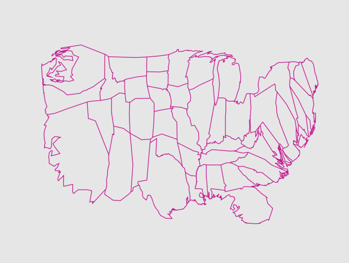
Doghouse Diaries maps bed regions. I relate to this. [Thanks, Robert]
-
-
-
PhD student Adrien Friggeri demonstrates a new clustering algorithm with a visualization of the agreement groups within the United States Senate over time.
As you might imagine, there are two obvious groupings, Republican and Democrat. It gets interesting though when you look at Democrats classified as Republicans and vice versa. For example, the 11 Republicans placed in the Democratic group of the 110th Congress:
Most of whom are either moderates or closer to the Democrats than to their own party. Charles Hagel was critic of the Bush Administration which he described as “the lowest in capacity, in capability, in policy, in consensus — almost every area” of any presidency in the last forty years. George Voinovich has been known to oppose lowering taxes and frequently joined the Democrats on tax issues. John Warner is a moderate Republican and has centrist stances on many issues, to the point that he once faced opposition of other members of his own party when he decided to run for re-election.
Be sure to click on the gray boxes to follow the trajectories of different cohorts.
-
-
-
What used to be a small specialty in a few newsrooms has grown some larger wings in the past couple of years. The challenge though is that a lot of journalists aren’t used to handling, let alone analyzing, a lot of data. The free and open source Data Journalism Handbook, a set of guides and case studies, hopes to help with that.
It was born at a 48 hour workshop at MozFest 2011 in London. It subsequently spilled over into an international, collaborative effort involving dozens of data journalism’s leading advocates and best practitioners – including from the Australian Broadcasting Corporation, the BBC, the Chicago Tribune, Deutsche Welle, the Guardian, the Financial Times, Helsingin Sanomat, La Nacion, the New York Times, ProPublica, the Washington Post, the Texas Tribune, Verdens Gang, Wales Online, Zeit Online and many others.
At a glance, looks like a promising resource, even if you’re not a journalist.
-
The MIT SENSEable City Lab, in partnership with BBVA, visualizes spending in Spain during Easter of 2011. The animation shows the activity of 1.4 million people and 374,220 businesses, over 4 million transactions.
The map is less interesting to me since I’m a non-Spaniard (population density?), but the categorizations and spending volume over time is fun to see. Groceries are shown in blue, gas stations in yellow, fashion in pink, and red in bars and restaurants. During the day, you see people filling up the tank, and then as evening comes, the city centers and coast lights up red.
[via @pkedrosky]
-
-
-
About three years ago, I shared 37 data-ish blogs you should know about, but a lot has changed since then. Some blogs are no longer in commission, and lots of new blogs have sprung up (and died).
Today, I went through my feed reader again, and here’s what came up. Coincidentally, 37 blogs came up again. (Update: added two I forgot, so 39 now.) I’m subscribed to a lot more than this since I don’t unsubscribe to dried up feeds. But this list is restricted to blogs that have updated in the past two months and are at least four months old.
Read More -
-
Members Only
These tend to be made ad hoc and are usually pieced together manually, which takes a lot of time. Here’s a way to lay the framework in R, so you don’t have to do all the work yourself.
-
-
The Eatery app by Massive Health lets people snap pictures of their food and rate the healthiness. The premise is that you don’t have to carefully count calories to lose weight. You just need to be more aware of what you eat. Using 7.68 million ratings over a five-month span, Massive Health maps eating healthiness over an aggregated 24-hour time window.
Mouse back and forth over the map slowly to see the changes. It’s interesting that as night falls, desserts and midnight snacks make themselves known and then the green comes back in the morning.
[Thanks, Thomas]
-
-
It feels oh so wrong posting about bad charts in a report about happiness around the world, but here you go. I do it for you. The first World Happiness Report was released by the United Nations earlier this month. It’s filled with gems like the 3-d bar chart above. Notice the axis that starts at 0.66. (You shouldn’t do that because length is the visual cue here, and it makes the differences look greater than they actually are.)
Read More -
-
I listen to a lot of podcasts. They make my workouts much more enjoyable. For the most part though, I only listen to ones about sports and more general podcasts about design, technology, and working from home. However, a couple of months ago, Enrico Bertini and Moritz Stefaner started Data Stories, a podcast on visualization. Enrico is a researcher in the area and Moritz is more of a practitioner, so it’s a good contrast between the two.
Neither had experience producing podcasts before this, so it was rough around the edges at first. But each episode has been getting better. I highly recommend it.
In the most recent episode, with Andy Kirk, they discuss the most common question from people new to the field: how to get started. Go ahead and listen. It’s a good one if you’re itching to get your feet wet.
One thing I’d add (that maybe I missed as cars drove past me) is that it’s important to establish what you want to learn visualization for. The purpose will change what methods to use and what software to learn. Monitoring server load for a web service is going to be different than say, designing an atlas.
-