Feeding off the momentum from Stephen Wolfram’s personal analytics earlier this year, Wolfram|Alpha launched Facebook Analytics, which spits out graphs about your profile and your friends. You can see your activity over time, weekly distributions, and some general information about how people like and comment your status updates.
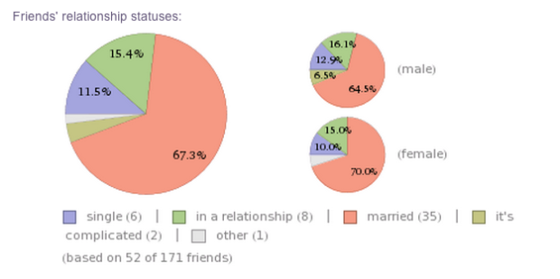
I’ve only updated my Facebook status a few times this year, so the profile-focused information is interesting to me, but the second half of the report provides high-level aggregates about your friends. For example, I’m apparently at a stage in life where most of my friends are either married or in a relationship. You can also see how your friends are connected via a network graph.
So you get more detail than you do out of current infographic-generators. The hook though is the links within the report that lead to information about your birthday or where you were born, kind of like when you end up reading about sasquatch on Wikipedia when your original search was actually work-related.
 Horace Mitchell, director of the NASA Scientific Visualization Studio


 Visualize This: The FlowingData Guide to Design, Visualization, and Statistics (2nd Edition)


